How to make a Tooltip with an Image ?
Last Updated :
09 Apr, 2024
The tooltip is the styling component that provides additional information or context when hovering over an element. We will explore various examples to make a tooltip with an image including a Tooltip With an Image on Top and Bottom, a Tooltip With an Image on Left and Right, and a Tooltip With an Array of Images.
- The HTML code defines two tooltip elements, each containing text (“Hover over me”) and an image wrapped in a ‘<span>’ element. The ‘<span>’ elements have the class ‘tooltiptext’.
- The CSS styles set the appearance and behavior of the tooltips. They define the position, visibility, and transition effects. The ‘.tooltip’ class sets the position to relative and styles the tooltip text when it’s hidden.
- When hovering over a tooltip trigger, the corresponding tooltip becomes visible and fades in smoothly due to the CSS transition effect applied to its opacity.
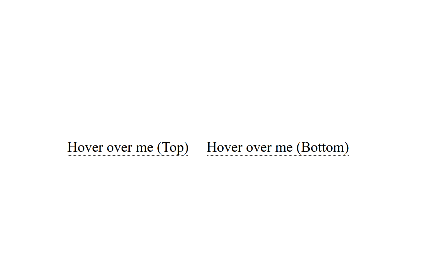
Example 1: The below example demonstrates a Tooltip With an Image on Top and Bottom.
HTML
<!DOCTYPE html>
<html>

<head>
    <title>Tooltip With an Image</title>
    <style>
        body {
            display: flex;
            justify-content: center;
            align-items: center;
            height: 100vh;
            margin: 0;
        }

        .tooltip {
            position: relative;
            display: inline-block;
            border-bottom: 1px dotted black;
            margin-right: 20px;
        }

        .tooltip .tooltiptext {
            visibility: hidden;
            width: 120px;
            background-color: #555;
            color: #fff;
            text-align: center;
            border-radius: 6px;
            padding: 5px;
            position: absolute;
            z-index: 1;
            opacity: 0;
            transition: opacity 0.3s;
            top: 100%;
            left: 50%;
            transform: translateX(-50%);
        }

        .tooltip:hover .tooltiptext {
            visibility: visible;
            opacity: 1;
        }

        .tooltip.top .tooltiptext {
            bottom: 100%;
            top: auto;
        }

        .tooltip.bottom .tooltiptext {
            top: 100%;
            bottom: auto;
        }
    </style>
</head>

<body>
    <div class="tooltip top">
        Hover over me (Top)
        <span class="tooltiptext">
            <img src=
"https://media.geeksforgeeks.org/wp-content/uploads/20240327032356/gfgimg.png"
                 alt="GeeksforGeeks Image"
                 style="width: 100px; height: auto;">
        </span>
    </div>
    <div class="tooltip bottom">
        Hover over me (Bottom)
        <span class="tooltiptext">
            <img src=
"https://media.geeksforgeeks.org/wp-content/uploads/20240327032356/gfgimg.png"
                 alt="GeeksforGeeks Image" style="width: 100px; height: auto;">
        </span>
    </div>
</body>

</html>
Output:
Example 2: A Tooltip With an Image on Left and Right, the tooltips are positioned relative to the text, and they appear on hover.
HTML
<!DOCTYPE html>
<html>

<head>
    <title>Tooltip With an Image</title>
    <style>
        body {
            display: flex;
            justify-content: center;
            align-items: center;
            height: 100vh;
            margin: 0;
        }

        .tooltip {
            display: inline-block;
            margin-right: 30px;
            border-bottom: 1px dotted black;
            position: relative;
        }

        .tooltip .tooltiptext {
            visibility: hidden;
            width: 120px;
            background-color: #555;
            color: #fff;
            text-align: center;
            border-radius: 6px;
            padding: 5px;
            position: absolute;
            z-index: 1;
            opacity: 0;
            transition: opacity 0.3s;
        }

        .tooltip .tooltiptext.left {
            bottom: 50%;
            right: 105%;
            margin-bottom: -15px;
        }

        .tooltip .tooltiptext.right {
            bottom: 50%;
            left: 105%;
            margin-bottom: -15px;
        }

        .tooltip:hover .tooltiptext {
            visibility: visible;
            opacity: 1;
        }
    </style>
</head>

<body>
    <div class="tooltip">
        Hover over me (Left)
        <span class="tooltiptext left">
            <img src=
"https://media.geeksforgeeks.org/wp-content/uploads/20240327032356/gfgimg.png"
                 alt="GeeksforGeeks Image"
                 style="width: 100px; height: auto;">
        </span>
    </div>
    <div class="tooltip">
        Hover over me (Right)
        <span class="tooltiptext right">
            <img src=
"https://media.geeksforgeeks.org/wp-content/uploads/20240327032356/gfgimg.png"
                 alt="GeeksforGeeks Image"
                 style="width: 100px; height: auto;">
        </span>
    </div>
</body>

</html>
Output:

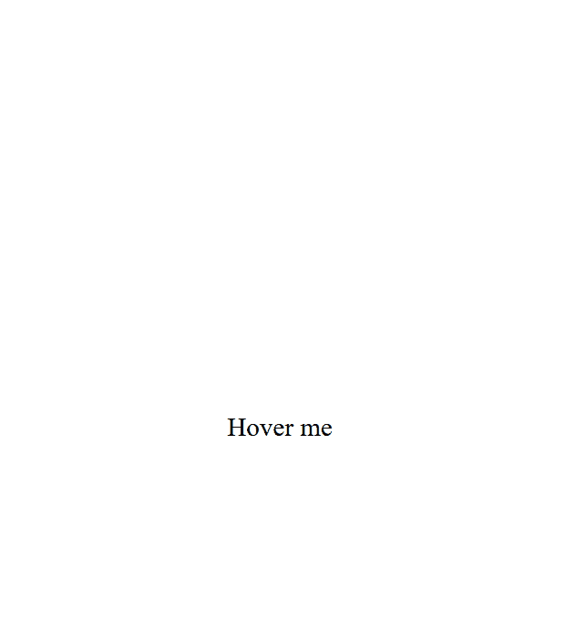
Example 3: A Tooltip With an Array of Images, the tooltip is positioned above the “Hover me” text and displays images from an array with a 1-second interval between changes.
HTML
<!DOCTYPE html>
<html>

<head>
    <title>Tooltip With an Image</title>
    <style>
        body {
            display: flex;
            justify-content: center;
            align-items: center;
            height: 100vh;
            margin: 0;
        }

        .tooltip {
            position: relative;
            display: inline-block;
            cursor: pointer;
        }

        .tooltip .tooltiptext {
            visibility: hidden;
            width: 200px;
            background-color: #333;
            color: #fff;
            text-align: center;
            border-radius: 6px;
            padding: 10px;
            position: absolute;
            z-index: 1;
            bottom: calc(100% + 10px);
            left: 50%;
            transform: translateX(-50%);
            opacity: 0;
            transition: opacity 0.3s ease-in-out;
        }

        .tooltip:hover .tooltiptext {
            visibility: visible;
            opacity: 1;
        }

        .tooltip img {
            width: 200px;
            height: auto;
            display: block;
        }
    </style>
</head>

<body>
    <div class="tooltip">
        Hover me
        <span class="tooltiptext" id="tooltipContent">
        </span>
    </div>
    <script>
        const images = [
"https://media.geeksforgeeks.org/wp-content/uploads/20240327032356/gfgimg.png",
"https://media.geeksforgeeks.org/wp-content/uploads/20240130202536/Gfg-Logo.png"
        ];
        const tooltipContent = document.getElementById("tooltipContent");
        let currentIndex = 0;

        function showImageTooltip() {
            if (currentIndex >= images.length) {
                currentIndex = 0;
            }
            tooltipContent.innerHTML =
                `<img src="${images[currentIndex]}" alt="Tooltip Image">`;
            currentIndex++;
            setTimeout(showImageTooltip, 1000);
        }
        showImageTooltip();
    </script>
</body>

</html>
Output:
Share your thoughts in the comments
Please Login to comment...