How to make a Tooltip with an Top Arrow ?
Last Updated :
21 Mar, 2024
Tooltips are the user interactive element, that is used to notify the important information to the user in a creative way. We can add a top arrow to the tooltip for more interaction.
These are the two different approaches through which we can make a Tooltip With a top Arrow:
Using CSS Pseudo-elements
In this approach, we are using CSS pseudo-elements to create a tooltip with a top arrow. By positioning an after pseudo-element on the tooltip container, the top arrow is created which then styles using styling properties.
Syntax:
selector::pseudo-element {
     property: value;
}
Example: The below example uses CSS Pseudo-elements to make a Tooltip With a top Arrow
HTML
<!DOCTYPE html>
<html>
<head>
<title>Using CSS Pseudo-elements</title>
<style>
body {
display: flex;
justify-content: center;
align-items: center;
height: 100vh;
margin: 0;
flex-direction: column;
}
h1 {
color: green;
}
.ttip {
position: relative;
display: inline-block;
margin-top: 20px;
}
.ttip .ttiptext {
visibility: hidden;
width: 120px;
background-color: rgb(59, 246, 106);
color: rgb(0, 0, 0);
text-align: center;
border-radius: 6px;
padding: 5px;
position: absolute;
z-index: 1;
top: -30px;
left: 50%;
transform: translateX(-50%);
opacity: 0;
transition: opacity 0.3s;
}
.ttip .ttiptext::after {
content: "";
position: absolute;
bottom: 100%;
left: 50%;
margin-left: -10px;
border-width: 10px;
border-style: solid;
border-color: rgb(255, 3, 3) transparent
transparent transparent;
transform: rotate(180deg);
}
.ttip:hover .ttiptext {
visibility: visible;
opacity: 1;
}
</style>
</head>
<body>
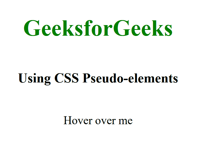
<h1>GeeksforGeeks</h1>
<h3>Using CSS Pseudo-elements</h3>
<div class="ttip">Hover over me
<span class="ttiptext">GFG is Awesome</span>
</div>
</body>
</html>
Output:
Using SVG
In this approach, we are using SVG to create a tooltip with a top arrow. The SVG polygon is positioned above the tooltip text, forming an arrow pointing upwards when hovered over.
Syntax:
<svg width="width" height="height">
    <!-- top shape -->
</svg>
Example: The below example uses SVG to make a Tooltip With a top Arrow
HTML
<!DOCTYPE html>
<html>
<head>
<title>Using SVG</title>
<style>
body {
display: flex;
flex-direction: column;
align-items: center;
margin: 0;
}
h1 {
color: green;
text-align: center;
}
h3 {
text-align: center;
}
.ttip {
position: relative;
display: inline-block;
margin-top: 50px;
}
.ttip .ttiptext {
visibility: hidden;
width: 140px;
background-color: #ecb745;
color: rgb(0, 0, 0);
text-align: center;
border-radius: 8px;
padding: 8px;
position: absolute;
z-index: 1;
top: -40px;
left: 50%;
transform: translateX(-50%);
opacity: 0;
transition: opacity 0.3s,
visibility 0s linear 0.3s;
box-shadow: 0 0 10px rgba(0, 0, 0, 0.3);
}
.ttip .ttiptext svg {
position: absolute;
bottom: 100%;
left: 50%;
transform: translateX(-50%);
}
.ttip .ttiptext svg polygon {
fill: #4caf50;
}
.ttip:hover .ttiptext {
visibility: visible;
opacity: 1;
transition: opacity 0.3s,
visibility 0s linear 0s;
}
</style>
</head>
<body>
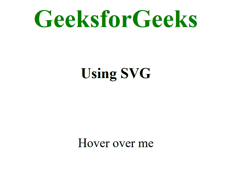
<h1>GeeksforGeeks</h1>
<h3>Using SVG</h3>
<div class="ttip">
Hover over me
<div class="ttiptext">
GFG is Awesome
<svg height="15" width="30">
<polygon points="0,15 15,0 30,15" />
</svg>
</div>
</div>
</body>
</html>
Output:
Share your thoughts in the comments
Please Login to comment...