How to Change the Tooltip Position to Left-Right ?
Last Updated :
19 Mar, 2024
The tooltip is a hint which appears when you hover over an element in the User Interface. You can easily create a tooltip using HTML and CSS by changing the visibility property and hover selector. The tooltip can be positioned left-right using the CSS left and right properties.
Approach
- Create the layout of the page with the appropriate class name in HTML.
- Apply appropriate styling to the element and the tooltip text.
- Position the tooltip absolute and use CSS left, and CSS right positioning properties to position the tooltip to the left and right side of the element.
- Set the visibility property to hidden for the tooltip text.
- Apply the hover selector to the element and set the visibility property to visible, so that on hovering the element, the tooltip appears.
Example: Create an HTML file named “index.html” and a CSS file named “style.css” and write the following codes.
HTML
<!DOCTYPE html>
<html lang="en">
<head>
<meta charset="UTF-8">
<meta name="viewport"
content="width=device-width, initial-scale=1.0">
<link rel="stylesheet"
href="style.css">
<title>Change Tooltip position to left-right</title>
</head>
<body>
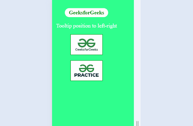
<header>
<h1>GeeksforGeeks</h1>
<p>Tooltip position to left-right</p>
</header>
<main>
<div class="content">
<img src=
"https://media.geeksforgeeks.org/wp-content/uploads/20230913133830/GFG.jpg"
alt="GFG logo">
<p class="tooltip left">
GFG logo
</p>
</div>
<div class="content">
<img src=
"https://media.geeksforgeeks.org/wp-content/uploads/20240218121512/gfg1.jpg"
alt="GFG Practice">
<p class="tooltip right">
GFG Practice logo
</p>
</div>
</main>
</body>
</html>
* {
    margin: 0;
    padding: 0;
    box-sizing: border-box;
}

body {
    min-height: 100vh;
    display: flex;
    flex-direction: column;
    align-items: center;
    background: rgb(47, 255, 141);
    color: white;
}

header {
    display: flex;
    flex-direction: column;
    align-items: center;
    margin-top: 5rem;
    /* Adjust margin for smaller screens */
}

header h1 {
    font-size: 2rem;
    background-color: #fff;
    color: green;
    border-radius: 3rem;
    padding: .5rem 1.5rem;
    margin-bottom: 2rem;
}

header p {
    font-size: 2rem;
    flex-wrap: wrap;
}

main {
    display: flex;
    flex-wrap: wrap;
    justify-content: center;
    gap: 2rem;
    margin-top: 3rem;
}

.content {
    width: min(250px, 90%);
    max-width: 300px;
    height: min(200px, 30vw);
    position: relative;
    border: 2px solid green;
    cursor: pointer;
}

.content img {
    width: 100%;
    height: 100%;
    object-fit: cover;
}

.tooltip {
    visibility: hidden;
    position: absolute;
    top: 40%;
    font-size: 1.5rem;
    padding: .5rem 1rem;
    color: white;
    background-color: green;
    border-radius: .2rem;
    transform-style: preserve-3d;
}

.left {
    left: -65%;
}

.right {
    right: -100%;
}

/* Arrows */
.left::after,
.right::before {
    content: '';
    width: 30px;
    height: 30px;
    position: absolute;
    top: 50%;
    transform: translateY(-50%) translateZ(-1px) rotateZ(45deg);
    background-color: green;
}

.left::after {
    right: -11%;
}

.right::before {
    left: -7%;
}

.content:hover {
    outline: 5px solid green;
}

.content:hover .left,
.content:hover .right {
    visibility: visible;
}

/* Media Queries */
@media screen and (max-width: 600px) {
    header {
        margin-top: 3rem;
        font-size: 10px;
    }

    main {
        height: 200px;
        width: 200px;
        margin-top: 2rem;
        /* margin-left: 6rem; */
    }
}

@media screen and (max-width: 500px) {
    .content {
        width: min(250px, 95%);
    }

    header {
        display: flex;
        justify-content: center;
        font-size: 8px;
    }
}

@media screen and (max-width: 400px) {
    .content {
        width: min(250px, 100%);
    }

    .tooltip {
        font-size: 10px;
    }
}
Output:
Share your thoughts in the comments
Please Login to comment...