Animated charts in R or Animated plots are dynamic visualizations that show changes in data over specified variables like time and others. They allow us to present data in a more engaging and interactive manner like an animation or a GIF, revealing patterns and relationships that might be difficult to observe in static plots.
To create animated charts in R Programming Language, there are several packages available like gganimate, plotly, and ggplot2. These packages provide functionalities to generate animated plots from static visualizations.
Hans Rosling’s Famous Animated Chart
Hans Rosling’s animated chart which is also known as the “Gapminder Chart,” is a famous data visualization that gained significant popularity due to its creative approach to presenting complex global data in a visually appealing way. The chart contains multiple variables such as per capita income, life expectancy, and population size of different countries over time. The animated nature of the chart allows viewers to observe changes in the variables as the bubbles represent countries that continuously grow and shrink with time.
Animating Gapminder Dataset
The Gapminder dataset is a widely used dataset in the field of data visualization. It contains socio-economic indicators for various countries over multiple years. The gap minder library in R makes it easy for us to access and manipulate this dataset without the need to manually download it in order to start working. It contains different datasets in the form of a dataframe also called a tibble. The main attraction is the “gapminder” dataframe, others include continent_colors, country_codes, country_colors, and gapminder_unfiltered dataframes.
In order to install gapminder the library, we need to type the following in R console: –
install.packages("gapminder")
The gapminder dataframe contains social-economic factors of different countries from 1952 till 2007 with a gap of 5 years in between two years each. It contains the life expectancy, population, and GDP per capita of different countries with their continents mentioned for a span of different years. We have verified it below.
R
library(gapminder)
rng <- unique(gapminder$year)
print(rng)
sprintf("Hence range of years from %d to %d.", min(rng), max(rng))
print(colnames(gapminder))
|
Output:-
[1] 1952 1957 1962 1967 1972 1977 1982 1987 1992 1997 2002 2007

[1] "Hence range of years from 1952 to 2007."

[1] "country"   "continent" "year"      "lifeExp"   "pop"       "gdpPercap"
Now we will view the gapminder dataset to get an idea of what we are actually using:-
R
library(ggplot2)
library(gapminder)
library(writexl)
print(head(gapminder, n = 10))
write.csv(gapminder, file = "./data.csv", row.names = FALSE)
write_xlsx(gapminder, path = "./data.xlsx")
|
Output:-
# A tibble: 10 × 6
   country     continent  year lifeExp      pop gdpPercap
   <fct>       <fct>     <int>   <dbl>    <int>     <dbl>
 1 Afghanistan Asia       1962    32.0 10267083      853.
 2 Afghanistan Asia       1967    34.0 11537966      836.
 3 Afghanistan Asia       1972    36.1 13079460      740.
 4 Afghanistan Asia       1977    38.4 14880372      786.
 5 Afghanistan Asia       1982    39.9 12881816      978.
 6 Afghanistan Asia       1987    40.8 13867957      852.
 7 Afghanistan Asia       1992    41.7 16317921      649.
 8 Afghanistan Asia       1997    41.8 22227415      635.
 9 Afghanistan Asia       2002    42.1 25268405      727.
10 Afghanistan Asia       2007    43.8 31889923      975.
Four methods of visualizing the dataset have been given in the above code for clarity :-
- In method 1 we can print the entire dataframe
data using the print.data.frame() function. `nrows`parameter specifies the number of rows to be printed. `nrow(data)` counts the total number of rows in provided dataframe, we can print all rows of the dataframe by setting `nrows`a line as this will produce very big output.
In method 2 we have used the head() function to extract the first 10 rows from the data dataframe. We set n to 10, so that it returns the first 10 rows of data. We use it when we want a glimpse of our dataset whereas print.data.frame provides a well-formatted table to view data.We use the write.csv() function in method 3 to write the dataframe to a CSV file, the file parameter specifies the file name. Setting `row.names = FALSE` ensures that row names are not included in the output file.We use the write_xlsx() function of the writexl package in method 4 to write the dataframe to an Excel file, and the path parameter specifies the file path and name.- The Excel and CSV file gets saved in the current working directory. To view the current working directory in R we can simply type in getwd() function and even we can change it using in setwd() function.
In both the write.csv() function and the write_xlsx() function the file and path parameters respectively specify the location where the files would be generated and their corresponding filename. Both have a similar value of the form “./<filename>.extension” where `./` is a relative path and represents the present working directory, i.e. the filename will be saved in the present working directory.
Now let’s view the Excel file and CSV file in the directory you saved on your computer.
.jpg)
Preview of data.xlsx file
.jpg)
Preview of data.csv file
By defining the plot object as in the below code using the ggplot2 package, we have set up the initial static plot with all the required aesthetics and layers. This plot will serve as the base for creating the animated version using gganimate. It serves as a blueprint for the final animated plot.
Aesthetic means something we can see. Each aesthetic is a mapping between a visual parameter like colour, shape, size of plot and the corresponding variable. Aesthetic mappings can be set in ggplot() function and in individual layers.
We have chosen the log of the population(column name “pop“) for the x-axis and life expectancy(column name “lifeExp“) for the y-axis from the data dataframe in the plot. The `size` parameter maps the population to the size of the points or bubbles. The size of the points will be determined by the population values. `color` paramater maps the continent names to the color of the points. Each continent will be represented by a different color. These are contained within the aes() function which helps us define the aesthetics.
If we run the above code in the R console and try to call the plot an empty plot will be displayed temporarily(removed as soon as it is closed), but in the case of saving the above code and running it from ‘.r‘ file the plot is saved as a pdf file in the current working directory. In the below explanation, we will assume running it in the R GUI console.
Now let’s add another layer to the previous code block.
R
library(ggplot2)
library(gapminder)
plot <- ggplot(gapminder, aes(x = log(pop), y = lifeExp, size = pop, color = continent)) +
geom_point(alpha = 0.5)
plot
|
Output:
Animated Chart
Now we are adding a geometric object geom_point to the plot. Geometric objects are used to represent data points in the plot. The geom_point() function is used to create scatter points in the plot, with each data point represented as a dot.
The `alpha` parameter is optional, it is used to specify the transparency level of the points. In this case, the points will have an alpha value of 0.5, which means they will be semi-transparent. Using a semi-transparent alpha value can be useful when there is overlapping data, as it helps us to see density patterns better.
Now on running it in R console, we get the following :-
Again another layer, we will continue this trend so on till the entire plot object is completely defined.
R
library(ggplot2)
library(gapminder)
plot <- ggplot(gapminder, aes(x = log(pop), y = lifeExp, size = pop, color = continent)) +
geom_point(alpha = 0.5) +
scale_size(range = c(1, 20), guide = "none")
plot
|
Output:
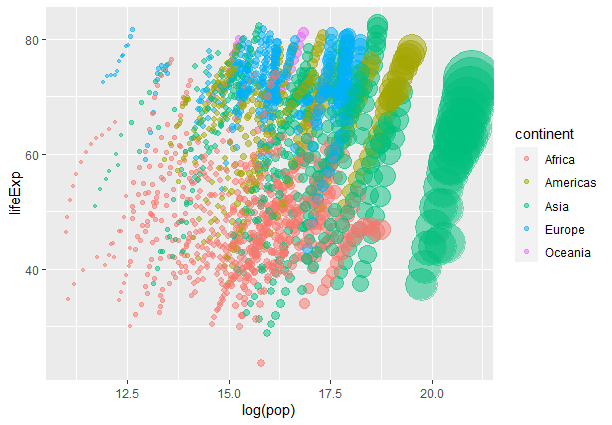
Bubble Animated Chart
We are customizing the size scale of the points in the plot using the the scale_size() function. The `range` the argument specifies the minimum and maximum values for the size scale.
Here we set the size of the points to vary between 1 and 20 units where `c(1, 20)` represents a vector with 2 elements 1 and 20 where 1 is the minimum value and 20 is the max allowed value for the bubble. The `guide` argument specifies the legend or guide associated with the size scale. Setting it to “none” means that no legend will be displayed for the size scale.
Now let’s add labels.
R
library(ggplot2)
library(gapminder)
plot <- ggplot(gapminder, aes(x = log(pop), y = lifeExp, size = pop, color = continent)) +
geom_point(alpha = 0.5) +
scale_size(range = c(1, 20), guide = "none") +
labs(x = "Log of Population", y = "Life expectancy")
plot
|
Output:
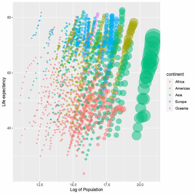
Changed labels in the plot
We use the labs() function to set the labels or names for the x-axis and y-axis of the plot. The x-axis label has been set to "Log of Population" and the y-axis label has been set to "Life expectancy".
Now let’s improve the legend.
R
library(ggplot2)
library(gapminder)
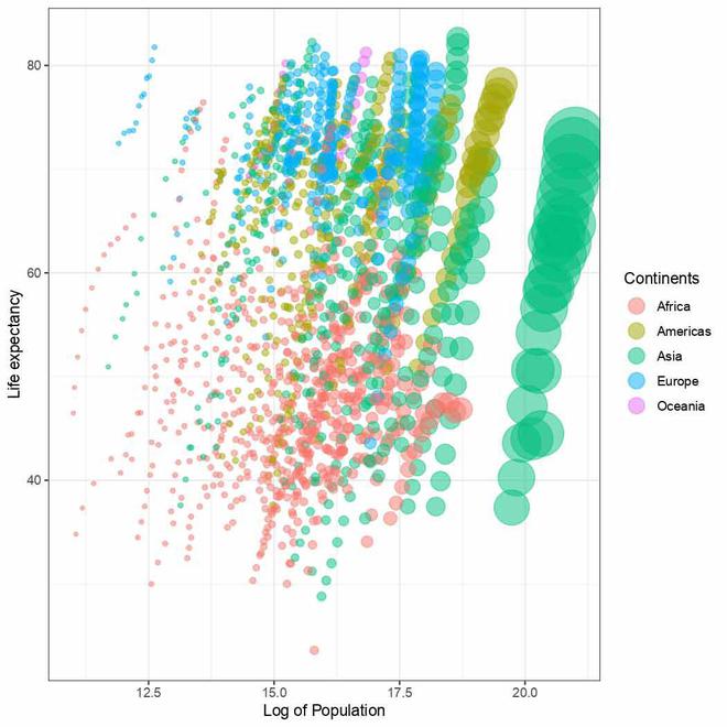
plot <- ggplot(gapminder, aes(x = log(pop), y = lifeExp, size = pop, color = continent)) +
geom_point(alpha = 0.5) +
scale_size(range = c(1, 20), guide = "none") +
labs(x = "Log of Population", y = "Life expectancy") +
guides(color = guide_legend(override.aes = list(size = 5), title = "Continents"))
plot
|
Output:

Updated legend in plot
We have used the guides() function to update the legend generated under the color parameter in aesthetics which is responsible for controlling the legend for continents. We have increased the size using overridelet’s.aes parameter in guide_legend() function and title parameter updates the name of the legend.
Now let’s update the theme.
R
library(ggplot2)
library(gapminder)
plot <- ggplot(gapminder, aes(x = log(pop), y = lifeExp, size = pop, color = continent)) +
geom_point(alpha = 0.5) +
scale_size(range = c(1, 20), guide = "none") +
labs(x = "Log of Population", y = "Life expectancy") +
guides(color = guide_legend(override.aes = list(size = 5), title = "Continents")) +
theme_bw()
plot
|
Output:
Plot with updated theme
Here we are applying the dark-on-light theme to the plot. It provides a clean and simple look to the plot, which can help focus attention on the data itself. Other popular theme alternatives include `theme_minimal()` ,`theme_classic()`, `theme_void()` and others.
Now we would like to display the change in years in our animation, so let’s set the same in our static plot.
R
library(ggplot2)
library(gapminder)
plot <- ggplot(gapminder, aes(x = log(pop), y = lifeExp, size = pop, color = continent)) +
geom_point(alpha = 0.5) +
scale_size(range = c(1, 20), guide = "none") +
labs(x = "Log of Population", y = "Life expectancy") +
guides(color = guide_legend(override.aes = list(size = 5), title = "Continents"))+
theme_bw() +
geom_text(label = gapminder$year, x = -Inf, y = Inf, hjust = -0.5,
vjust = 1.5, size = 12, color = "black")
plot
|
Output:
Year text added to plot
The geom_text() function is a geometric layer in ggplot2 used to add text to a plot. Here we have used to display the year as mentioned in the `label` on the plot. The line `x = -Inf, y = Inf` sets the text to be at the extreme top-left position which may send it outside the plot’s boundary so the `hjust` and `vjust` arguments are set accordingly to position text in a desired way. The `size` argument sets the size of the text to 12 points,`color` argument sets the color of the text to black.
As we may notice all the years in the gapminder dataset have been placed onto the plot clumsily one above another. This is the part that will get corrected automatically when we animate our plot.
R
library(ggplot2)
library(gapminder)
library(gganimate)
plot <- ggplot(gapminder, aes(x = log(pop), y = lifeExp, size = pop, color = continent)) +
geom_point(alpha = 0.5) +
scale_size(range = c(1, 20), guide = "none") +
labs(x = "Log of Population", y = "Life expectancy") +
guides(color = guide_legend(override.aes = list(size = 5), title = "Continents")) +
theme_bw() +
geom_text(label = gapminder$year, x = -Inf, y = Inf, hjust = -0.5, vjust = 1.5,
size = 12, color = "black") +
transition_time(year)
plot
|
Output:
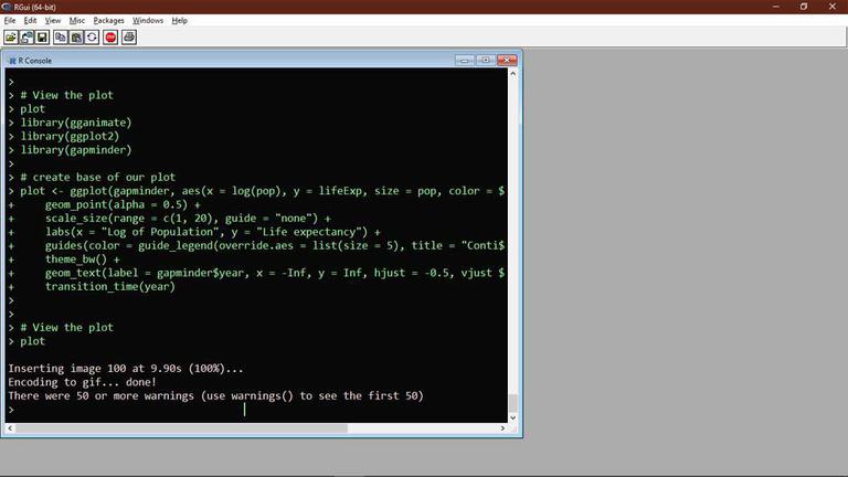
The transition_time() function of the gganimate the package is used to create a time-based animation, we have set it to plot transitions between different years. Now try running the above code in R GUI console like below:-
The output received is a temporary gif file displayed in the photo viewer.
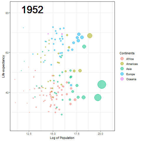
Temporary gif plot
We are very close to our target of Hans Rosling data. Now we just need to make the transition of years smooth instead of blinking for clarity. Hence we need to modify the geom_text() function again.
R
library(ggplot2)
library(gapminder)
library(gganimate)
plot <- ggplot(gapminder, aes(x = log(pop), y = lifeExp, size = pop, color = continent)) +
geom_point(alpha = 0.5) +
scale_size(range = c(1, 20), guide = "none") +
labs(x = "Log of Population", y = "Life expectancy") +
guides(color = guide_legend(override.aes = list(size = 5), title = "Continents")) +
theme_bw() +
geom_text(label = as.character(gapminder$year), x = min(log(gapminder$pop)),
y = max(gapminder$lifeExp), hjust = 0, vjust = 1, size = 12,
color = "black") +
transition_time(year)
plot
|
Output:
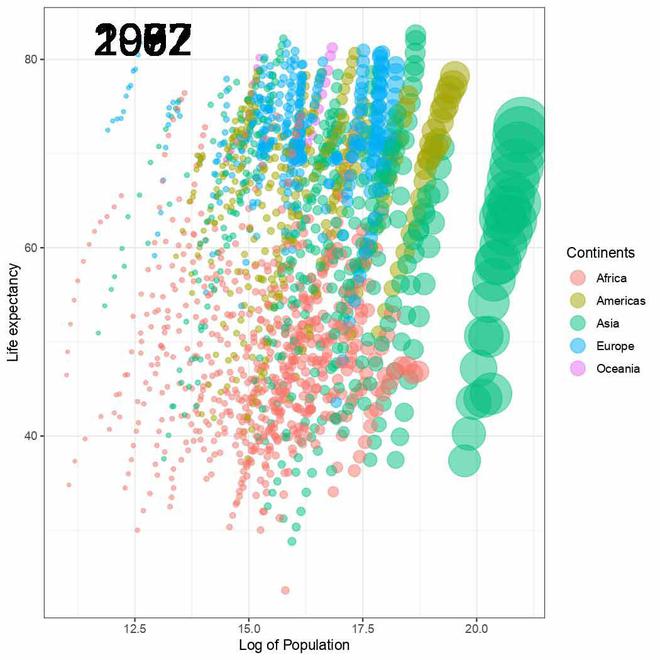
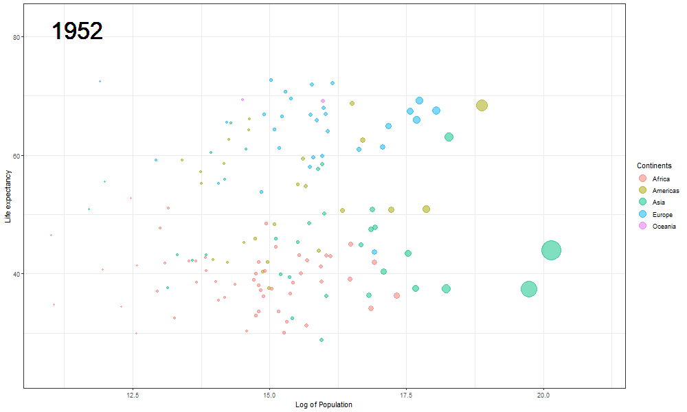
The Hans Rosling plot
Here we updated the x and y coordinates from (-Inf, Inf) to ( min(log(gapminder$pop), max(gapminder$lifeExp) ) so as to be within the plot during the transition and to not exit every time of the plot when the year updates leading to readjustment of positions and a blank year being displayed for a moment in animation. `vjust` and `hjust‘ have been adjusted accordingly by trial. Also in the `label` parameter we now passed the year converted to character format since it caused strange output to be displayed unlike the previous plot hence guaranteeing that the year we pass is a character type data type as accepted by label avoiding strange behavior.
The plot will help us to observe any trends or patterns related to population density or the impact of population growth on life expectancy. Now we will save it as a .gif file.
You need the gifski package and av package installed in the system for the renderer backend for creating the gif and video output file respectively. Type the following in R Terminal to install them:-
install.packages("gifski")

install.packages("av")
R
library(ggplot2)
library(gapminder)
library(gganimate)
plot <- ggplot(gapminder, aes(x = log(pop), y = lifeExp, size = pop, color = continent)) +
geom_point(alpha = 0.5) +
scale_size(range = c(1, 20), guide = "none") +
labs(x = "Log of Population", y = "Life expectancy") +
guides(color = guide_legend(override.aes = list(size = 5), title = "Continents")) +
theme_bw() +
geom_text(label = as.character(gapminder$year), x = min(log(gapminder$pop)),
y = max(gapminder$lifeExp), hjust = 0, vjust = 1, size = 12,
color = "black") +
transition_time(year)
anim_save(filename = "./logpopvslifeExp.gif", animation = plot, height = 600,
width = 1000)
|
Output:
Rendering [=============================================>] at 2 fps ~ eta: 0s
After the Rendering is complete like above open the GIF file in the present working directory to view it.
The final Rosling plot is saved as a gif.
We use the anim_save() function of gganimate package to save the animation as a GIF file. The filename parameter stores the filename which must be used to save the plot, in the animation parameter we pass the plot object, and height and width parameters are used to manipulate the dimensions of the final .gif file.
Note :-
Please ensure that you have write permissions in the directory where you want to save your animated gif file else the following warning might be encountered if user does not have admin privileges and gif file won’t be saved :-
Warning message:
file_renderer failed to copy frames to the destination directory.
To ensure that the file that gets rendered is actually saved in the desired directory please run RStudio or any text editor you are using with administrator rights(in Windows based systems) or as a superuser(in Linux/Unix based systems) which will force write operation on that directory.
Share your thoughts in the comments
Please Login to comment...