The Iris dataset is a classic dataset often used for learning and practicing data analysis and machine learning techniques. The Iris dataset in the R Programming Language is often used for loading the data to build predictive models.
Iris dataset in R
The Iris dataset comprises measurements of iris flowers from three different species: Setosa, Versicolor, and Virginica. Each sample consists of four features: sepal length, sepal width, petal length, and petal width. Additionally, each sample is labeled with its corresponding species.
Dataset Link: Iris Dataset
For Visualization in R, we can use various packages like ggplot2, dplyr, and summary tools for this purpose. Visualizations such as scatter plots, box plots, and histograms help us understand the distribution of each feature and identify potential patterns or outliers.
By loading the libraries required for our analysis. These libraries contain functions and tools that we’ll use later for data manipulation, visualization, and modeling.Also we read the Iris dataset from a CSV file into our R environment. This dataset contains information about the sepal and petal dimensions of different iris flowers, along with their species.
R
library(randomForest)
library(e1071)
library(class)
library(ggplot2)
library(reshape2)
library(dplyr)
setwd("Your/directory/path")
iris_data <- read.csv("iris.csv", header = TRUE)
|
Basically here we check the structure of the dataset , we display the first few rows of the dataset to get an overview of its structure and contents. This helps us understand what kind of data we’re working with.
Output:
  Id SepalLengthCm SepalWidthCm PetalLengthCm PetalWidthCm     Species
1  1           5.1          3.5           1.4          0.2 Iris-setosa
2  2           4.9          3.0           1.4          0.2 Iris-setosa
3  3           4.7          3.2           1.3          0.2 Iris-setosa
4  4           4.6          3.1           1.5          0.2 Iris-setosa
5  5           5.0          3.6           1.4          0.2 Iris-setosa
6  6           5.4          3.9           1.7          0.4 Iris-setosa
Check the structure of the dataset
Output:
'data.frame':    150 obs. of  6 variables:
 $ Id           : int  1 2 3 4 5 6 7 8 9 10 ...
 $ SepalLengthCm: num  5.1 4.9 4.7 4.6 5 5.4 4.6 5 4.4 4.9 ...
 $ SepalWidthCm : num  3.5 3 3.2 3.1 3.6 3.9 3.4 3.4 2.9 3.1 ...
 $ PetalLengthCm: num  1.4 1.4 1.3 1.5 1.4 1.7 1.4 1.5 1.4 1.5 ...
 $ PetalWidthCm : num  0.2 0.2 0.2 0.2 0.2 0.4 0.3 0.2 0.2 0.1 ...
 $ Species      : Factor w/ 3 levels "Iris-setosa",..: 1 1 1 1 1 1 1 1 1 1 ...
str(iris_data) it’s provides the structure of the dataset. It gives information about the variables (columns) present in the dataset, including their names, data types, and the first few values. It’s particularly useful for understanding the types of variables we’re dealing with, such as numeric, factor, or character.
Generate summary statistics for Iris dataset
Output:
       Id         SepalLengthCm    SepalWidthCm   PetalLengthCm
 Min.   :  1.00   Min.   :4.300   Min.   :2.000   Min.   :1.000
 1st Qu.: 38.25   1st Qu.:5.100   1st Qu.:2.800   1st Qu.:1.600
 Median : 75.50   Median :5.800   Median :3.000   Median :4.350
 Mean   : 75.50   Mean   :5.843   Mean   :3.054   Mean   :3.759
 3rd Qu.:112.75   3rd Qu.:6.400   3rd Qu.:3.300   3rd Qu.:5.100
 Max.   :150.00   Max.   :7.900   Max.   :4.400   Max.   :6.900
  PetalWidthCm              Species
 Min.   :0.100   Iris-setosa    :50
 1st Qu.:0.300   Iris-versicolor:50
 Median :1.300   Iris-virginica :50
 Mean   :1.199
 3rd Qu.:1.800
 Max.   :2.500
Now generate summary statistics for the numeric variables in the dataset. These statistics provide us with insights into the central tendency, dispersion, and distribution of the data.
Data Visualization of Iris dataset in R
R
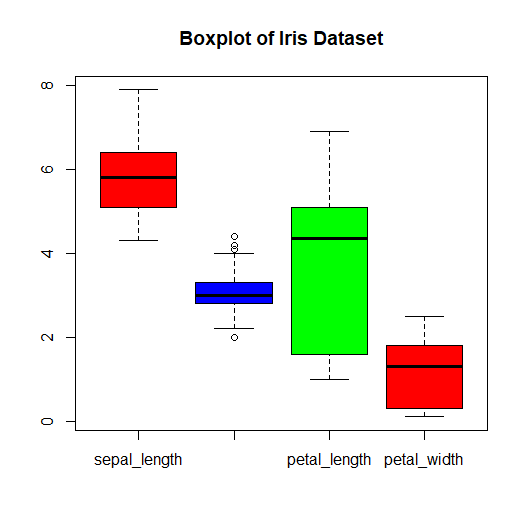
boxplot(iris_data[, -5], col = c("red", "blue", "green"),
main = "Boxplot of Iris Dataset")
|
Output:
Output
This code generates a boxplot for each numerical variable (columns 1 to 4, excluding the last column) in the iris dataset.
- The col parameter specifies the colors of the boxplots for each species.
- The main parameter sets the title of the boxplot.
Histogram
R
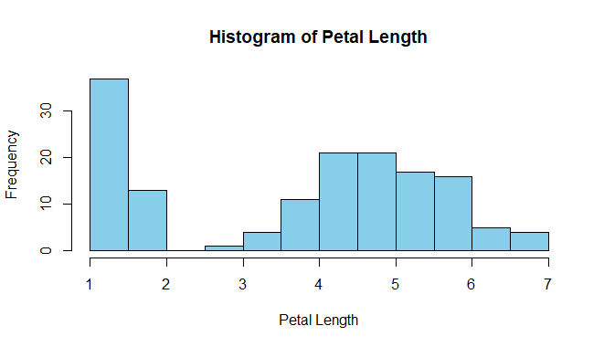
data(iris)
hist(iris$Petal.Length,
main = "Histogram of Petal Length",
xlab = "Petal Length",
col = "skyblue",
border = "black")
|
Output:
Iris dataset in R
This code generates a histogram for the Petal Length variable.
- The main parameter sets the title of the histogram.
- xlab parameter sets the label for the x-axis.
- col parameter sets the color of the bars in the histogram.
Heatmap
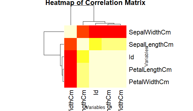
The “iris” dataset, reshapes it into a matrix form, and then plots a heatmap using the `heatmap()` function to visualize the mean petal length across different combinations of sepal length and sepal width.
R
numeric_data <- iris_data[, sapply(iris_data, is.numeric)]
correlation_matrix <- cor(numeric_data)
heatmap(correlation_matrix,
main = "Heatmap of Correlation Matrix",
xlab = "Variables",
ylab = "Variables",
col = heat.colors(12),
symm = TRUE)
heatmap(heatmap_matrix, Rowv = NA, Colv = NA, col = heat.colors(12),
scale = "column", xlab = "Sepal Length", ylab = "Sepal Width",
main = "Heatmap of Petal Length")
|
Output:
Iris dataset in R
First we calculates the correlation matrix for the numeric variables in the iris dataset and then creates a heatmap using the heatmap() function. The color scale is set using the col parameter.
Pairplot
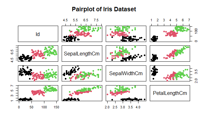
This code will produce a pairplot showing pairwise scatterplots of the variables (Sepal Length, Sepal Width, Petal Length, Petal Width) against each other, with points colored by species.We can see many types of relationships from this plot such as the species Setosa has the smallest of petals widths and lengths. Such information can be gathered about any other species.
R
pairs(iris_data[, 1:4],
main = "Pairplot of Iris Dataset",
pch = 19,
col = iris$Species)
|
Output:
Iris dataset in R
Histogram with Distplot
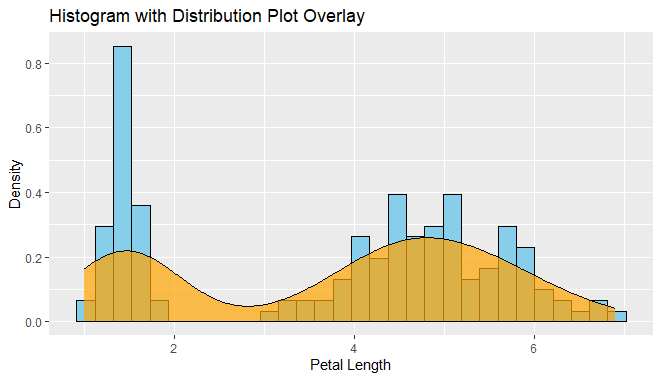
Histogram: The histogram represents the distribution of the “petal_length” variable. It divides the range of values into intervals (bins) and displays the frequency or count of observations falling into each bin using bars. This helps visualize the distribution of petal lengths in the dataset and provides insights into the range and frequency of different petal lengths.
Distribution Plot Overlay: The distribution plot overlay, shown in red, provides a smoothed estimate of the probability density function (PDF) of the “petal_length” variable. It offers additional information about the shape and central tendency of the distribution beyond what the histogram provides. The density plot is a smoothed version of the histogram and gives a sense of the underlying probability distribution of the data.
R
library(ggplot2)
ggplot(iris_data, aes(x = PetalLengthCm)) +
geom_histogram(aes(y = ..density..), fill = "skyblue", color = "black", bins = 30) +
geom_density(alpha = 0.7, fill = "orange") +
labs(title = "Histogram with Distribution Plot Overlay",
x = "Petal Length",
y = "Density")
|
Output:
Iris dataset in R
Conclusion
Starting with understanding the dataset’s structure and features, we’ve seen how to check for missing values and outliers, ensuring our analysis is robust. Then, through various visualizations like scatter plots, histograms, and heatmaps, we’ve uncovered interesting patterns and relationships in the data.
Overall, the Iris dataset serves as a great learning resource for beginners in data science. It’s straightforward yet offers plenty of opportunities to practice essential skills like data manipulation, visualization, and analysis.
Share your thoughts in the comments
Please Login to comment...