How to Add Trendline in Google Sheets
Last Updated :
29 Dec, 2023
In general, a trendline is a straight or curved line that provides a visual representation of the data points of the data. The trendlines are used in various industries like finance, science, and Data Analysis Companies. The uses of trendlines are as follows
- They are used to identify the whole trend direction of the data. Whether it’s upward, downward, or flatten. Based on this the respected organization is going to get insights.
- They are used for simple forecasting by extending the trendline we can make some rough predictions about the direction of the trend based on the historical data.
- These are even in statistical analysis to quantify the relationship between variables and assess the strength and significance of trends.
How to Add and Edit a Trendline in Google Sheets
Step 1: Open Google Sheets and the Excel File
Open Google Sheets and open the Excel file that contains the spreadsheet to which we want to add the trendline to its plot.

Step 2: Select the Data
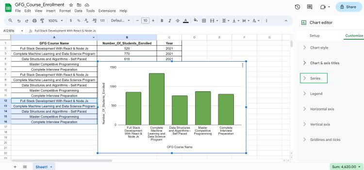
Select the drag the data points that we want to include in the chart. In our considered let’s plot the graph for a number of students enrolled in the year in different courses offered by GFG based on sample data.

Step 3: Go to Insert Tab and Select the Chart
Next, Click on the Insert Chart on the toolbar which is located on the top. In the chart editor, we need to select the chart that best suits our data.

Step 4: Click the “Chart” option, choose “Customize,” select “Series,” and then click on Trendline
After plotting the simple plot we need to click on Edit Chart -> Customize -> Series -> Trendline -> Select the type of Trendline -> Click on Apply -> Click on Done
Edit Chart -> Customize -> Series
Step 5: Choose the Trendline Type, click Apply, and then select Done
Series -> Trendline -> Select the type of Trendline -> Click on Apply -> Click on Done

How to Customize the Trendline in Google Sheets
After plotting the basic trendline on the graph. We can customize the properties of the trendline which include its color size by following these steps:
Step 1: Click on Chart
The first step is that we need to select the chart we want to customize. In our example, we are going to select the plotted chart as follows

Step 2: Click on Ellipsis
After selecting the chart we need to click on the ellipsis which is located in the top right corner of the selected chart

Step 3: Click on the Customize Tab
Later, after clicking on the ellipsis we need to click edit chart then a side window is going to appear on the right side with two tabs. Setup and Customize to Customize the chart or the trendline we need to click on the Customize Tab.

1. Line Color:- We can customize the color of the Trend Line using the color picker. In our article, we changed the color of Trendline from red to blue color
2. Line Opacity:- We can also adjust the brightness of the trendline based on the options provided by Google Sheets. (10%,20%,50%,90%,100%)
3. Line Thickness:- We can also adjust the thickness of the line based on the pixels.
4. Labeling:- We can also adjust the label of the trendline which is used to represent what that trendline indicates.
How to Change the Type of Trendline in Google Sheets
We can also change the type of trendline based on the trend we want to find out on different types of data. They are
1. Linear Trendline:- It’s represented as a Straight line that connects all the data points with a minimum distance. Mostly Linear Trendlines are used for analyzing trends over some period of time.
2. Exponential Trendline:- Exponential Trendline represents the growth or decay in the data. It’s most useful when we want to identify trends of sales that are increasing exponentially.
3. Polynomial Trendline:- It represents the curve that best fits the data points based on a polynomial equation. When you add a trend line of this type, you can choose a series of polynomials (e.g., quadratic, cubic).
4. Power Series Trendline:- It represents power-law relationships between variables. Useful when data reveal a power-law increase or decrease.
5. Moving Average Trendline:- It represents the average of a specific number of data points, and facilitates changes in the data. Useful for identifying long-term trends.
6. Logarithmic Trendline:- The logarithmic trend line is the best-fitting curve that is most useful when the change in the data increases or decreases rapidly and then flattens out.

Types of Trendlines in Google Sheets
FAQs
Can you add a trendline to the Google Sheets chart?
Yes, we can add a trendline to a chart in Google Sheets by selecting the chart, clicking on the three dots (ellipsis) in the top right corner, selecting “Trendline”, and choosing the trendline type you want
How do you insert a trendline?
To insert a trendline into Google Sheets, click on the chart, click the “+” sign, select “Trendline” and choose the desired trendline type from the options.
Can you add a line of best fit in Google Sheets?
Yes, we can add a good fit line by adding a “Linear” trendline to a scatter plot or line chart in Google Sheets.
Share your thoughts in the comments
Please Login to comment...