Histogram using Plotly in Python
Last Updated :
28 Jul, 2020
Plotly is a Python library which is used to design graphs, especially interactive graphs. It can plot various graphs and charts like histogram, barplot, boxplot, spreadplot and many more. It is mainly used in data analysis as well as financial analysis. plotly is an interactive visualization library.
Histogram in Plotly
A histogram is a graph where the data are stocked and the each stocked is counted and represented. More broadly, in plotly a histogram is an accumulated bar chart, with several possible accumulation functions. The data to be stocked can be numerical data but also categorical or date data. It is commonly used in dealing with large data of sets.
Syntax: plotly.express.histogram(data_frame=None, x=None, y=None, color=None, facet_row=None, facet_col=None, facet_col_wrap=0, hover_name=None, hover_data=None, animation_frame=None, animation_group=None, category_orders={}, labels={}, color_discrete_sequence=None, color_discrete_map={}, marginal=None, opacity=None, orientation=None, barmode=’relative’, barnorm=None, histnorm=None, log_x=False, log_y=False, range_x=None, range_y=None, histfunc=None, cumulative=None, nbins=None, title=None, template=None, width=None, height=None)
Parameters:
data_frame: DataFrame or array-like needs to be passed for column names
x: Either a name of a column in data_frame, or a pandas Series or array_like object. Values from this column or array_like are used to position marks along the x axis in cartesian coordinates.
y: Either a name of a column in data_frame, or a pandas Series or array_like object. Values from this column or array_like are used to position marks along the y axis in cartesian coordinates.
color: Either a name of a column in data_frame, or a pandas Series or array_like object.
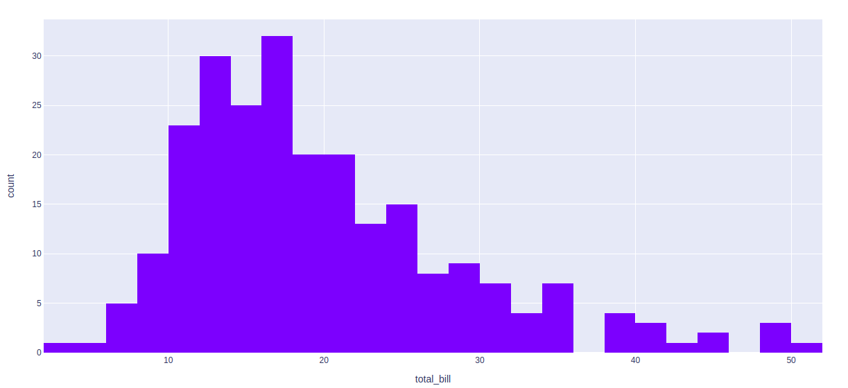
Example: Using the tips Dataset
Python3
import plotly.express as px
df = px.data.tips()
fig = px.histogram(df, x="total_bill")
fig.show()
|
Output:
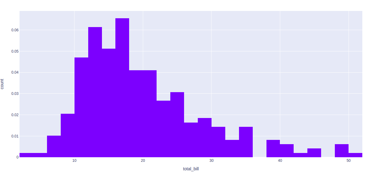
Type of normalization
By default, mode through which the bins are represented is count of samples. We can change this mode using Plotly. Ir=t can be done using histnorm argument. Different values that can be passed using this argument are-
- percent or probability: The output of histfunc for a given bin is divided by the sum of the output of histfunc for all bins.
- density: The output of histfunc for a given bin is divided by the size of the bin.
- probability density: The output of histfunc for a given bin is normalized such that it corresponds to the probability that a random
Example 1:
Python3
import plotly.express as px
df = px.data.tips()
fig = px.histogram(df, x="total_bill",
histnorm='probability density')
fig.show()
|
Output:
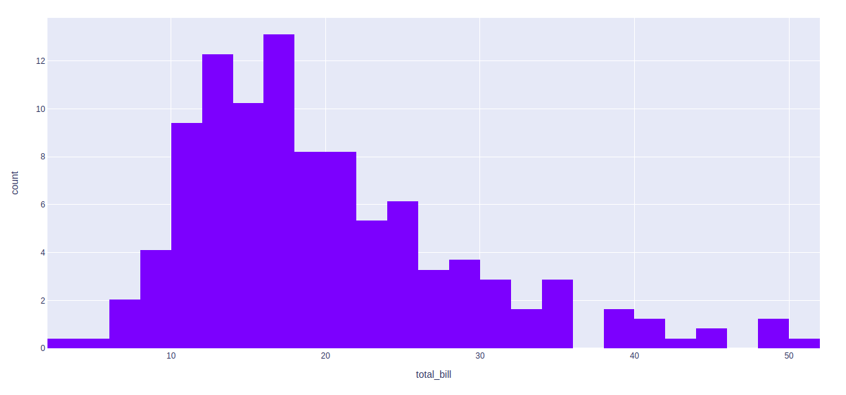
Example 2:
Python3
import plotly.express as px
df = px.data.tips()
fig = px.histogram(df, x="total_bill", histnorm='percent')
fig.show()
|
Output:
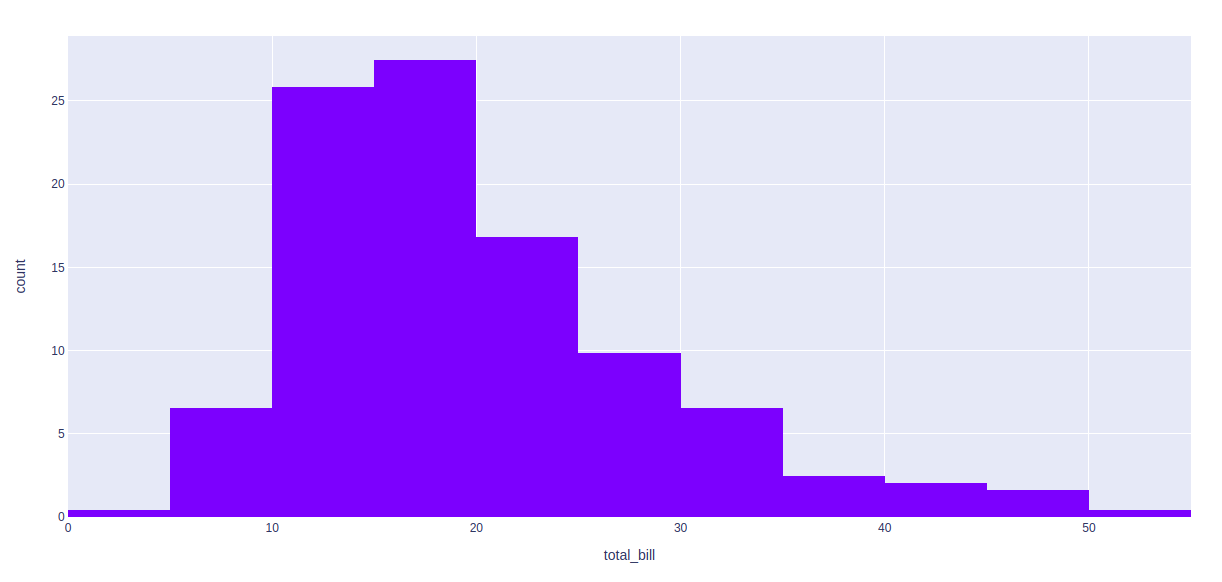
Selecting the number of bins
By default, the number of bins is chosen in such a way that this number is comparable to the typical number of samples in a bin. In plotly the number, as well as range of values, can be customized by using nbins parameter.
Example:
Python3
import plotly.express as px
df = px.data.tips()
fig = px.histogram(df, x="total_bill",
histnorm='percent',
nbins = 10)
fig.show()
|
Output:
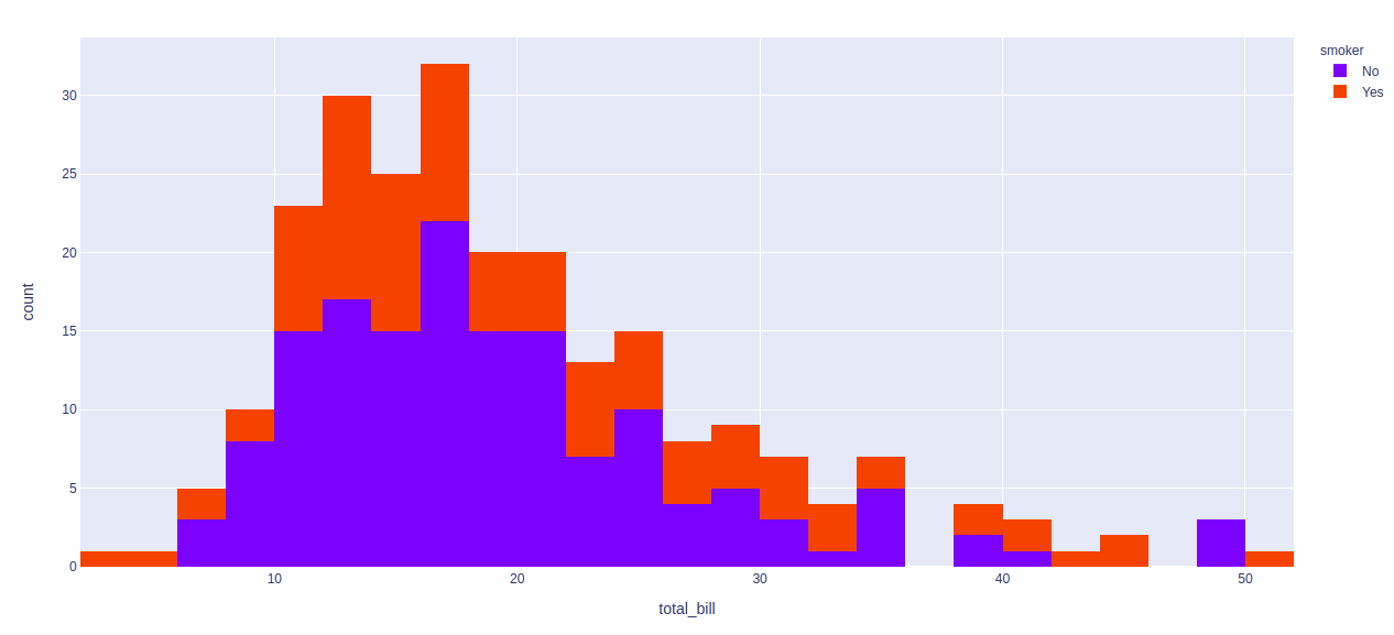
Stacked values in Histogram
In plotly different values can be shown in one column by using the color argument.
Example:
Python3
import plotly.express as px
df = px.data.tips()
fig = px.histogram(df, x="total_bill", color = "smoker")
fig.show()
|
Output:
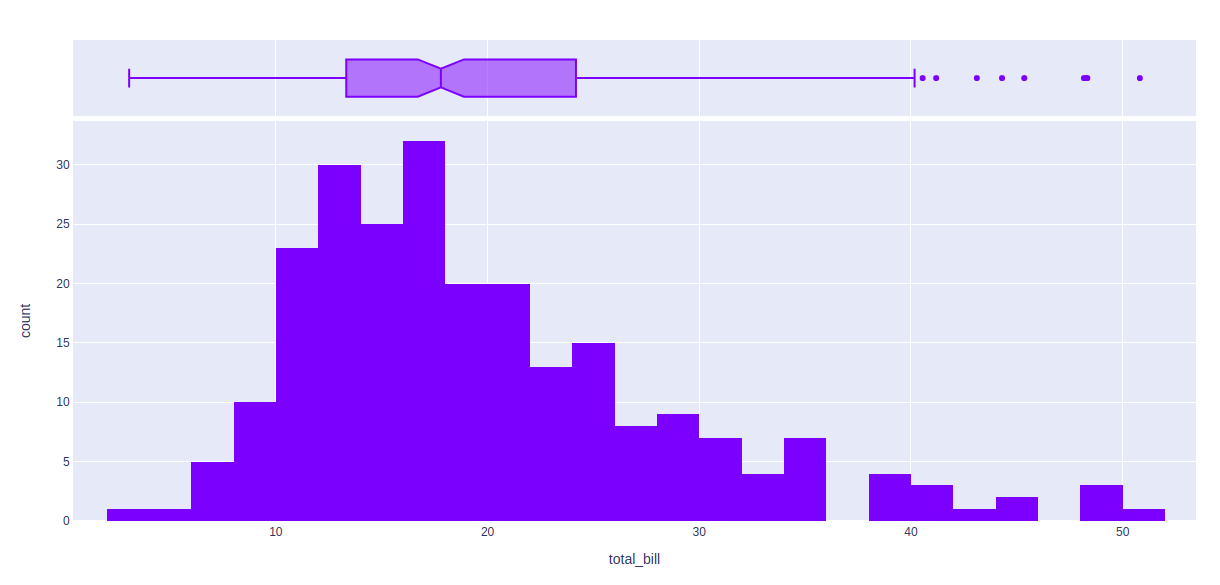
Visualizing the underlying distribution
In plotly, by using the marginal parameter we can visualize the distribution of the values. Marginal parameter has three values:
Example:
Python3
import plotly.express as px
df = px.data.tips()
fig = px.histogram(df, x="total_bill", marginal = 'box')
fig.show()
|
Output:
Share your thoughts in the comments
Please Login to comment...