Gantt Chart in plotly
Last Updated :
29 Aug, 2020
Plotly is a Python library that is used to design graphs, especially interactive graphs. It can plot various graphs and charts like histogram, barplot, boxplot, spreadplot, and many more. It is mainly used in data analysis as well as financial analysis. plotly is an interactive visualization library.
Gantt Chart
A Gantt chart is parallel to bar chart that delineates a project schedule. In Gantt chart tasks are performed in the vertical axis and the time intervals are performed in the horizontal axis. The width of the horizontal bars in the graph shows the endurance of both the activity. A Gantt chart is made up of numerous different elements. the main 8 key components are:
- Task list
- Timeline
- Date line
- Bars
- Milestones
- Dependencies
- Progress
- Resource assigned
Syntax: plotly.figure_factory.create_gantt(df, colors=None, index_col=None, show_colorbar=False, reverse_colors=False, title=’Gantt Chart’, bar_width=0.2, showgrid_x=False, showgrid_y=False, height=600, width=None, tasks=None, task_names=None, data=None, group_tasks=False, show_hover_fill=True)
Parameters:
df: input data for gantt chart. Must be either a a dataframe or a list.
colors: either a plotly scale name, an rgb or hex color, a color tuple or a list of colors
show_colorbar: determines if colorbar will be visible. Only applies if values in the index column are numeric.
show_hover_fill: enables/disables the hovertext for the filled area of the chart.
title: title of the chart
height: Height of the chart
weight: Weight of the chart
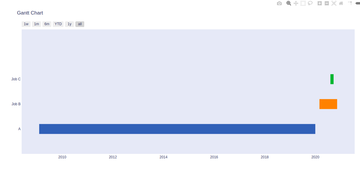
Example 1:
Python3
import plotly.figure_factory as ff
df = [dict(Task="A", Start='2020-01-01', Finish='2009-02-02'),
dict(Task="Job B", Start='2020-03-01', Finish='2020-11-11'),
dict(Task="Job C", Start='2020-08-06', Finish='2020-09-21')]
fig = ff.create_gantt(df)
fig.show()
|
Output:
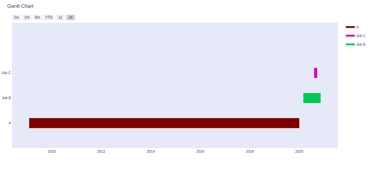
Example 2:
Python3
import plotly.figure_factory as ff
df = [dict(Task="A", Start='2020-01-01', Finish='2009-02-02'),
dict(Task="Job B", Start='2020-03-01', Finish='2020-11-11'),
dict(Task="Job C", Start='2020-08-06', Finish='2020-09-21')]
colors = ['#7a0504', (0.2, 0.7, 0.3), 'rgb(210, 60, 180)']
fig = ff.create_gantt(df, show_colorbar = True, colors = colors )
fig.show()
|
Output:
Share your thoughts in the comments
Please Login to comment...