Introducing the EcoSight Analytics by our team for the GeeksforGeeks EcoTech Hackathon. Our project combines a carbon footprint calculator, emission reduction tips, satellite image classification, and air quality index analysis empowering users to make informed decisions for a sustainable future. With interactive visualizations and a technology stack including Python, Django, and HTML, CSS, JavaScript for our project, it promotes greener lifestyles and fosters global environmental awareness. You can test it here.
Problem Statement
The environmental issues our planet grapples with are manifold, ranging from the relentless menace of climate change to the alarming decline in biodiversity, the pervasive pollution problem, and the ever-depleting natural resources. These challenges underscored the urgency for our tech-savvy generation to step up and make a difference. In this context, Data Science emerged as a potent ally, offering analytical tools and machine learning techniques that could revolutionize our approach to these pressing issues.
What made EcoTech unique was the autonomy given to participants in choosing their datasets. This freedom enabled us to address issues that personally resonated with us, giving us a sense of ownership and passion for our projects. Whether we were crafting predictive models, delving deep into complex datasets, or uncovering valuable insights, the potential of Data Science was on full display.
But our responsibilities did not stop at analysis and model training. We were tasked with a crucial step: deploying our data-driven solutions to websites. This step ensured that our innovative solutions were not confined to the realm of theory but were accessible to a wider audience, bringing real-world relevance to our work.
EcoTech was a collaborative effort that epitomized the spirit of innovation, cooperation, and change. The judging criteria, which included innovation in projects, the usability and responsiveness of deployed websites, and the adept use of algorithms and data science techniques, emphasized the holistic nature of the event. We weren’t just showcasing technical expertise; we were working together to create practical solutions that could make a real impact in the journey toward a sustainable environment.
EcoTech emerged as an embodiment of the belief that Data Science can be a force for good. It was a collective effort that showcased how, when harnessed effectively, data has the potential to drive positive change and transform our world. This hackathon was more than just a competition; it was a critical step in the global movement towards a more sustainable future.
Project Links
Github repository: Here
Project website: EcoSight
Video presentation: Here
Our Team
- Data Scientist/Backend: Shibam Roy – A passionate and skilled Data Analyst with a profound love for coding. His extensive knowledge of various programming languages and frameworks enables him to undertake complex data analysis projects. From childhood, Shibam has been dedicated to coding, resulting in an impressive portfolio of remarkable projects. He has knowledge in C++ , Python, Data Science, and DSA. His analytical mindset, creativity, and effective communication make him a valuable asset to any data-driven team.
- Front-end developer/UI designer: Ankush Roy – an integral member of the our team, known for his exceptional front-end development skills, mathematical acumen, and mastery of C++. His artistic eye elevates user experiences, while his passion for mathematics enriches data insights. With a strong grasp of C++. His adaptability and innovation align seamlessly with our mission to fuse data science and web development for transformative solutions.
- Data Scientist: Swadhin Maharana – a dynamic and accomplished individual who stands at the forefront of the exciting intersection of Data Science and Python programming. With an insatiable curiosity and a passion for unraveling complex patterns in data, Swadhin has established himself as a distinguished expert in his field.
Overall Steps
Our overall procedure included a few steps, and this could be explained very easily via a flowchart:
.png)
Procedure flowchart
Even though we had multiple steps in between, which are well described in the sections below, this is just for a quick check of the overall steps.
Pre-requisites
Finding Data
One of the most challenging tasks in this project was to fetch data for this section of the project. Even though there were many sites offering data regarding carbon emissions, most of them were paid and they didn’t qualify the needs of our project. After facing such challenges, we found out a few numbers of websites, which contained quality data which we required.
The sources include:
- OurWorldInData
- Statistica
- Dewesoft
By the use of these sources we got our data in a kind of raw format, which was further preprocessed to get it into some work.
Preprocessing Data
These datasets contained multiple features, the data we obtained from OurWorldInData contains features such as co2 emissions, co2 emissions per capita, co2 emissions by natural gas, and co2 emissions by coal per annum, of multiple countries. It contains multiple other features which we wouldn’t have required for this project, so we dropped those features. Moreover, the dataset contains very old data as well, (as old as 1850s), we filtered out the data to only to the most recent years, so that there’s least inaccuracy.
Besides this, we also obtained data from Statistica and Dewesoft, which was already in a pretty much clean format, so we didn’t need to preprocess it much, we just extracted the features we required. They contained data about electricity prices of many countries and most common source of electricity in those countries respectively.
Python
import pandas
import numpy
from matplotlib import pyplot
import seaborn as sns
carbon=pandas.read_csv("co2_data.csv")
carbonNew=carbon.groupby('country',as_index=False).apply(lambda cnt:cnt[cnt['year']==cnt['year'].max()])
carbonOld=carbon.groupby('country',as_index=False).apply(lambda cnt:cnt[cnt['year']==cnt['year'].min() ])
carbonNew=carbonNew[['country','population','year','co2_per_capita','co2','coal_co2','energy_per_capita','temperature_change_from_co2']]
carbonOld=carbonOld[['country','year','population','co2_per_capita','co2']]
carbonOld=carbonOld.dropna(subset=['co2','population','co2_per_capita'])
carbonNew['co2']=carbonNew['co2'].fillna(carbonNew.co2.mean())
carbonNew['population']=carbonNew['population'].fillna(carbonNew.co2.mean())
carbonNew['co2_per_capita']=carbonNew['co2_per_capita'].fillna(carbonNew.co2.mean())
carbonNew['coal_co2']=carbonNew['coal_co2'].fillna(carbonNew.co2.mean())
carbonNew['energy_per_capita']=carbonNew['energy_per_capita'].fillna(carbonNew.co2.mean())
carbonNew['temperature_change_from_co2']=carbonNew['temperature_change_from_co2'].fillna(carbonNew.co2.mean())
carbonNew['country']=carbonNew['country'].str.lower()
c1=pandas.read_csv("allData/PowerSource.csv")
c2=pandas.read_csv("allData/PricesElectricity.csv")
c3=pandas.read_csv("allData/required_data.csv")
def lowerCase(x):
return x.lower()
c1['country']=c1['country'].apply(lowerCase)
c2['country']=c2['country'].apply(lowerCase)
c3['country']=c3['country'].apply(lowerCase)
c1=c1.drop("Unnamed: 0",axis=1)
c2=c2.drop("Unnamed: 0",axis=1)
c3=c3.drop("Unnamed: 0",axis=1)
merged=c1.merge(c2, on='country', how='left') \
.merge(c3, on='country', how='left')
def remNewLine(x):
return x.replace("\n","")
merged['major_power_source']=merged['major_power_source'].apply(remNewLine)
def remDollar(x):
a=str(x).replace("$","")
return float(a)
merged['AvgPrice']=merged['AvgPrice'].apply(remDollar)
merged['AvgPrice']=merged['AvgPrice'].fillna(merged['AvgPrice'].mean())
merged=merged.dropna()
|
We also added a row called Avg , which contains the average value for each column, this would be used just in case if the user’s specified country is not found in the data.
Here is the code to add the new row:
Python
newRow = {'country': ['Avg'], 'major_power_source': ['Oil'], 'AvgPrice': [merged['AvgPrice'].mean()],'year':[2021],'population':[merged['population'].mean()],'co2':[merged['co2'].mean()],'co2_per_capita':[merged['co2_per_capita'].mean()],'gas_co2_per_capita':[merged['gas_co2_per_capita'].mean()]}
newRow=pandas.DataFrame(newRow)
merged= pandas.concat([merged, newRow])
|
How the Calculations are performed?
We didn’t train any ML model for this section of our project, it was something which you can call automated Data analysis, we already have the data and on the basis of the inputs of a user, we calculate the carbon emissions annually , we also calculate in what percentages are electricity bills, gas bills etc. contributing to their annual emissions, this way the users are aware on how they can further reduce their emissions.
We also done some research on this topic and found out a few values, for example how many Co2 is produced when 1 KwH electricity is produced. We utilized these values to find out the annual carbon emissions of the users.
Here is a function which we need before the main function, this finds the per capita emissions of the users belonging to a particular country:
Python
def getPerCapita(Country):
try:
return d[d['country']==Country.lower()]['co2_per_capita'].values[0]
except:
return d[d['country']=='Avg']['co2_per_capita'].values[0]
|
NOTE: here the variable “d” refers to the dataset, you can check the code in details in our github repository.
The main function which does the overall calculation is here:
Python
def CarbonEmissions(Country, DailyDist, LongDistLand, LongDistAir, ElecBill , GasBill):
try:
SourceElec=d[d['country'] == Country.lower()]['major_power_source'].values[0]
PriceElec=d[d['country']==Country.lower()]['AvgPrice'].values[0]
KwHElec=(float(ElecBill)/float(PriceElec))
ElecMonthly=(ElecCO2[SourceElec]*KwHElec)/1000000
NGKwh=float(GasBill)*0.121
NGMonthly=(NGKwh*490)/1000000
NVehiclePerYear=(float(DailyDist)*100*365)/1000000
AirVehiclePerYear=(float(LongDistAir)*285)/1000000
LandVehiclePerYear=(float(LongDistLand)*50)/1000000
total=NVehiclePerYear+AirVehiclePerYear+LandVehiclePerYear+(ElecMonthly*12)+(NGMonthly*12)
found=True
return found,total,getPercentage(NVehiclePerYear,total),getPercentage(AirVehiclePerYear,total),getPercentage(LandVehiclePerYear,total),getPercentage(ElecMonthly*12,total),getPercentage(NGMonthly*12,total)
except:
SourceElec=d[d['country'] == 'Avg']['major_power_source'].values[0]
PriceElec=d[d['country']=='Avg']['AvgPrice'].values[0]
KwHElec=(float(ElecBill)/float(PriceElec))
ElecMonthly=(ElecCO2[SourceElec]*KwHElec)/1000000
NGKwh=float(GasBill)*0.121
NGMonthly=(NGKwh*490)/1000000
NVehiclePerYear=(float(DailyDist)*100*365)/1000000
AirVehiclePerYear=(float(LongDistAir)*285)/1000000
LandVehiclePerYear=(float(LongDistLand)*50)/1000000
total=NVehiclePerYear+AirVehiclePerYear+LandVehiclePerYear+(ElecMonthly*12)+(NGMonthly*12)
found=False
return found,total,getPercentage(NVehiclePerYear,total),getPercentage(AirVehiclePerYear,total),getPercentage(LandVehiclePerYear,total),getPercentage(ElecMonthly*12,total),getPercentage(NGMonthly*12,total)
|
Demo Input:
Python
Found,total,daily,air,land,elec,ng=CarbonFootprint("India",3,600,800,40,30)
print(total)
|
Output:
4.65
That’s all about the carbon footprint calculator, let’s move to the other sections of the project.
A Short way of explaining everything in this section:
- We started by collecting multiple data from sources like OurWorldInData, Statistica and Dewesoft
- Then we loaded our dataset as a data frame by the use of Pandas.
- Data collection was the toughest part of this section, but we were able to collect quality data.
- We further researched about emmissions and there calculations, how much carbon dioxide is emmitted in an activity etc.
Satellite Image Classification:
Pre-requisites
- Programming Language: Python
- Platform for analysis and model training: Jupyter Notebook
- Libraries used: Pandas , Numpy , Matplotlib , Keras , Scikit-Learn , OS
Dataset used
We used the given dataset in this project section so we didnt need to find anything else.
We used this dataset from kaggle: here to train our model. It contains more than 40,000 images.
All of the images were classified on the basis of 17 tags such as “road”, “agriculture”, “slash and burn” etc.
Steps taken
- We Started with the .csv file containing all image file names, we modified it such that we could utilize the image names into it.
- Next, we used ResNet50 as the base model for our project.
- We added some new layers to the model and gone through the training procedure.
Model Training
Imports:
Python
import numpy
import pandas
from sklearn.model_selection import train_test_split
from tensorflow.keras.applications import ResNet50
from tensorflow.keras.metrics import AUC,Metric, Precision, Recall
from tensorflow.keras.layers import Dense, GlobalAveragePooling2D
from tensorflow.keras.models import Model,load_model
from tensorflow.keras.preprocessing.image import ImageDataGenerator
from tensorflow.keras.layers import Dropout
from tensorflow.keras.preprocessing import image
import os
import random
import matplotlib.pyplot as plt
|
Here in this project, we have used ResNet50 as a base model.
ResNet50: ResNet-50 is a convolutional neural network (CNN) that is 50 layers deep and is used for computer vision applications.
In between, we performed a lot of data exploration, and a few steps were taken to modify the data for our use.
Python
base = ResNet50(weights='imagenet', include_top=False)
|
Making image DataGenerator objects to feed the model
Python
data = 'train-jpg'
trainDatagen=ImageDataGenerator(rescale=1./255)
trainGen=datagen.flow_from_dataframe(
training, directory=data, x_col='image_name', y_col=['is_cloudy', 'is_water','is_habitation', 'is_partly_cloudy', 'is_conventional_mine',
'is_agriculture', 'is_slash_burn', 'is_blow_down', 'is_primary','is_artisinal_mine', 'is_cultivation', 'is_bare_ground',
'is_selective_logging', 'is_road', 'is_blooming', 'is_haze','is_clear'],
target_size=(224,224), batch_size=32, class_mode='raw')
testDatagen=ImageDataGenerator(rescale=1./255)
testGen=datagen.flow_from_dataframe(
validation, directory=data, x_col='image_name', y_col=['is_cloudy', 'is_water','is_habitation', 'is_partly_cloudy', 'is_conventional_mine',
'is_agriculture', 'is_slash_burn', 'is_blow_down', 'is_primary','is_artisinal_mine', 'is_cultivation', 'is_bare_ground',
'is_selective_logging', 'is_road', 'is_blooming', 'is_haze','is_clear'],
target_size=(224,224), batch_size=32, class_mode='raw')
|
We added 2 layers and 1 output layer using the following code:
Python
x = base.output
x = GlobalAveragePooling2D()(x)
x = Dense(2048, activation='relu')(x)
x = Dense(1024, activation='relu')(x)
predictions = Dense(17, activation='sigmoid')(x)
model = Model(inputs=base.input, outputs=predictions)
|
We also used average pooling to optimize training procedure.
to avoid interruptions, we freeze the model:
Python
for layer in base.layers:
layer.trainable = False
|
Fitting to the data
Python
model.compile(optimizer='adam', loss='binary_crossentropy', metrics=[AUC(name='auc')])
model.fit(train_generator, epochs=3, validation_data=val_generator)
|
Predicting with our model
Python
img = image.load_img(img_path, target_size=img_size)
x = image.img_to_array(img)
x = numpy.expand_dims(x, axis=0)
x = x / 255.0
preds = model.predict(x)
|
Here we have first converted the image to a NumPy array and then started predicting the probabilities using it.
Visualizations:
Python
import pandas
labels=pandas.read_csv("train_v2.csv/train_v2.csv")
allImageTags=set(labels.tags)
everything=""
for i in allImageTags:
everything+=" "+i+" "
everything=everything.split(" ")
count={}
for i in set(everything):
if i!='':
count[i]=0
for j in labels.tags:
for i in set(everything):
if i!="" and i in j:
count[i]+=1
plt.figure(figsize=(10,6))
plt.bar(count.keys(),count.values(),color='cyan')
for i, v in enumerate(count.values()):
plt.text(i, v, str(v), ha='center')
plt.xticks(rotation=90)
plt.title("Count of each tag")
plt.xlabel("Tags")
plt.ylabel("Count")
plt.savefig("CountOfTags.png")
plt.show()
|
Output:
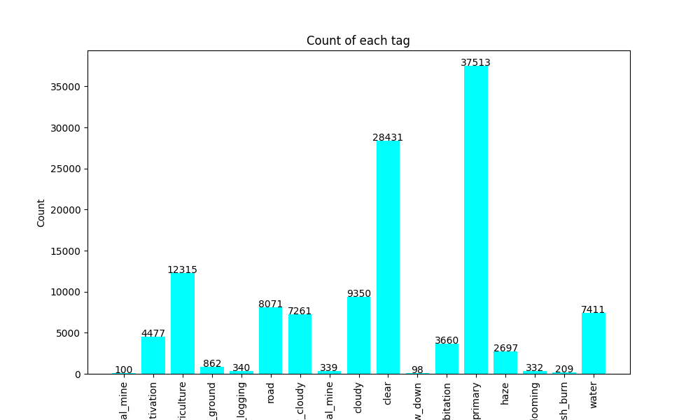
Count of all tags
Saving the model:
In this section, we have used keras’ own model saving format, that is as a .h5 file.
You can also use the following code to save your keras model in a similar way:
Python
model.save('OutputModel.h5')
|
Air Quality Index of India
Pre-requisites
Programming Language: Python
Platform for analysis and model training: Jupiter Notebook
Libraries used: Pandas , Numpy , Seaborn , Matplotlib , Scikit-learn , Joblib
Dataset used
We used the given dataset in this project section so we didn’t need to find anything else.
We used this dataset from kaggle: here to train our model. It contains data from 2017-2022 about AQI(air quality index) of India.
In this section, our main objective was to find out different insights, however we also trained a model additionally.
Steps taken:
- We started with preprocessing the data, we changed the data types to proper ones, and jumped straight into analysis as it was pretty much clean.
- We made multiple visualizations to have a clear picture of the data.
- Then, we rearranged the data and split it in a format so that it is feedable to our model
- We used a Random Forest Regression model for this section of our project. Even though training a model was not our main purpose, we made one for fun purposes and also as just an experiment, and the model also works while giving pretty much satisfactory accuracy.
Visualizations:
Python
import pandas
df=pandas.read_csv("air-quality-india.csv")
df['Timestamp']=pandas.to_datetime(df['Timestamp'])
plt.figure(figsize=(10,6))
sns.lineplot(data=df,x=df.Year,y='PM2.5')
plt.xlabel("Years")
plt.ylabel("Air pollution level")
plt.title("Air pollution per Year")
plt.show()
|
Output:

Air pollution over the years
Python
import pandas
df=pandas.read_csv("air-quality-india.csv")
df['Timestamp']=pandas.to_datetime(df['Timestamp'])
plt.figure(figsize=(10,6))
sns.lineplot(data=df,x=df.Month,y='PM2.5')
plt.xlabel("Months")
plt.ylabel("Air pollution level")
plt.title("Air pollution per Month")
plt.show()
|
Output:
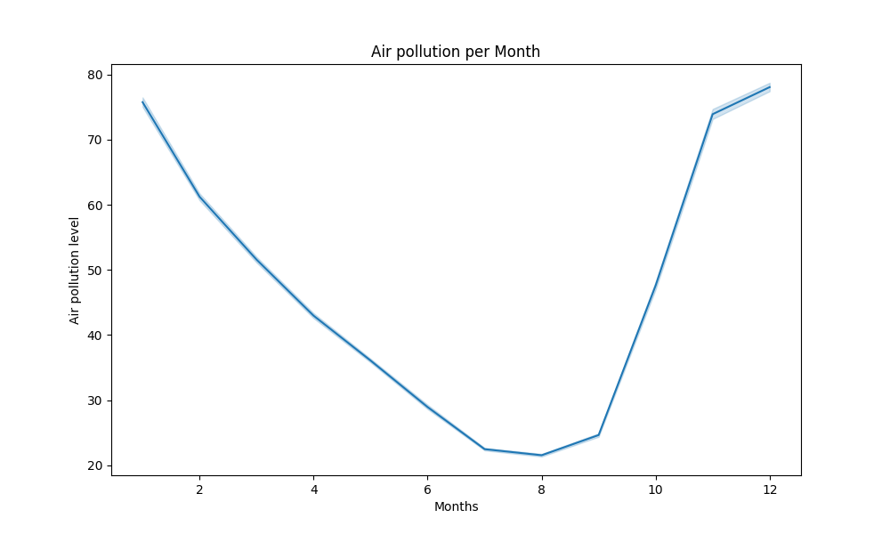
Air Pollution over the year
Python
import pandas
df=pandas.read_csv("air-quality-india.csv")
df['Timestamp']=pandas.to_datetime(df['Timestamp'])
plt.figure(figsize=(10,6))
sns.lineplot(data=df,x=df.Day,y='PM2.5')
plt.xlabel("Day")
plt.ylabel("Air pollution level")
plt.title("Air pollution per day in a month")
plt.show()
|
Output:

Air Pollution Per Day Per Month
Python
import pandas
df=pandas.read_csv("air-quality-india.csv")
df['Timestamp']=pandas.to_datetime(df['Timestamp'])
plt.figure(figsize=(10,6))
sns.lineplot(data=df,x=df.Hour,y='PM2.5')
plt.xlabel("Hour")
plt.ylabel("Air pollution level")
plt.title("Air pollution Per day")
plt.show()
|
Output:

Air Pollution per day
Python
import pandas
df=pandas.read_csv("air-quality-india.csv")
df['Timestamp']=pandas.to_datetime(df['Timestamp'])
plt.figure(figsize=(10,6))
sns.lineplot(data=df,x=df.Timestamp,y='PM2.5')
plt.xlabel("Timestamp")
plt.ylabel("Air pollution level")
plt.title("Air pollution Overall")
plt.show()
|
Output:
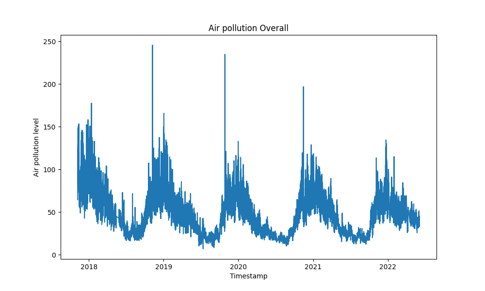
Overall Air Quality Indices
Python
plt.figure(figsize=(12, 6))
plt.plot(numpy.arange(200), Ytest[:200], label='Actual')
plt.plot(numpy.arange(200), predictions[:200], label='Predicted')
plt.title('Actual Values vs. Predictions')
plt.xlabel('Time')
plt.ylabel('Values')
plt.legend()
plt.tight_layout()
plt.show()
|
Output:
-(1).png)
Model Predictions
Note: You may need to change some arguments in the above code to make a similar graph for your project, in case you want to create something exactly similar, you may refer to this.
Model Evaluation and Saving it:
Our model was pretty much satisfactory considering the data size and other factors, we have calculated the MSE, RMSE , MAE , and R – Squared error for model evaluation and the values are as follows:
Mean Squared Error:  21.793092876871878
Root of Mean squared Error:  4.668307281753407
Mean Absolute Error:  2.7221482617304416
R- Squared error:  0.9646128599076852
And for saving it we have used Joblib. even though the file format we used was Pickle, but Joblib was much more efficient than the Pickle module itself. However, due to its extremely large size we used an additional argument called “compress” which allows us to compress our model. Here is a demo code for it:
Python
joblib.dump(model,"airQualityModel.pkl",compress=9)
|
A Short way of explaining everything in this section is:
- We started by Downloading the dataset from Kaggle here.
- Then we loaded our dataset as a data frame by the use of Pandas.
- Basically, the data had multiple columns like Hour, Month, Year, Day, Timestamp/date, and the air quality index.
- We further explored the dataset and found out to be quality data , and it had no missing data points at all!
- We also made multiple visualizations to further deep dive into the data
Demo Screenshots

Demo Input for carbon footprint calculator
.png)
Demo Result for carbon footprint calculator
Results of satellite image classification
Key Findings
From Air Quality Index
- In the year 2020, there was a sudden decrease in the air pollution, and resulted in a good air quality index, most probably this was due to Corona Virus.
- Each year, especially in the month of August, we have good air quality index, this should usually happen due to the phenomenon called “Wet Deposition.”
- Each day, during the time of 5AM, 12AM and 4-5PM, the air quality index shows a sudden great change. This can be because these are considered as the business hours.
- Pollution was at its peak in the year of 2018, it gradually decreased to 2020, and it slightly started to raise by 2021, by which we can predict almost about by this year or maybe the next, it would cross the air pollution of 2017!
From Satellite image classification
Not much insights were found in this, we trained a deep learning model instead.
From Carbon Footprint calculation
- Most of the countries use Oil for their electricity production, which usually exerts about 730g of Carbon per 1KWh, which is a bad news!
- On an average electricity cost is about $0.16 globally.
- Globally, on an average each person emits about 4.61 Tonnes of carbon each year, while the target emissions are less than or equal to 2.5 Tonnes!
- Carbon Dioxide mostly from natural gas is around 1.3 Tonnes per year per person!
How to use our model?
You can simply access our project website here.
After visiting there, you can hover your mouse over the “Project” section to see our project.
.png)
Project section of our website
You can choose any particular project you want to visit and explore:)
All the steps to use are completely user-friendly so it isn’t difficult at all.
Now, if you want to test the models locally in your computer you can follow the upcoming steps.
For Air Quality Index Model
You can download the model directly from here.
Once you install it, please install a few libraries (make sure to have an internet connection), to do so , you may run these following commands in your command prompt:
Python
pip install numpy
pip install joblib
|
Once, you’re done, create a new python file and run this following code:
Python
import numpy
import joblib
yr=2023
hr=16
mnth=9
day=1
inpArray=numpy.array([[hr,day,yr,mnth]])
model=joblib.load("airQualityModel.pkl")
print(model.predict(inpArray))
|
make sure to keep airQualityModel.pkl near your python script, else you can even mention your custom path.
Hope you like our model:)
For Satellite Image Classification
You can download the model from here.
Once you install it, please install a few libraries (make sure to have an internet connection), to do so , you may run these following commands in your command prompt:
Python
pip install tensorflow
pip install numpy
|
Once, you’re done, create a new python file and run this following code:
Python
import numpy
from tensorflow.keras.models import load_model
from tensorflow.keras.preprocessing import image
model=load_model("SuperImpModel.h5")
img = image.load_img("ChangeThisToYourImgPath", target_size=(224,224))
x = image.img_to_array(img)
x = numpy.expand_dims(x, axis=0)
x = x / 255.0
preds = model.predict(x)
print(preds)
|
make sure to keep SuperImpModel.h5 near your python script, else you can even mention your custom directory.
Hope you like our model:)
Query Section
1. What our project basically targets to do?
Our project promotes sustainable environmental development and also features multiple applications such as a carbon footprint calculator, so that people are aware of their own carbon emission contributions, not only does it calculate the carbon emissions it also suggests recommendations on how we can improve ourselves to have a better future!
Our project also has a Satellite image classification model which basically classifies the situation of any satellite image given to it, this will classify the probability of that particular area of having pollution, water, mine etc.
This can be used to identify your locality in a better way.
That’s not all, we also analyzed the air pollution index data from 2017 to 2022 and drew out multiple helpful insights, you can check the overall analysis too! This also has a predictive model to find out upcoming air pollution indices especially in India, the model isn’t available to run on the website, but you can run it locally in your computer (instructions are given near the Jupyter notebook, or you can check the other questions too)
2. How can you access our project?
You are already in the correct place; you can view this overall repository to find out our work.
3.How can you run the Air Pollution Index model?
Due to GitHub restrictions, we can’t upload this file here as its quite large, but you can check the python notebook used to make it in the AirQuality folder.
4.Which libraries and language are we using?
We are using python as a language for the overall logic, and we are also using JavaScript in web development. For non-programming languages we are using HTML and CSS for web development. When it comes to libraries, we are using matplotlib and seaborn because of their wonderful capabilities of creating visualizations, we are also using pandas and NumPy for data management, TensorFlow Keras for deep learning and Scikit-Learn for machine learning.
5.How is the backend working?
For the backend and server hosting we are using free tier of python anywhere. As a framework we are working with Django.
6.What is our project for?
Our project is solely made for sustainable environment development, we are creating it on the occasion of a wonderful hackathon organized by Geeksforgeeks which is called EcoTech, but besides for the hackathon we are also going to maintain this site after, and further developmental plans would be there for this website.
7.What are the future plans for this website?
We are going to maintain our website even after this hackathon ends, we already have plans like tourism recommendation system, social media updates on ecology, and many more! the updates would be coming soon be ready!
8.How did we come up with this idea?
We were really concerned about our environment, moreover due to the beautiful theme of the hackathon organized by GeeksForGeeks, we thought and found out the actual reasons for environmental degradation. Some Key factors are deforestation, and carbon emissions. Our project exactly aims to spread awareness on that issue.
Conclusion
In conclusion, the sustainable development of our ecosystem is not just a vision; it’s a tangible reality that we are actively shaping through innovation and collective efforts. Our website, equipped with features like Satellite Image Classification, Carbon Footprint Calculator, and Air Quality Index Analysis, is a testament to our commitment to this cause. As we navigate the intricate web of data and technology, we discover the means to harmonize our existence with nature.
While our world is unmistakably progressing towards sustainability, the urgency of our situation cannot be overstated. Climate change and ecological degradation continue to challenge our planet. We must act swiftly, collectively, and decisively to preserve the delicate balance of our environment. Our mission is to not only provide tools for understanding and mitigating environmental impact but also to inspire action.
By embracing sustainable choices and advocating for change, we can accelerate this global transformation. Together, we have the power to safeguard our planet for generations to come. Let’s work tirelessly, innovate relentlessly, and inspire one another to move swiftly towards a more sustainable future. Our planet’s well-being depends on it.
Data sources
We are thankful to all the data sources through which we have accessed the datasets, here are the sources:
- Major Electricity Source of each country
- Electricity Prices over the world
- CO2 Emissions
- Amazon Satellite Images Data
- Air Quality Data of India
Acknowledgments
We would like to express our sincere gratitude to GeeksforGeeks for organizing the hackathon that inspired this website. The hackathon was a well-organized and challenging event that provided us with the opportunity to learn new skills, collaborate with talented individuals, and develop this website.
We would also like to thank the following people for their support and guidance throughout the development of this website:
Without your help and support, this website would not have been possible. Thank you!
We would like to give special thanks to GeeksforGeeks for organizing the hackathon that inspired our website. GeeksforGeeks is a leading online platform for learning computer science and programming. It offers a wide range of resources, including tutorials, articles, practice problems, and more. We are grateful for the opportunity to have participated in the hackathon and to have learned so much from the experience.
Thank you for reading this article:)
Share your thoughts in the comments
Please Login to comment...