Draw Scatter Plot with two Nominal Variables with Plotly Package in R
Last Updated :
12 Jun, 2023
A scatter plot is a visual representation of the relationship between two variables. It is commonly used to identify patterns and trends in data. In this article, we will learn how to create a scatter plot with two nominal variables using the Plotly package in R Programming Language.
- Nominal variables: Nominal variables are categorical variables that do not have a natural order or ranking. For example, hair color (brown, black, blonde) and eye color (brown, blue, green) are nominal variables.
- Continuous variables: Continuous variables are numerical values that can take any value within a certain range, as opposed to discrete variables that can only take specific, separated values. Examples of continuous variables include height, weight, and temperature.
Plotly: Plotly is a data visualization library that allows you to create interactive charts and graphs in R.
Steps Needed to Create a Scatter Plot
To create a scatter plot with two nominal variables using Plotly in R, follow these steps. The first step is to install the Plotly package and after installing the Plotly package, you need to load it.
R
install.packages("plotly")
library(plotly)
|
Use the plot_ly() function to create the scatter plot. Specify the x and y variables, and set the type option to “scatter”. You can also use the mode option to control the appearance of the points. For example, to create a scatter plot with x on the x-axis and y on the y-axis.
Syntax:
plot_ly(x, y, type, mode, size, color)
Where,
- x – ~carat, – this sets the variable “carat” to be plotted on the x-axis. The tilde (~) is used to indicate that the variable is unquoted and should be evaluated as a variable.
- y – ~price, – this sets the variable “price” to be plotted on the y-axis.
- type – “scatter”, – this sets the type of chart to be a scatter plot.
- mode – “markers”, – this sets the mode of the chart to “markers,” which means that individual data points will be represented by markers (e.g., circles, squares, etc.).
- size – this sets the size of the markers
- color – ~cut – this sets the variable “cut” to be used for coloring the markers.
Customize the appearance of the plot by adding additional options. For example, you can use the layout() function to add a title and axis labels.
R
layout(title = "Scatter Plot", xaxis = list(title = "X-axis Label"),
yaxis = list(title = "Y-axis Label"))
|
Scatter Plot with Nominal Variables
We will use the mtcars dataset and create a scatter plot with cyl on the x-axis and gear on the y-axis. We will use the type = “scatter” option to create a scatter plot, and the mode = “markers + lines” option to add lines connecting the points. This will create a scatter plot with cyl on the x-axis and gear on the y-axis. The points will be connected by lines.
R
library(plotly)
data <- mtcars
plot <- plot_ly(mtcars, x = ~cyl, y = ~gear,
type = "scatter",
mode = "markers+lines")
plot <- plot %>%
layout(title = "Scatter Plot with Nominal Variables",
xaxis = list(title = "Cylinders"),
yaxis = list(title = "Gears"))
plot
|
Output:

Scatter Plot with Nominal Variables
Scatter Plot with Nominal Variables
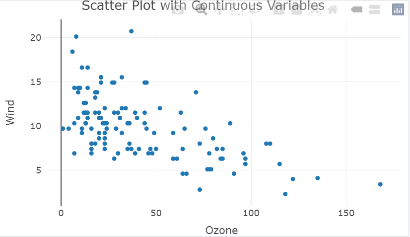
We’ll use the airquality dataset, which contains information about the air quality in New York City. We’ll create a scatter plot with the Ozone variable on the x-axis and the Wind variable on the y-axis. This will create a scatter plot with Ozone on the x-axis and Wind on the y-axis.
R
library(plotly)
data <- airquality
plot <- plot_ly(airquality, x = ~Ozone,
y = ~Wind, type = "scatter",
mode = "markers")
plot <- plot %>%
layout(title = "Scatter Plot with Continuous Variables",
xaxis = list(title = "Ozone"),
yaxis = list(title = "Wind"))
plot
|
Output:
Scatter Plot with Nominal Variables
Now let’s draw one more scatter plot using the diamonds dataset. In this dataset, we will draw a scatter plot of carat vs price by cut.
R
library(plotly)
data <- diamonds[sample(nrow(diamonds), 100),]
plot <- plot_ly(data, x = ~carat,
y = ~price, type = "scatter",
mode = "markers", size = 10,
color = ~cut) %>%
layout(xaxis = list(title = "Carat"),
yaxis = list(title = "Price"),
title = "Scatter plot of Carat vs Price by Cut")
plot
|
Output:

Scatter Plot of Carat vs Price by Cut
Share your thoughts in the comments
Please Login to comment...