How to do 3D line plots grouped by two factors with the Plotly package in R?
Last Updated :
13 Jun, 2023
Users can construct dynamic and visually appealing charts with Plotly, a strong and adaptable data visualization library. We will be able to produce 3D line plots with Plotly that can be used to evaluate complex data and effectively convey findings. In this article, we will explore the process of creating 3D line plots that are grouped by two factors using the Plotly package in R.
Required Packages
In order to complete this task, we will require the Plotly package. This package can be easily installed by using the “install.packages” function in R. In addition, we will also need to have some data that we wish to visualize in a 3D line plot.
Load the Plotly library into R
library(plotly)
Syntax of plot_ly() function
Once the Plotly package and data have been loaded into R, we can use the plot_ly function to create a basic 3D line plot. The syntax for this function is as follows:
Syntax: plot_ly(data, x = ~x, y = ~y, z = ~z, type = “scatter3d”, mode = “lines”)
Parameters:
- data: The data frame containing the data to be plotted.
- x: The variable to use for the x-axis. This is specified using a tilde (~) followed by the variable name.
- y: The variable to use for the y-axis.
- z: The variable to use for the z-axis.
- type: The type of plot to create. In this case, we are creating a scatter plot, so the value should be set to “scatter”.
- mode: The mode of the plot. In this case, we are creating a line plot, so the value should be set to “lines”.
3D line plots grouped by two factors
Let’s demonstrate the creation of a 3D line plot grouped by two factors using the Plotly package in R. We will be using the mtcars dataset as an example, which is a built-in dataset in R that contains information on various car models and their specifications. Load the mtcars dataset into R
data("mtcars")
Plotting mtcars Data
In the below code, we used the plot_ly function to create a basic 3D line plot. The x argument specifies the variable to use for the x-axis, wt (weight of the car), the y argument specifies the variable to use for the y-axis, mpg (miles per gallon), and the z argument specifies the variable to use for the z-axis, qsec (quarter mile time). The type argument is set to “scatter” and the mode argument is set to “lines”.
R
p <- plot_ly(mtcars, x = ~wt, y = ~mpg, z = ~qsec,
type = "scatter3d", mode = "lines")
ggplotly(p)
|
Output:
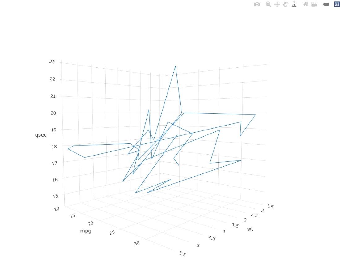
3D line plots
Plotting Cylinder Data
Here, we added the color argument to the plot_ly function to group the data by the number of cylinders in each car model, represented by the cyl variable. The color argument is set to ~cyl, which uses the cyl variable to color the data points in the plot.
R
q <- plot_ly(mtcars, x = ~wt, y = ~mpg,
z = ~qsec, color = ~cyl,
type = "scatter3d", mode = "lines")
ggplotly(q)
|

3D line plots
Plotting Transmission Data
Here, we modified the color argument in the plot_ly function to group the data by the transmission type of each car model, represented by the am variable. The color argument is set to ~am, which uses the am variable to color the data points in the plot.
R
r <- plot_ly(mtcars, x = ~wt, y = ~mpg,
z = ~qsec, color = ~am,
type = "scatter3d", mode = "lines")
ggplotly(r)
|

3D lines plots
Grouping All Data in One Plotting Canvas
We combined the two previous plots by using the + operator in the color argument to group the data by both the number of cylinders and the transmission type. The color argument is set to ~cyl + am, which uses both the cyl and am variables to color the data points in the plot.
R
s <- plot_ly(mtcars, x = ~wt, y = ~mpg,
z = ~qsec, color = ~cyl + am,
type = "scatter3d", mode = "lines")
ggplotly(s)
|
Output:

3D lines plots
Adding a Legend
In this final step, we used the `layout` function to add a legend to the plot. The `legend` argument is set to `list(x = 0.85, y = 0.95)`, which specifies the x and y coordinates of the legend in the plot. The x and y axes and the quarter mile time axis are also labeled with titles using the `xaxis`, `yaxis`, and `zaxis` arguments, respectively.
R
t <- plot_ly(mtcars, x = ~wt, y = ~mpg,
z = ~qsec, color = ~cyl + am,
type = "scatter3d",
mode = "lines") %>% layout(scene =
list(xaxis = list(title = "Weight"),
yaxis = list(title = "Miles per Gallon"),
zaxis = list(title = "Quarter Mile Time"),
legend = list(x = 0.85, y = 0.95)))
ggplotly(t)
|
Output:

3D lines plots
With these simple steps, we have created a 3D line plot grouped by two factors in R using the Plotly package. The final plot provides us with a clear visual representation of the relationship between the weight, miles per gallon, and a quarter-mile time of different car models, grouped by their number of cylinders and transmission type.
Like Article
Suggest improvement
Share your thoughts in the comments
Please Login to comment...