Scatter Slot using Plotly in R
Last Updated :
27 Sep, 2023
In order to examine the relationship between two variables in data analysis, scatter plots are a fundamental visualisation tool. When we wish to visualize the distribution of data points and search for patterns, trends, or outliers, they are extremely helpful. With the help of the potent R package Plotly, we can make interactive scatter plots that look good. This post will offer a thorough tutorial on producing scatter plots in R using Plotly.
Scatter Plots
The values for two different numerical variables are represented by dots in a scatter plot (also known as a scatter chart or scatter graph). Each dot’s location on the horizontal and vertical axes represents a data point’s values. To view relationships between variables, utilise scatter plots.
Uses of Scatter Plots
- The main purposes of scatter plots are to examine and display correlations between two numerical variables. When the data are viewed as a whole, the patterns shown by the dots in a scatter plot are in addition to the values of the individual data points. With scatter plots, correlational correlations are frequently identified.
- A scatter plot might be helpful for spotting further data trends. Based on how tightly sets of data points cluster together, we can categorise the data points into groups. Additionally, scatter plots can reveal any unexpected gaps in the data as well as any outlier spots. This can be helpful if we wish to divide the data up into distinct categories, such as when creating user personas.
Plotly Package
The plotly package in R is a powerful and versatile library for creating interactive and visually appealing data visualizations. It is built on top of the JavaScript library Plotly.js, which allows you to create interactive web-based charts and plots. plotly in R enables you to create a wide range of plots, including scatter plots, line charts, bar plots, heatmaps, and more, with the added advantage of interactivity.
Pre-Requisites
Before moving forward make sure you have plotly package installed.
install.packages("plotly")
Scatter Plots in R using Plotly
Loading the package
Create Basic Scatter Plot
R
x <- c(1, 2, 3, 4, 5)
y <- c(2, 3, 5, 4, 7)
plot_ly(x = x, y = y, type = 'scatter', mode = 'markers')
|
Output:

scatter plot using plotly in R
Customizing Scatter Plots
R
plot_ly(x = x, y = y, type = 'scatter', mode = 'markers') %>%
layout(
xaxis = list(title = 'X-axis'),
yaxis = list(title = 'Y-axis'),
title = 'Customized Scatter Plot'
)
|
Output:

Customized Scatter Plot
- Plotly plots are created using the plot_ly function.
- The inputs x = x and y = y define the data that will be plotted on the x-axis and y-axis, respectively. We can reference variables in the data frame by using the symbol.
- type =’scatter’ indicates that we want to produce a scatter plot.
- mode =’markers’: This show the plot to represent data points as markers.
Changing Marker Color and Size
R
plot_ly(x = x, y = y, type = 'scatter', mode = 'markers',
marker = list(color = 'red', size = 10))
|
Output:
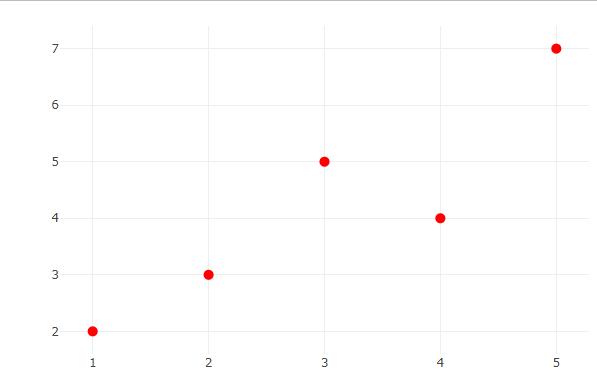
scatter plot using plotly in R
Adding Regression Line
R
plot_ly(x = x, y = y, type = 'scatter', mode = 'markers') %>%
add_trace(
x = x,
y = lm(y ~ x)$fitted.values,
mode = 'lines',
line = list(color = 'blue'),
name = 'Regression Line'
)
|
Output:
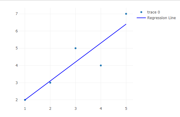
Adding Regression Line
- Add a new trace or layer to the current plot using the add_trace method.
- x = x: The regression line’s x-values match those of the initial data points.
- y = fitted by lm(y x).lm(y x) is used to fit a linear regression model to the data in this case, and it is then is used to get the regression model’s predicted values. The regression line’s y-values are produced in this way.
- mode = ‘lines’: This will show the system to represent the inserted trace as a line.
- line = list(color = ‘blue’): This causes the regression line’s colour to be changed to blue.
Multiple Scatter Plots
R
x1 <- c(1, 2, 3, 4, 5)
y1 <- c(2, 3, 5, 4, 7)
x2 <- c(1, 2, 3, 4, 5)
y2 <- c(3, 4, 2, 6, 5)
plot_ly(x = x1, y = y1, type = 'scatter', mode = 'markers', name = 'Dataset 1')%>%
add_trace(x = x2, y = y2, type = 'scatter', mode = 'markers', name = 'Dataset 2')
|
Output:

Multiple Scatter Plots
- plot_ly(x=x1, y=y1, type=’scatter’, mode=’markers’, name=’Dataset 1′): The first scatter plot (Dataset 1) is started with this line. It is configured to a scatter plot with markers and instructs the user to plot x1 on the x-axis and y1 on the y-axis. For use in the legend, the name attribute is set to “Dataset 1”.
- add_trace(type = “scatter,” mode = “markers,” name = “Dataset 2”): This line expands the plot by include a second scatter plot (Dataset 2). It is configured to a scatter plot with markers and instructs the user to plot x2 on the x-axis and y2 on the y-axis. For use in the legend, the name attribute is set to “Dataset 2”.
3D Scatter Plot
R
x <- c(1, 2, 3, 4, 5)
y <- c(2, 3, 5, 4, 7)
z <- c(10, 8, 12, 9, 15)
categories <- c("A", "B", "A", "C", "B")
category_colors <- c("red", "blue", "green")
plot_ly(x = x, y = y, z = z, type = 'scatter3d', mode = 'markers',
marker = list(color = factor(categories, levels = unique(categories),
labels = category_colors)))
|
Output:

3D scatter plot
- plot_ly(x = x, y = y, z = z, type =’scatter3d’, mode =’markers’,…)
- Using Plotly, this line creates a 3D scatter plot from scratch.
- The data points’ coordinates in 3D space are specified by the expressions x = x, y = y, and z = z.
- To construct a 3D scatter plot, use the type =’scatter3d’ specification.
- Data points should be shown as markers, according to the mode =’markers’ setting.
- label = category_colors, colour = factor(categories), levels = unique(categories), and marker = list
- The data points are given colours based on the categories they fall under using this section of the code.
- Each category is assigned a particular colour from the category_colors vector in the factor variable created by factor(categories, levels = unique(categories), labels = category_colors).
Conclusion
This article thoroughly examines how to create interactive scatter plots in R using the Plotly package. Scatter plots are essential for finding data trends and visualising correlations between variables. Plotly, which is based on the Plotly.js framework, enables R users to construct engaging data visualisations. The course goes over crucial aspects of scatter plot building, customization, and interaction to improve data understanding. For data professionals, learning how to make dynamic scatter plots with Plotly is an important skill that will help with effective data analysis and communication.
Share your thoughts in the comments
Please Login to comment...