Draw ggplot2 plot with two Y-axes on each side and different scales in R
Last Updated :
24 Jun, 2021
There are many data available that have more than one unit like Temperature, Pressure, Height of a person, etc. We want to represent these data using more than one unit in a basic plot because other users may not be familiarized with the unit you have provided in the plot. It becomes difficult for them to analyze from the plot. In such a case, we need two axes having different scales on both. Therefore, dual axes can be used if there is scaling between both axes. This is known as a scaling factor.
For example, One y-axis can have distance in miles and another ax can have distance in kilometer because there might be a few people who are not comfortable with measuring distances using miles.
In this article, we are going to see how to add two vertical axes on either side having different scales using the ggplot2 bar plot in R Programming Language using a suitable example.
Installation
First, you need to install the ggplot2 package if it is not previously installed in R Studio. To install and load write the below command in R Console :
install.packages("ggplot2")
library(ggplot2)
Creating Bar Plot
For creating a simple bar plot we will use the function geom_bar( ).
Syntax: geom_bar(stat, fill, color, width)
Parameters :
- stat : Set the stat parameter to identify the mode.
- fill : Represents color inside the bars.
- color : Represents color of outlines of the bars.
- width : Represents width of the bars.
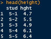
Example: Consider a dataset that consists of information about the heights of five different students in a class. The height given in the data set is in feet. So, we need two Y-axes to represent the heights using the units “feet” and “centimeters.”
First, we create a Data Frame which has two vectors “stud” containing students ID and “height” containing students height in feet and store it in a variable “height”.
R
height <- data.frame(stud=c("S-1","S-2","S-3",
"S-4","S-5"),
hght=c(4.7, 5.5, 4.9, 6.1,
6.4))
head(height)
|
Output:
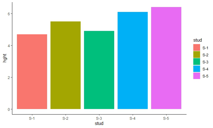
Bar Plot
R
library(ggplot2)
plt <-ggplot(data=height, aes(x=stud, y=hght,fill=stud)) +
geom_bar(stat="identity")+
theme_classic()
plt
|
Output:
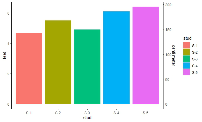
Adding Two Y-axes on either side
As scaling comes into the picture we have to use the R function scale_y_continuous( ) which comes in ggplot2 package. Also, another function sec_axis( ) is used to add a secondary axis and assign the specifications to it. The syntax is :
sec_axis(trans,name,breaks,labels,guide)
Parameters which we need :
trans : A formula or function needed to transform.
name : The name of the secondary axis.
Now, to transform the feet scale into centimeter-scale we need the scaling factor. To convert use :
1 feet = 30.48 cm
Now, in the trans argument inside the sec_axis( ) use the above scaling factor value and write the formula of conversion as shown below :
R
plt+scale_y_continuous(
"feet",sec.axis=sec_axis(~.*30.48,name="centi meter"))
|
Output:
Share your thoughts in the comments
Please Login to comment...