Axes and Scales in Lattice Plots in R
Last Updated :
25 Sep, 2023
In R Programming Language, lattice graphics are a powerful method for displaying data. They offer a versatile and dependable framework for making many other types of plots, such as scatterplots, bar charts, and more. Understanding how to adjust and modify the axes and scales is a crucial component in producing successful lattice graphs. We will examine the principles of axes and scaling in lattice plots in R in this post to assist us in producing educational and aesthetically pleasing visualizations.
What are Lattice Plots
Lattice plots are a type of trellis plot, introduced by William S. Cleveland, that extend the concept of conditioning in statistical graphics. They allow us to create multiple related plots in a single panel, making it easier to compare and visualize data across different groups or subsets.
To create lattice plots in R, we can use the lattice package. The basic idea is to define a formula for the plot, specifying the variables to be plotted on the x and y axes, as well as any conditioning variables.
Customizing Axes and Scales
Customizing axes and scales is crucial for making our lattice plots informative and visually appealing. Here are some essential concepts and techniques:
Changing Axis Labels
R
library(lattice)
xyplot(mpg ~ wt, data = mtcars,
xlab = "Car Weight (in 1000 lbs)", ylab = "Miles per Gallon")
|
Output:
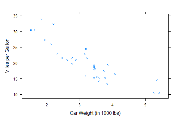
Axes and scales in lattice plots in R
Modifying Axis Limits
R
library(lattice)
data(mtcars)
xyplot(mpg ~ hp | factor(cyl), data = mtcars,
scales = list(x = list(labels = c("Low", "Medium", "High")),
y = list(labels = c("Low", "Medium", "High"))))
|
Output:
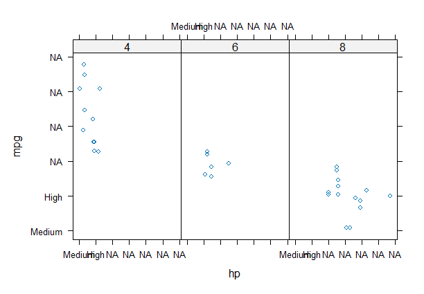
Axes and scales in lattice plots in R
We can customize the axes by specifying the scales argument within lattice functions. The scales argument allows you to control various aspects of the axes, such as labels, ticks, and limits.
Adding Tick Marks and Grid Lines
R
xyplot(mpg ~ wt, data = mtcars, scales = list(tick.number = 5, alternating = 2))
|
Output:
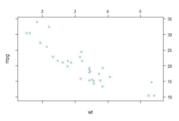
Axes and scales in lattice plots in R
Adding a Background Color
R
library(lattice)
my_plot <- xyplot(mpg ~ wt, data = mtcars,
scales = list(x = list(log = 10), y = list(log = "e")),
xlab = list(label = "Custom X-Axis Label", cex = 1.2),
ylab = list(label = "Custom Y-Axis Label", cex = 1.2),
main = "Scatterplot of MPG vs. Weight",
sub = "Data from mtcars dataset",
par.settings = list(axis.line = list(col = "blue", lwd = 2, lty = 2),
superpose.line = list(col = "red", lwd = 2),
layout.widths = list(main.right = 0.8)))
my_plot$par.strip.text$cex <- 1.2
my_plot$par.axis.text$cex <- 1.2
my_plot$par.xlab.text$rot <- 45
my_plot$par.settings$grid.pars$col <- "gray"
my_palette <- rainbow(10)
my_plot$par.settings$superpose.symbol$pch <- 20
my_plot$par.settings$superpose.symbol$col <- my_palette
print(my_plot)
|
Output:
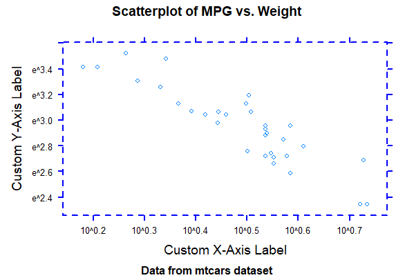
Axes and scales in lattice plots in R
- We create a scatterplot (xyplot) of the mpg (miles per gallon) variable against the wt (weight) variable from the mtcars dataset.
- The scales argument is used to customize the scales. We set the x-axis to a base 10 logarithmic scale and the y-axis to a natural logarithmic scale.
- We customize the x-axis and y-axis labels (xlab and ylab) with larger font size (cex parameter).
- The main argument specifies the main title of the plot, and sub provides a subtitle.
- The par.settings argument is used to customize various plot settings, including axis line color and style.
- We customize the size of strip text (used for labeling different groups) and axis text to make them larger (cex parameter).
- We rotate the x-axis labels by 45 degrees to improve readability.
- We change the color of grid lines to gray.
- We create a custom color palette using the rainbow function.
- We set the point character (pch) to 20 (a solid circle) and apply the custom color palette to the points in the plot.
Conclusion
Customizing axes and scales in lattice plots is essential for creating clear and meaningful visualizations. Whether we need to change labels, modify axis limits, or use different scales, the lattice package provides a flexible and powerful framework for tailoring our plots to your specific needs. Experiment with these customization options to enhance the effectiveness of our lattice plots and convey your data’s story more effectively.
Share your thoughts in the comments
Please Login to comment...