Design a Interactive 360-degree Product Viewer using HTML CSS and JavaScript
Last Updated :
29 Dec, 2023
Creating an interactive 360-degree product viewer with an attractive user interface using HTML, CSS, and JavaScript is a simple, interactive resource that can be used to provide a virtual tour of your product. In this article, we will create an Interactive 360-degree Product Viewer using HTML, CSS, and JavaScript.
Approach
- Create an HTML structure for your product viewer with an image section and two buttons.
- Now style the viewer container and buttons using the CSS. Set dimensions, colors, and positioning according to your design preferences.
- Use JavaScript to handle the interactivity by writing functions differently for the previous and next buttons.
- Make an update function such that it rotates an HTML element with the id ‘productImage’ around the Y-axis.
- Test your interactive 360-degree product viewer in different browsers and devices to ensure it works as expected.
Example: In this example, we will see the design of a product viewer with a 360-degree viewer.
HTML
<!DOCTYPE html>
<html lang="en">
<head>
<meta charset="UTF-8">
<meta name="viewport"
content="width=device-width, initial-scale=1.0">
<link rel="stylesheet"
href="style.css">
<script src="script.js" defer></script>
<title>The 360° Product Viewer</title>
</head>
<body>
<div class="product-viewer">
<div class="viewer-container">
<img src="/image/car.png"
class="product-image"
id="productImage"
alt="Product Image">
</div>
<div class="controls">
<button id="prevBtn" class="control-button">
Previous
</button>
<button id="nextBtn" class="control-button">
Next
</button>
</div>
</div>
</body>
</html>
|
CSS
body {
display: flex;
justify-content: center;
align-items: center;
height: 100vh;
margin: 0;
}
.product-viewer {
display: flex;
flex-direction: column;
align-items: center;
width: 400px;
}
.viewer-container {
position: relative;
width: 100%;
overflow: hidden;
box-shadow: 0 0 10px rgba(0, 0, 0, 0.2);
}
.product-image {
width: 100%;
transition: transform 0.5s;
}
.controls {
display: flex;
justify-content: space-between;
width: 100%;
margin-top: 10px;
}
.control-button {
padding: 10px 20px;
background-color: #000000;
color: #fff;
border: none;
cursor: pointer;
border-radius: 5px;
transition: background-color 0.3s;
}
.control-button:hover {
background-color: #0000FF;
}
|
Javascript
const productImage =
document.getElementById('productImage');
const nextBtn =
document.getElementById('nextBtn');
const prevBtn =
document.getElementById('prevBtn');
const topBtn =
document.getElementById('topBtn');
const bottomBtn =
document.getElementById('bottomBtn');
let currentFrame = 1;
const totalFrames = 36;
nextBtn.addEventListener('click', () => {
if (currentFrame < totalFrames) {
currentFrame++;
update();
}
});
prevBtn.addEventListener('click', () => {
if (currentFrame > 1) {
currentFrame--;
update();
}
});
function update() {
const rotation = (currentFrame - 1) * (360 / totalFrames);
productImage.style.transform = `rotateY(${rotation}deg)`;
}
|
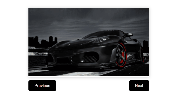
Output:
Share your thoughts in the comments
Please Login to comment...