How to Create a Focus Style for Interactive Elements in CSS ?
Last Updated :
26 Mar, 2024
In web development, ensuring that interactive elements have a clear focus state is crucial for accessibility and usability. When users navigate a webpage using keyboard controls, they rely on visual cues to understand which element they are currently interacting with.
Using focus
The outline approach adds an outline around the focused element without affecting the layout of the page using the sudo class focus.
Syntax:
:focus {
  outline: 2px solid #308D46;
}
Example 1: Using the CSS `:focus` pseudo-class, this example adds a green outline to the input element when it is focused, providing visual feedback to users.
HTML
<!DOCTYPE html>
<html lang="en">

<head>
    <meta charset="UTF-8">
    <meta name="viewport"
          content="width=device-width, initial-scale=1.0">
    <title>Outline Approach Example</title>
    <style>
        input:focus {
            outline: 2px solid #308D46;
        }
    </style>
</head>

<body>
    <input type="text" placeholder="Enter your name">
</body>

</html>
Output:

Example 2: Utilizing the CSS `:focus` pseudo-class, this example applies a green box shadow to the button element when it is focused, enhancing its visual appearance and providing interactive feedback to users.
HTML
<!DOCTYPE html>
<html lang="en">

<head>
    <meta charset="UTF-8">
    <meta name="viewport"
          content="width=device-width, initial-scale=1.0">
    <title>Box-Shadow Approach Example</title>
    <style>
        button:focus {
            box-shadow: 0 0 5px 2px #308D46;
        }
    </style>
</head>

<body>
    <button>Click me</button>
</body>

</html>
Output:

Example 3: In this example, the `:focus` pseudo-class in CSS is employed to add a green border around the hyperlink when it receives focus, offering a visual indication of interactivity to users.
HTML
<!DOCTYPE html>
<html lang="en">

<head>
    <meta charset="UTF-8">
    <meta name="viewport"
          content="width=device-width, initial-scale=1.0">
    <title>Border Approach Example</title>
    <style>
        a:focus {
            border: 2px solid #308D46;
        }
    </style>
</head>

<body>
    <a href="#">Link</a>
</body>

</html>
Output:

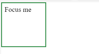
Example 4: To demonstrate using the `:focus` pseudo-class along with the `::after` pseudo-element in CSS is utilized to create a green border around the div when it receives focus, providing a visual cue for user interaction.
HTML
<!DOCTYPE html>
<html lang="en">

<head>
    <meta charset="UTF-8">
    <meta name="viewport" content="width=device-width, initial-scale=1.0">
    <title>Pseudo-Elements Approach Example</title>
    <style>
        div:focus::after {
            content: '';
            position: absolute;
            top: 0;
            left: 0;
            width: 100px;
            height: 100px;
            border: 2px solid #308D46;
        }
    </style>
</head>

<body>
    <div tabindex="0">Focus me</div>
</body>

</html>
Output:
Share your thoughts in the comments
Please Login to comment...