3D Scatter Plot using graph_objects Class in Plotly-Python
Last Updated :
10 Jul, 2020
Plotly is a Python library that is used to design graphs, especially interactive graphs. It can plot various graphs and charts like histogram, barplot, boxplot, spreadplot, and many more. It is mainly used in data analysis as well as financial analysis. plotly is an interactive visualization library.
Scatter plot using graph_objects class
If a plotly express does not provide a good starting point, then it is possible to use go.Scatter3D class from plotly.graph_objects. Scatter plot are those charts in which data points are represented horizontally and on the vertical axis to show how one variable affect on another variable. The mode of the property decides the appearance of data points.
Syntax: plotly.graph_objects.Scatter3d(arg=None, connectgaps=None, customdata=None, customdatasrc=None, error_x=None, error_y=None, error_z=None, hoverinfo=None, hoverinfosrc=None, hoverlabel=None, hovertemplate=None, hovertemplatesrc=None, hovertext=None, hovertextsrc=None, ids=None, idssrc=None, legendgroup=None, line=None, marker=None, meta=None, metasrc=None, mode=None, name=None, opacity=None, projection=None, scene=None, showlegend=None, stream=None, surfaceaxis=None, surfacecolor=None, text=None, textfont=None, textposition=None, textpositionsrc=None, textsrc=None, texttemplate=None, texttemplatesrc=None, uid=None, uirevision=None, visible=None, x=None, xcalendar=None, xsrc=None, y=None, ycalendar=None, ysrc=None, z=None, zcalendar=None, zsrc=None, **kwargs)
Parameters:
x – Sets the x coordinates.
y – Sets the y coordinates.
z – Sets the z coordinates.
mode – Determines the drawing mode for this scatter trace.
Example 1:
Python3
import plotly.express as px
import plotly.graph_objects as go
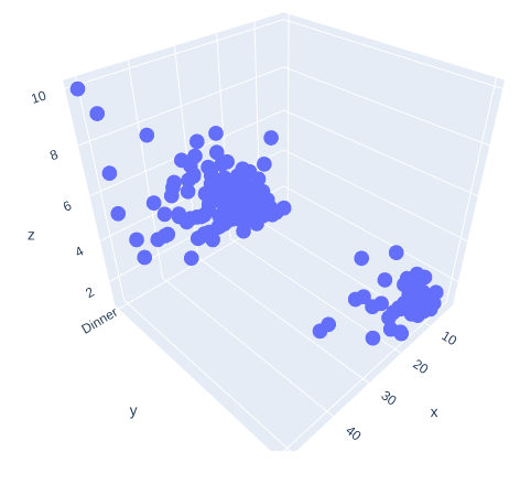
df = px.data.tips()
fig = go.Figure(data =[go.Scatter3d(x = df['total_bill'],
y = df['time'],
z = df['tip'],
mode ='markers')])
fig.show()
|
Output:
Example 2:
Python3
import plotly.express as px
import plotly.graph_objects as go
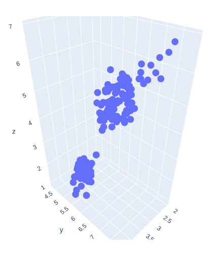
df = px.data.iris()
fig = go.Figure(data =[go.Scatter3d(x = df['sepal_width'],
y = df['sepal_length'],
z = df['petal_length'],
mode ='markers')])
fig.show()
|
Output:
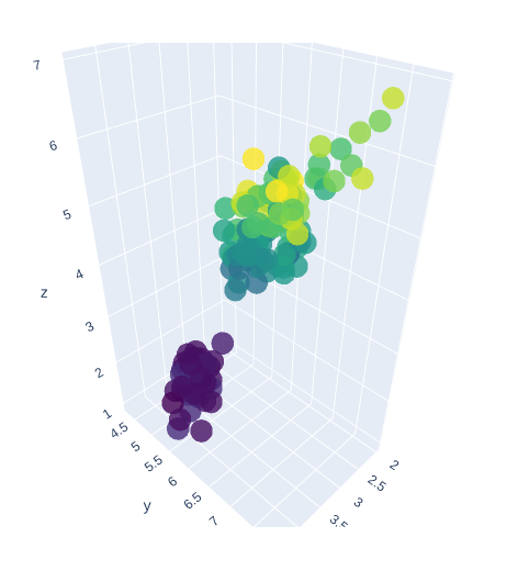
Presenting 3D Scatter Plot with Color scaling and Marker Styling
In plotly, color scaling and marker styling are a way to represent the data more effectively, and it makes data more understandable.
Example 1:
Python3
import plotly.express as px
import plotly.graph_objects as go
df = px.data.iris()
fig = go.Figure(data =[go.Scatter3d(x = df['sepal_width'],
y = df['sepal_length'],
z = df['petal_length'],
mode ='markers',
marker = dict(
size = 12,
color = df['petal_width'],
colorscale ='Viridis',
opacity = 0.8
)
)])
fig.show()
|
Output:
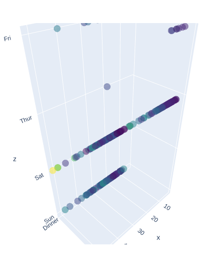
Example 2:
Python3
import plotly.express as px
import plotly.graph_objects as go
df = px.data.tips()
fig = go.Figure(data =[go.Scatter3d(x = df['total_bill'],
y = df['time'],
z = df['day'],
mode ='markers',
marker = dict(
color = df['tip'],
colorscale ='Viridis',
opacity = 0.5
)
)])
fig.show()
|
Output:
Like Article
Suggest improvement
Share your thoughts in the comments
Please Login to comment...