3D scatter plot using Plotly in Python
Last Updated :
10 Jul, 2020
Plotly is a Python library that is used to design graphs, especially interactive graphs. It can plot various graphs and charts like histogram, barplot, boxplot, spreadplot, and many more. It is mainly used in data analysis as well as financial analysis. plotly is an interactive visualization library.
3D Scatter plot in Plotly
A scatterplot can be used with several semantic groupings which can help to understand well in a graph. They can plot two-dimensional graphics that can be enhanced by mapping up to three additional variables while using the semantics of hue, size, and style parameters. All the parameter control visual semantic which are used to identify the different subsets. Using redundant semantics can be helpful for making graphics more accessible. It can be created using the scatter_3d function of plotly.express class.
Syntax: plotly.express.scatter_3d(data_frame=None, x=None, y=None, z=None, color=None, symbol=None, size=None, text=None, hover_name=None, hover_data=None, custom_data=None, error_x=None, error_x_minus=None, error_y=None, error_y_minus=None, error_z=None, error_z_minus=None, animation_frame=None, animation_group=None, category_orders={}, labels={}, size_max=None, color_discrete_sequence=None, color_discrete_map={}, color_continuous_scale=None, range_color=None, color_continuous_midpoint=None, symbol_sequence=None, symbol_map={}, opacity=None, log_x=False, log_y=False, log_z=False, range_x=None, range_y=None, range_z=None, title=None, template=None, width=None, height=None)
Parameters:
data_frame (DataFrame or array-like or dict) – This argument needs to be passed for column names (and not keyword names) to be used.
x (str or int or Series or array-like) – Either a name of a column in data_frame, or a pandas Series or array_like object.
y (str or int or Series or array-like) – Either a name of a column in data_frame, or a pandas Series or array_like object.
color (str or int or Series or array-like) – Either a name of a column in data_frame, or a pandas Series or array_like object. Values from this column or array_like are used to assign color to marks.
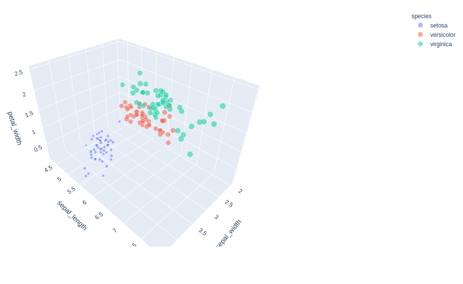
Example 1: Using Iris Dataset
Python3
import plotly.express as px
df = px.data.iris()
fig = px.scatter_3d(df, x = 'sepal_width',
y = 'sepal_length',
z = 'petal_width',
color = 'species')
fig.show()
|
Output:

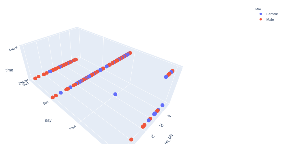
Example 2: Using tips dataset
Python3
import plotly.express as px
df = px.data.tips()
fig = px.scatter_3d(df, x = 'total_bill',
y = 'day', z = 'time',
color = 'sex')
fig.show()
|
Output:
Customizing 3D Scatter Plot
In Plotly, through the parameters of px.scatter_3d, it is possible to customize the style of the figure for some option.
Example 1: Using the Iris dataset.
Python3
import plotly.express as px
df = px.data.iris()
fig = px.scatter_3d(df, x = 'sepal_width',
y = 'sepal_length',
z = 'petal_width',
color = 'species',
size='petal_length',
size_max = 20,
opacity = 0.5)
fig.show()
|
Output:
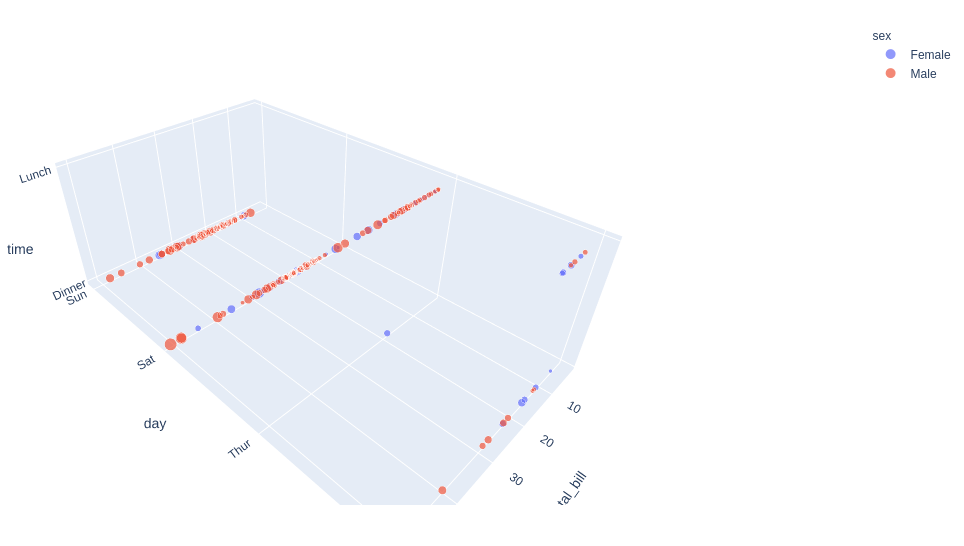
Example 2: Using tips dataset
Python3
import plotly.express as px
df = px.data.tips()
fig = px.scatter_3d(df, x = 'total_bill',
y = 'day',
z = 'time',
color = 'sex',
size='tip',
size_max = 20,
opacity = 0.7)
fig.show()
|
Output:
Like Article
Suggest improvement
Share your thoughts in the comments
Please Login to comment...