In R programming, ggplot2 is a well-liked library for data visualization. It offers a versatile method for producing a wide range of plots, including scatterplots, line plots, bar charts, histograms, and many more. Users of ggplot2 can produce visualizations that more clearly convey the patterns and relationships in their data by utilizing several coordinate systems.
Coordinate System in ggplot2
To depict the values of the data, the ggplot2 package uses two primary coordinate systems. They are:
- Linear Coordinate system
- Non-Linear Coordinate system
Linear Coordinate System in ggplot2
The Linear coordinate system is the one that mostly uses the cartesian coordinate system and is the default coordinate system of the ggplot2. It consists of the origin, which is where the two axis, i.e., the x and y axis intersect. This system is mainly used for zooming, fixing coordinates, and flipping coordinates. There are three types of linear coordinate systems. They are as follows:
Zooming the plot using coord_cartesian()
The coord_cartesian() is used to zoom in and out on a figure using the ggplot2 without affecting the underlying data. When dealing with data that has extreme numbers or outliers that obscure the subtleties of the remaining data, this can be helpful. The “xlim” and “ylim” parameters of the “coord_cartesian()” function specify the x and y-axis boundaries, respectively.
Syntax:
coord_cartesian(xlim = NULL, ylim = NULL, expand = TRUE)
Parameters:
- xlim: It is used to provide the x-axis limits. It accepts a vector of two values that represent the minimum and maximum x-axis limits. The boundaries remain unchanged if NULL.
- ylim: It accepts a vector of two values that define the minimum and maximum y-axis limits. The boundaries remain unchanged if NULL.
- expand: The axis limits can be slightly enlarged to make sure that all data points are visible by using this option. The axis bounds are increased if TRUE (the default), and collapsed if FALSE.
Now, let us see how to zoom in on a particular area of a barplot using coord_cartesian()
Example: Original graph
R
library(ggplot2)
data <- data.frame(
Language = c("Python", "Java", "C++", "R", "Php"),
Popularity = c(14, 25, 23, 30, 10)
)
ggplot(data, aes(x = Language, y = Popularity)) +
geom_bar(stat = "identity") +
labs(title = "Programming Language Popularity") +
xlab("Language") +
ylab("Popularity")
|
Output:
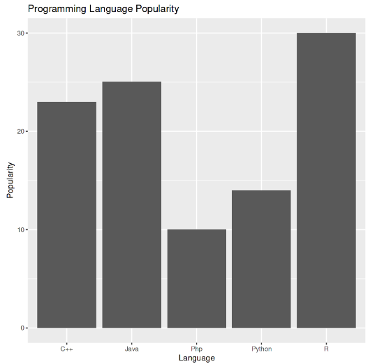
Original Graph
Example: Graph after applying coord_cartesian()
R
library(ggplot2)
data <- data.frame( Language = c("Python", "Java", "C++", "C#", "JavaScript"),
Popularity = c(14, 25, 23, 18, 10))
ggplot(data, aes(x = Language, y = Popularity)) +
geom_bar(stat = "identity", fill = "steelblue") +
labs(title = "Programming Language Popularity",
x = "Language", y = "Popularity") +
coord_cartesian(ylim = c(0, 15))
|
Output:
In this example, we enlarged the area of the plot using coord_cartesian(). This produced a map that only displays the bars that fall within that range, which makes it simpler to see the specifics of the data in that region.
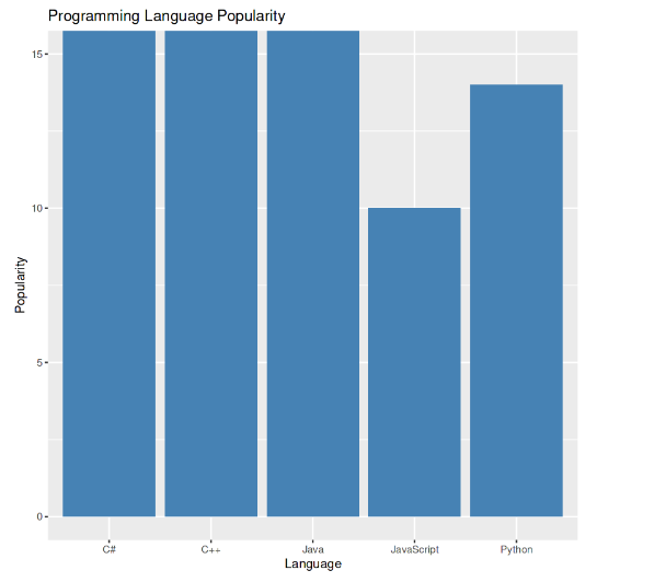
Zoomed in coordinates with coord_cartesian()
Fixing Aspect Ratio with coord_fixed()
The fixed aspect ratio for the plot can be specified using the coord_fixed() function in ggplot2. When working with data where the relationship between the x and y variables is significant and should be maintained, this can be helpful. One argument, ratio, is required by the coord_fixed() method, and it determines the plot’s aspect ratio as the relationship between its y and x units. The x and y scales are modified to have the same range of data units per inch when the plot’s fixed aspect ratio is specified using the coord_fixed() function.
Syntax:
coord_fixed(ratio = 1, xlim = NULL, ylim = NULL)
Parameters:
- ratio: It is used to describe the plot’s aspect ratio, which is the ratio of the plot’s height to width. The plot has a square aspect ratio when the default value of 1 is used.
- xlim, ylim: It specifies the x-axis and y-axis boundaries. The boundaries are not altered if NULL.
Let us see how to set a fixed aspect ratio on a scatterplot using coord_fixed():
Example: Original graph
R
library(ggplot2)
data <- data.frame(
theta = seq(0, 2 * pi, length.out = 50),
radius = rnorm(50)
)
ggplot(data, aes(x = theta, y = radius)) +
geom_point() +
labs(title = "Scatterplot with Polar Coordinates System")
|
Output:
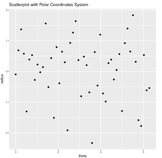
Original Graph
Example: Graph after applying coord_fixed()
R
library(ggplot2)
data <- data.frame(x = c(10, 20, 30, 40, 50),
y = c(30, 60, 90, 120, 150))
ggplot(data, aes(x = x, y = y)) +
geom_point() +
labs(title = "With Fixed Aspect Ratio- SCATTERPLOT",
x = "X-axis", y = "Y-axis") +
coord_fixed(ratio = 1)
|
Output:
In this example, a scatterplot was made. The plot was then given a fixed aspect ratio of 1:1 using coord_fixed(). This makes sure that the plot’s aspect ratio doesn’t change the relationship between the x and y variables.
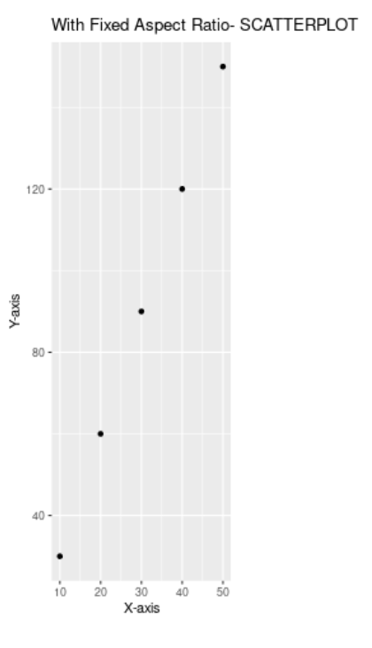
Fixed Aspect Ratio with coord_fixed()
Swapping Axes with coord_flip()
A graph’s x and y axes can be flipped using the coord_flip() function in ggplot2. When working with data where the y variable should be shown horizontally and the x variable vertically, this can be helpful. Coord_flip() does not accept any arguments. The x and y axes of the plot are switched using the coord_flip() method, making the horizontal axis the vertical axis and vice versa.
Syntax:
coord_flip()
There are no parameters for the coord_flip() function.
Now, let us see the use of coord_flip() to change a bar chart’s axes.
Example: Original graph
R
library(ggplot2)
data <- data.frame(
x = c("P", "Q", "R", "S"),
y = c(100, 80, 60, 40)
)
ggplot(data, aes(x = x, y = y)) +
geom_bar(stat = "identity") +
labs(title = "Bar Chart with Cartesian Coordinate System") +
xlab("Category") +
ylab("Value")
|
Output:
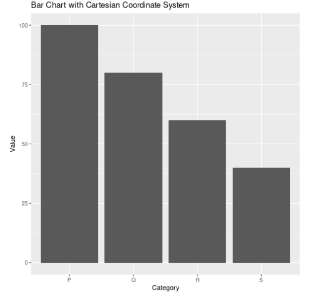
Original Graph
Example: Graph after using coord_flip()
R
library(ggplot2)
data <- data.frame(
x = c("P", "Q", "R", "S"),
y = c(100, 80, 60, 40)
)
ggplot(data, aes(x = x, y = y)) +
geom_bar(stat = "identity") +
labs(title = "Bar Chart with Cartesian Coordinate System-coord_flip") +
xlab("Category") +
ylab("Value") +
coord_flip()
|
Output:
In this example, we used a dataset of four categories and their values to build a bar chart. After switching the plot’s x and y axes using coord_flip(), the bar chart was transformed into a horizontal bar chart.
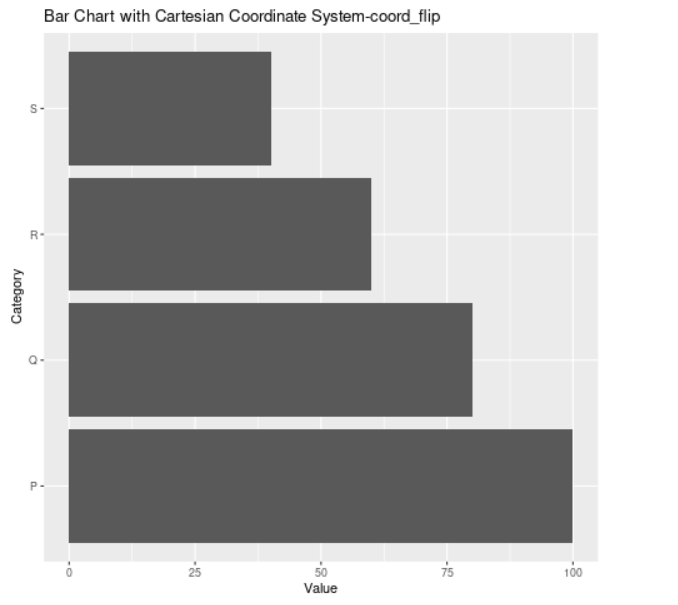
Flipped axis with coord_flip()
Non-Linear Coordinate System
The non-linear coordinate system is used for map projection, polar coordinates, and applying an arbitrary transformation to the axes. There are three types of non-linear coordinate systems. They are as follows:
Transforming Scales with coord_trans()
When there is a non-linear relationship between the data, one input, ytrans or xtrans, is required by the coord_trans() method to specify the transformation to be applied to the y or x-axis, respectively. The scales of the plot are transformed using the coord_trans() function, and as a result, the grid lines and tick labels are modified to reflect the translation.
Syntax:
coord_trans(x = NULL, y = NULL, xlim = NULL, ylim = NULL,
    lambda = NULL, breaks = NULL, labels = NULL, trans = NULL)
Parameters:
- x/y: It specifies the transformation for the x-axis and y-axis, respectively. They accept either a function object representing a custom transformation or a character string indicating the transformation function, such as “log10” for a logarithmic transformation.
- xlim/ylim: It specifies the x-axis and y-axis boundaries. The boundaries remain unchanged if NULL.
- lambda: The Box-Cox transformation, a family of power transformations that includes the logarithmic transformation as a specific case, has lambda as its parameter. When the default value is NULL, no Box-Cox transformation is carried out.
- breaks and labels: To set the tick locations and labels for the converted axis, breaks and labels are used. They use the scale_*_continuous() functions’ format as their starting point.
- trans: It is used to define a special transformation function that transforms a vector of values.
Let us see how to modify a line chart’s y-axis with coord_trans()
Example: Original graph
R
library(ggplot2)
data <- data.frame(
year = rep(c(2021, 2022, 2023), each = 4),
month = rep(c("May", "June", "July", "August"), times = 3),
value = rnorm(12)
)
ggplot(data, aes(x = month, y = value, group = year)) +
geom_line() +
labs(title = "Line Chart with Faceted Coordinate System") +
xlab("Month") +
ylab("Value") +
facet_wrap(~ year, nrow = 1)
|
Output:
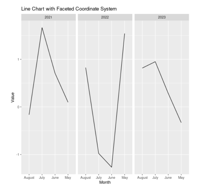
Original Graph
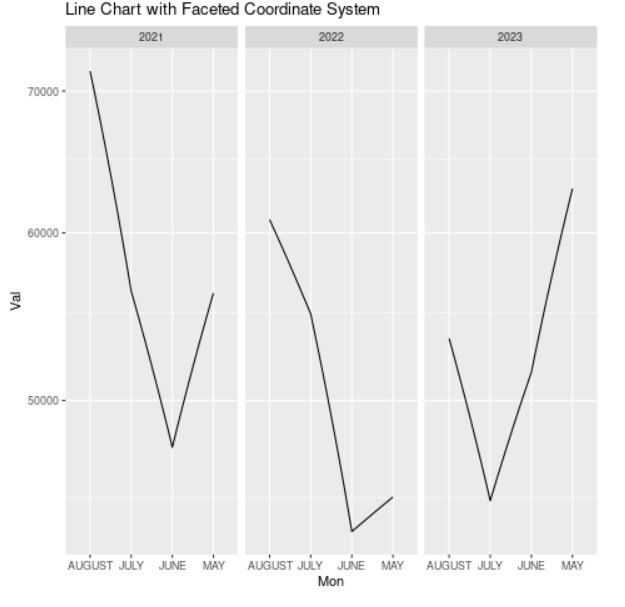
Example: Graph after using coord_trans()
R
library(ggplot2)
data <- data.frame(
year = rep(c(2021, 2022, 2023), each = 4),
month = rep(c("MAY", "JUNE", "JULY", "AUGUST"), times = 3),
value = rnorm(12, mean = 50000, sd = 10000)
)
ggplot(data, aes(x = month, y = value, group = year)) +
geom_line() +
labs(title = "Line Chart with Faceted Coordinate System") +
xlab("Mon") +
ylab("Val") +
facet_wrap(~ year, nrow = 1) +
coord_trans(y = "log10")
|
Output:
In this example. we can see how the y-axis is altered using a logarithmic scale using the coord_trans() method. Using the data.frame() method, we first built a dataset with three years’ worth of arbitrary data. Next, using the ggplot() function, we constructed a ggplot object with the dataset and aesthetic mappings.
Then, we used the geom_line() function to add a layer for the line chart and the coord_trans() function to change the y-axis to have a logarithmic scale. We can change the coordinate system scales by using the coord_trans() function, which accepts the scale transformation as an argument. In this instance, the y-axis scale was converted to a logarithmic scale using the formula y = “log10”.
Transform scale with coord_transf()
Polar Coordinated with coord_polar()
The ggplot2 package is used to create a scatterplot with a polar coordinate system. This type of coordinates is used to produce circular plots, including pie charts and radial plots. The data are plotted using the theta and radius radial axes.
Syntax:
coord_polar(theta = "x")
Parameter:
- theta: It specifies the angle (theta) determined by the x variable for polar coordinates.
Example:
R
library(ggplot2)
data <- data.frame(
theta = c(300, 600, 900, 1200, 1500, 1800),
radius = c(100, 200, 300, 400, 500, 600),
group = c("P", "Q", "R", "P", "Q", "R")
)
p <- ggplot(data, aes(x = theta, y = radius, color = group))
p <- p + geom_point()
p <- p + coord_polar()
print(p)
|
Output:
This example showed how to make a scatterplot with a polar coordinate system using ggplot2’s “coord_polar()” function. In order to produce the scatterplot with a polar coordinate system, the algorithm first created a dataset with three columns: one for the angle, one for the radius, and one for the group.
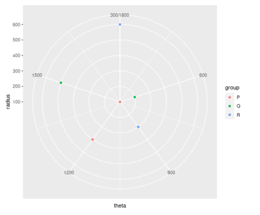
Polar coordinates with coord_polar()
These examples all demonstrate how to use ggplot2 to produce visualizations with various coordinate systems, which can be useful for showcasing patterns or correlations in the data.
Share your thoughts in the comments
Please Login to comment...