How to Plot a Smooth Line using ggplot2 in R ?
Last Updated :
02 Jul, 2021
In this article, we will learn how to plot a smooth line using ggplot2 in R Programming Language.
We will be using the “USArrests” data set as a sample dataset for this article.
 Murder Assault UrbanPop Rape
Alabama      13.2     236       58 21.2
Alaska       10.0     263       48 44.5
Arizona       8.1     294       80 31.0
Arkansas      8.8     190       50 19.5
California    9.0     276       91 40.6
Colorado      7.9     204       78 38.7
Let us first plot the regression line.
Syntax:
geom_smooth(method=lm)
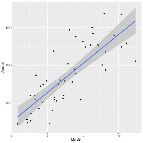
We have used geom_smooth() function to add a regression line to our scatter plot by providing “method=lm” as an argument. We have set method=lm as lm stands for Linear Model, which plots a linear regression line.
But we can see in the below example that although the Linear regression line is a best-fit line however it is not a smooth line. Further in this article, we will see how we can plot a smooth line using multiple approaches.
Example:
R
library(ggplot2)
plot <- ggplot(USArrests, aes(Murder,Assault)) + geom_point()
plot + geom_smooth(method = lm)
|
Output:
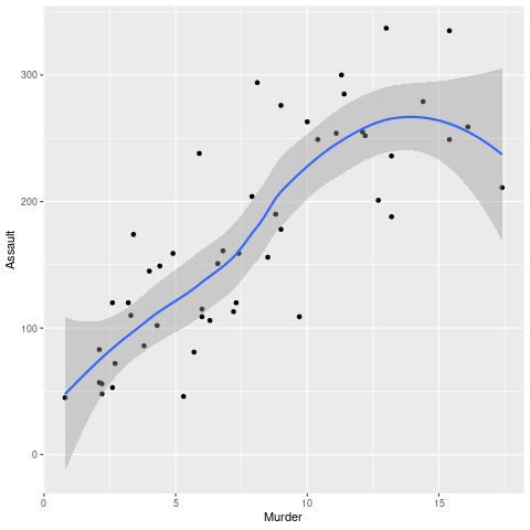
Method 1: Using “loess” method of geom_smooth() function
We can plot a smooth line using the “loess” method of the geom_smooth() function. The only difference, in this case, is that we have passed method=loess, unlike lm in the previous case. Here, “loess” stands for “local regression fitting“. This method plots a smooth local regression line.
Syntax:
geom_smooth(method = loess)
Example:
R
library(ggplot2)
plot <- ggplot(USArrests, aes(Murder,Assault)) + geom_point()
plot + geom_smooth(method = loess)
|
Output:
Method 2: Using Polynomial Interpolation
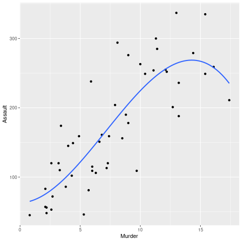
We can also use the formula: y~ploy(x,3), along with the linear model method, which gives us the same smooth line as in the previous example. Pass “se” as FALSE in the argument. By default, the value of “se” remains TRUE, which results in plotting a confidence interval around the smooth line.
Syntax:
geom_smooth(method = “lm”, formula = y ~ poly(x, 3), se = FALSE)
Example:
R
library(ggplot2)
plot <- ggplot(USArrests, aes(Murder,Assault)) + geom_point()
plot + geom_smooth(method = "lm", formula = y ~ poly(x, 3), se = FALSE)
|
Output:
Method 3: Using stat_smooth() function with “loess” method
stat_smooth() and geom_smooth() both are aliases. Both of them have the same arguments and both of them are used to plot a smooth line. We can plot a smooth line using the “loess” method of stat_smooth() function. The only difference, in this case, is that we have passed method=loess, unlike lm in the previous case. Here, “loess” stands for “local regression fitting”. This method plots a smooth local regression line.
Syntax:
stat_smooth(method = loess)
Example:
R
library(ggplot2)
plot <- ggplot(USArrests, aes(Murder, Assault)) + geom_point()
plot + stat_smooth(method = loess)
|
Output:

Method 4: Spline Interpolation
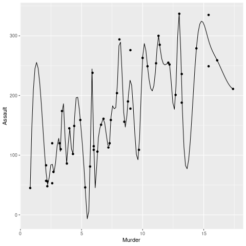
Spline regression is a better method as it overcomes the shortcomings of Polynomial Regression as Polynomial Regression was only able to express a particular amount of curvature. In simple words, splines are piecewise polynomial functions.
To draw a spline use the spline function when passing the dataframe for plotting.
Syntax:
spline( attributes )
Example:
R
library(ggplot2)
spline.d <- as.data.frame(spline(USArrests$Murder, USArrests$Assault))
plot <- ggplot(USArrests, aes(x = Murder, y = Assault))+geom_point() +
geom_line(data = spline.d, aes(x = x, y = y))
plot
|
Output:
Share your thoughts in the comments
Please Login to comment...