Analysis of Car Sales Data in R
Last Updated :
15 Mar, 2024
Car sales data can provide valuable insights into the automotive market, helping us understand the factors that influence prices, sales, and overall market trends. The dataset includes information on Price_in_thousands, Engine_size, Horsepower, Fuel_efficiency, and sales. Our goal is to analyze and visualize this data to uncover patterns, relationships, and trends in the R Programming Language.
Dataset Link: Car Sales
Load Packages and Data
R
# Install and load necessary packages
install.packages(c("tidyverse", "ggplot2", "plotly", "lubridate"))
library(tidyverse)
library(ggplot2)
library(plotly)
library(lubridate)

# Load the dataset
car_data <- read.csv("your\\path")

head(car_data)
Output:
  Price_in_thousands Engine_size Horsepower Fuel_efficiency  sales
1              21.50         1.8        140              28 16.919
2              28.40         3.2        225              25 39.384
3                 NA         3.2        225              26 14.114
4              42.00         3.5        210              22  8.588
5              23.99         1.8        150              27 20.397
6              33.95         2.8        200              22 18.780
Check the Structure
R
# Check the structure of the dataset
str(car_data)
Output:
'data.frame':    157 obs. of  5 variables:
 $ Price_in_thousands: num  21.5 28.4 NA 42 24 ...
 $ Engine_size       : num  1.8 3.2 3.2 3.5 1.8 2.8 4.2 2.5 2.8 2.8 ...
 $ Horsepower        : int  140 225 225 210 150 200 310 170 193 193 ...
 $ Fuel_efficiency   : int  28 25 26 22 27 22 21 26 24 25 ...
 $ sales             : num  16.92 39.38 14.11 8.59 20.4 ...
Check the Summary
R
# Display summary statistics
summary(car_data)
Output:
 Price_in_thousands  Engine_size      Horsepower    Fuel_efficiency
 Min.   : 9.235     Min.   :1.000   Min.   : 55.0   Min.   :15.00
 1st Qu.:18.017     1st Qu.:2.300   1st Qu.:149.5   1st Qu.:21.00
 Median :22.799     Median :3.000   Median :177.5   Median :24.00
 Mean   :27.391     Mean   :3.061   Mean   :185.9   Mean   :23.84
 3rd Qu.:31.948     3rd Qu.:3.575   3rd Qu.:215.0   3rd Qu.:26.00
 Max.   :85.500     Max.   :8.000   Max.   :450.0   Max.   :45.00
 NA's   :2          NA's   :1       NA's   :1       NA's   :3
     sales
 Min.   :  0.11
 1st Qu.: 14.11
 Median : 29.45
 Mean   : 53.00
 3rd Qu.: 67.96
 Max.   :540.56
Check Null Value and Duplicate Rows
R
# Check for null values
colSums(is.na(car_data))

# Check for duplicate records
duplicate_rows <- car_data[duplicated(car_data), ]

# Display the duplicate rows
print(duplicate_rows)
Output:
Price_in_thousands        Engine_size         Horsepower
                 2                  1                  1
   Fuel_efficiency              sales
                 3                  0

[1] Price_in_thousands Engine_size        Horsepower
[4] Fuel_efficiency    sales
<0 rows> (or 0-length row.names)
Visualization of Car Sales Data in R
R
# Install and load necessary packages
# install.packages("ggplot2")
library(ggplot2)

# Load the dataset (replace with your actual dataset path)
car_data <- read.csv("your//path")

# Customize Scatterplot
custom_scatterplot <- ggplot(car_data, aes(x = Horsepower, y = Price_in_thousands,
                                           color = Fuel_efficiency)) +
  geom_point(size = 3, alpha = 0.7) +
  scale_color_gradient(low = "blue", high = "red") +  # Adjust color scale
  labs(
    title = "Customized Scatterplot",
    x = "Horsepower",
    y = "Price_in_thousands",
    color = "Fuel_efficiency"
  ) +
  theme_minimal()

# Show the scatterplot
print(custom_scatterplot)
Output:
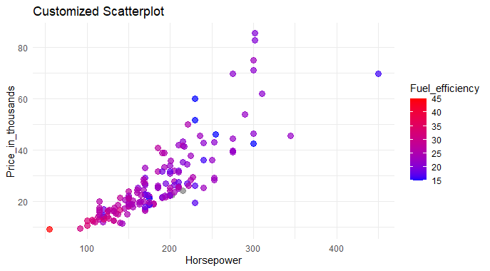
Analyzing Car Sales Data in R
Data Points Visualization: The scatterplot visually displays data points from a car dataset, where each point represents a car.
- Horsepower vs. Price: The horizontal axis (x-axis) represents the car’s horsepower, while the vertical axis (y-axis) represents the car’s price in thousands.
- Color Coded Fuel Efficiency: Cars are color-coded based on fuel efficiency, ranging from blue (less fuel-efficient) to red (more fuel-efficient).
- Point Size and Transparency: Larger and more transparent points indicate higher concentrations of cars at specific data points, aiding in identifying patterns.
- Title and Axis Labels: The plot is titled “Customized Scatterplot,” with clear labels for the x-axis, y-axis, and color legend, enhancing overall readability.
Histogram with Distplot for Analyzing Car Sales Data in R
R
# Assuming 'Price_in_thousands' is the column of interest in your 'car_data' dataframe
ggplot(car_data, aes(x = Price_in_thousands)) +
  geom_histogram(aes(y = ..density..), fill = "skyblue", color = "black", bins = 30) +
  geom_density(alpha = 0.7, fill = "orange") +
  labs(title = "Histogram with Distribution Plot Overlay for Price_in_thousands",
       x = "Price_in_thousands",
       y = "Density")
Output:
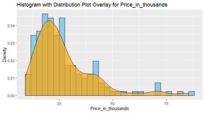
Analyzing Car Sales Data in R
This plot effectively visualizes the distribution of car prices in thousands using a combination of a histogram and a density plot overlay.
- The histogram, in sky blue with black outlines, shows the frequency of prices in bins, while the smooth orange density plot provides a continuous representation of the probability distribution.
- The title and labeled axes enhance clarity, making it easy to interpret the distribution of car prices in the dataset.
Outliers Detection for Analyzing Car Sales Data in R
R
# Set up a larger plotting area
par(mar = c(5, 5, 2, 2))

# Create a boxplot with enhanced features
boxplot(car_data$Price_in_thousands,
        main = "Distribution of Car Prices",
        col = "skyblue",
        border = "black",
        horizontal = TRUE,  # Display as a horizontal boxplot
        notch = TRUE,       # Add a notch for median confidence interval
        notchwidth = 0.5,   # Adjust the width of the notch
        outline = TRUE,     # Show individual data points
        cex.main = 1.2,     # Increase the title font size
        cex.axis = 1.1,     # Increase the axis label font size
        cex.lab = 1.1,      # Increase the axis tick label font size
        ylim = c(0, max(car_data$Price_in_thousands, na.rm = TRUE) * 1.1)
)

# Add labels and grid
title(xlab = "Price in Thousands", cex.lab = 1.2)
title(ylab = "")
grid(lty = 2, col = "gray", lwd = 0.5)
Output:
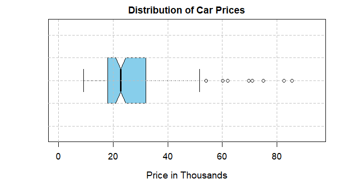
Analyzing Car Sales Data in R
Time Series Plot
R
# Load necessary packages and read the dataset
library(tidyverse)

# Specify the path to the dataset
dataset_path <- "your//path"

# Read the dataset
car_data <- read.csv(dataset_path)

# Create a time series object
ts_data <- ts(car_data$sales, frequency = 1)

# Time Series Plot
plot(ts_data, main = "Time Series Plot of Sales", xlab = "Date", ylab = "Sales",
     col = "blue", type = "l")

# Apply a Simple Moving Average (SMA) to smooth the series
sma_window <- 12  # Set the window size for the moving average
sma <- stats::filter(ts_data, rep(1/sma_window, sma_window), sides = 2)

# Overlay the moving average on the plot
lines(sma, col = "red", lwd = 2)

# Add legend
legend("topright", legend = c("Original Sales", paste("SMA (", sma_window, ")",
                                         sep = "")), col = c("blue", "red"), lty = 1)
Output:
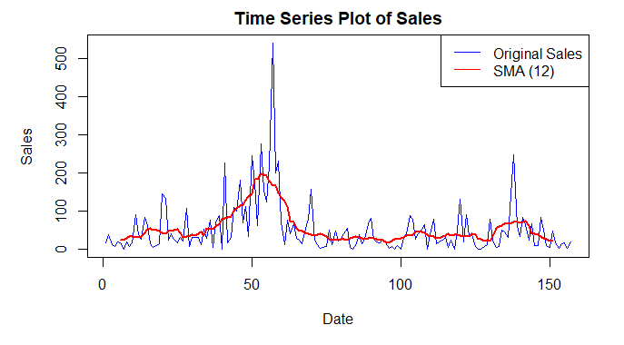
Analyzing Car Sales Data in R
Dataset Loading: The code reads a dataset from a specified path using the read.csv function and assigns it to the car_data variable.
- Time Series Object Creation: A time series object (
ts_data) is created using the sales column from the car_data dataset, specifying a frequency of 1 (assuming the data is monthly). - Time Series Plot: A time series plot is generated using the
plot function, visualizing the sales over time in blue. - Simple Moving Average (SMA): A simple moving average with a window size of 12 is applied to smooth the time series.
- Overlaying SMA on Plot: The smoothed moving average (
sma) is overlaid on the original time series plot in red using the lines function. - Legend Addition: A legend is added to the top-right corner, labeling the original sales plot in blue and the SMA plot in red, enhancing the plot’s interpretability.
Create a Model for Car Sales Data
R
# Load necessary packages
library(tidyverse)
library(randomForest)

# Load the car dataset
car_data <- read.csv("your//path")

# Handle missing values if needed
car_data <- na.omit(car_data)

# Split the dataset into training and testing sets
set.seed(123)
train_indices <- sample(1:nrow(car_data), 0.8 * nrow(car_data))
train_data <- car_data[train_indices, ]
test_data <- car_data[-train_indices, ]

# Train a Random Forest regression model with hyperparameter tuning
rf_model <- randomForest(
  sales ~ .,
  data = train_data,
  ntree = 500,    # Adjust as needed
  mtry = 3,       # Adjust as needed
  nodesize = 5    # Adjust as needed
)

# Make predictions on the test set
predictions <- predict(rf_model, newdata = test_data)

# Evaluate the regression model
rmse <- sqrt(mean((predictions - test_data$sales)^2))
print(paste("Root Mean Squared Error (RMSE):", round(rmse, 4)))

# Mapping Accuracy
mapping_accuracy <- 1 - (rmse / sd(test_data$sales))
print(paste("Mapping Accuracy:", round(mapping_accuracy, 4)))
Output:
[1] "Root Mean Squared Error (RMSE): 99.9132"

[1] "Mapping Accuracy: 0.0485"
Data Splitting: The code divides the car dataset into two parts for training (80%) and testing (20%).
- Random Forest Model Training: A smart program is taught to predict car sales using various information like horsepower, price, etc. The program learns by considering examples in the training data.
- Making Predictions: The trained program is then tested on new data to predict car sales. These predictions are saved.
- Model Evaluation – RMSE: The program’s predictions are compared to the real sales numbers in the test data, and the Root Mean Squared Error (RMSE) is calculated. This helps measure how close the predictions are to the actual values.
- Mapping Accuracy: Another measure called Mapping Accuracy is calculated. It tells us how well the predictions map to the real sales values. Higher mapping accuracy is better.
- Results Printing: The final results, including RMSE and Mapping Accuracy, are displayed for us to understand how well the program performed. If needed, we can adjust certain settings to make the program even smarter.
Make Predictions for Car Sales Data
R
# Now, if you want to predict future values, you can use the trained model
# Let's create a new observation for prediction
new_observation <- data.frame(
  Price_in_thousands = c(25),
  Engine_size = c(2),
  Horsepower = c(150),
  Fuel_efficiency = c(25)
)

# Make predictions on the new observation
future_prediction <- predict(rf_model, newdata = new_observation)

# Display the predicted class
print(future_prediction)
Output:
       1
17.64733
Predicting Future Values: Now, if you want to predict future car sales using the trained model, you can do that.
- Creating a New Observation: We create a new set of information for a hypothetical car. This includes the price (25), engine size (2), horsepower (150), and fuel efficiency (25).
- Making Predictions: The trained model is used to predict the future sales of this new car based on the provided information.
- Displaying Predicted Sales: The predicted sales value for the new car is then displayed. This gives us an estimate of how many units this hypothetical car might sell in the future, according to the trained model.
Conclusion
Our analysis of the car sales dataset has provided valuable insights into pricing, sales, and market trends. We explored key variables, visualized patterns, addressed outliers, and even implemented a classification model for predictions. Here we use various analytical techniques, we gained a deeper understanding of the automotive market dynamics.
Share your thoughts in the comments
Please Login to comment...