How to use interactive time series graph using dygraphs in R
Last Updated :
27 Jun, 2022
Dygraphs refer to as Dynamic graphics which leads to an easy way to create interaction between user and graph. The dygraphs are mainly used for time-series analysis. The dygraphs package is an R interface to the dygraphs JavaScript charting library in R Programming Language.
Creating simple dygraphs
Let’s take stock data for a better understanding of time series.
Download (Tesla) Stock data from the quantmod library by using getSymbols(). We will plot 5 different dynamic plots.
- Series colour
- Vertical and Horizontal Shading
- Candlestick
- Upper/lower bar
- Range Selector
First of all, install dygraphs and quantmod package in rstudio.
install.packages(“dygraphs”)
install.packages(“quantmod”)
You can download data directly from this link: TSLA Stock Data
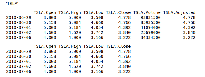
Here, OHLC represents the open, high, low, and closing price of each period in stock data. So, we are fetching this parameter and storing it in the price variable.
R
library(dygraphs)
library(quantmod)
getSymbols("TSLA")
head(TSLA,n=5)
price<-OHLC(TSLA)
head(price, n=5)
|
Output:
colours
Series color graph
Dygraph can assign different color palettes to each visualization line. For example, our four-parameter in TSLA data (open, high, low, close) can be represented as different colors. Dygraph provides dyOptions() in which colors parameter can be useful to identify each stock line smoothly.
R
dygraph(price, main = "TSLA Stock price analysis") %>%
dyOptions(colors = RColorBrewer::brewer.pal(4, "Dark2"))
|
Output:
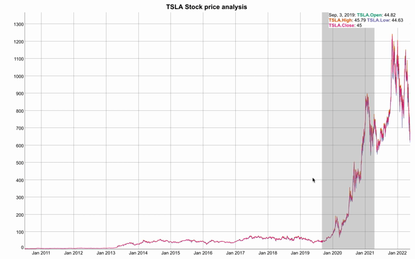
Visualising 4 parameter of stock price
Vertical and Horizontal shading
Vertical shading:
Dygraph can assign shading features on the timeline portion to analyze different time intervals. By using dyshading, we can assign time-interval corresponding to color for better analysis of the stock portion.
R
dygraph(price, main = "TSLA Stock price analysis") %>%
dySeries(label = "Temp (F)",
color = "black") %>%
dyShading(from = "2018-1-1",
to = "2019-12-1",
color = "#FFE6E6") %>%
dyShading(from = "2020-1-1",
to = "2021-1-1",
color = "#CCEBD6")
|
Output:
Horizontal shading
Dygraphs provide horizontal shading by use of mean and standard deviations. We can assign intervals in dyshading and assign axis parameters to y. Here, ROC function is used to create ROC Curve.
R
ret = ROC(TSLA[, 4])
mn = mean(ret, na.rm = TRUE)
std = sd(ret, na.rm = TRUE)
dygraph(ret, main = "TSLA Share Price") %>%
dySeries("TSLA.Close", label = "TSLA") %>%
dyShading(from = mn - std, to = mn + std, axis = "y")
|
Output:
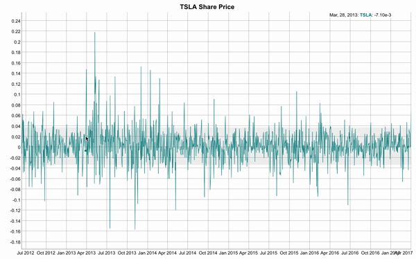
Horizontal shade in grey colour
Candlestick graph
Candlestick graphs are most commonly used by professional traders in the stock market to predict price movement based on past data. dygraph can easily plot this graph just in one line of command. Here, we are storing the last 30 days stock data to create a candlestick graph. Red bar shows down in stock and the green bar shows up in stock.
R
TSLA <- tail(TSLA, n=30)
graph <- dygraph(OHLC(TSLA))
dyCandlestick(graph)
|
Output:
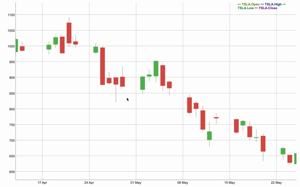
Candlestick Graph
Upper/lower bar
We can create multiple series in which each series has an upper/lower bar in terms of shade just like the error bar. In the Below graph, the amazon and tesla series example is shown.
R
getSymbols("AMZN")
stocks <- cbind(AMZN[,2:4], TSLA[,2:4])
dygraph(stocks, main = "Amazon and Tesla Share Prices") %>%
dySeries(c("AMZN.Low", "AMZN.Close",
"AMZN.High"), label = "AMZN") %>%
dySeries(c("TSLA.Low", "TSLA.Close",
"TSLA.High"), label = "TSLA")
|
Output:
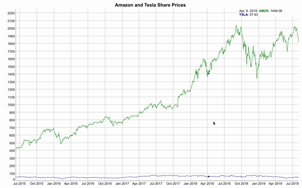
Upper/Lower Bar Graph
Range Selector
We can add a range selector at the bottom of the dygraph chart for an easy interface of panning and zooming by dyRangeSelector() function.
R
dygraph(TSLA,
main = "Tesla Stock Price Analysis")
%>% dyRangeSelector()
|
Output:
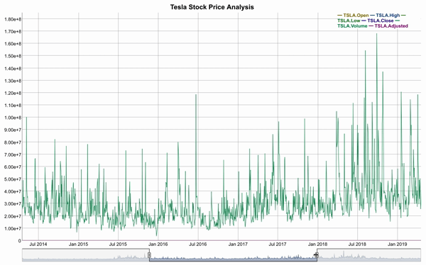
Select range from below
Share your thoughts in the comments
Please Login to comment...