In this article, we will discuss Hierarchical Data and Dendrogram and Visualizing Hierarchical Data with Dendrograms in R Programming Language.
What is Hierarchical Data?
Hierarchical data refers to data that is organized in a hierarchical or tree-like structure, where each data point or record has a defined relationship with one or more other data points, forming a parent-child relationship.
Uses of Hierarchical Data
- Organizational Structure: Hierarchical data can represent organizational structures, where each employee may have a manager (parent) and several subordinates (children). This structure can be represented as a hierarchy, with the CEO at the top and employees at different levels beneath.
- File Systems: In computer science, file systems are often organized hierarchically. Directories (folders) can contain files and subdirectories, which can in turn contain additional files and directories, forming a tree-like structure.
- Biological Taxonomy: Taxonomy in biology is hierarchical, with species grouped into genera, genera into families, families into orders, and so on. This hierarchical structure reflects the evolutionary relationships between different organisms.
- Nested Data: Hierarchical data can also arise in databases and data formats such as JSON and XML, where data elements can be nested within one another to represent relationships or groupings.
- Network Routing: Hierarchical data structures are used in computer networks for routing and organizing network resources. For example, routers may be organized hierarchically into domains, subdomains, and individual network segments.
- Genealogical Records: Genealogical data often follows a hierarchical structure, with individuals organized into families, families into clans or lineages, and lineages into larger groups.
What is Dendrogram?
Dendrograms are a popular way to visualize hierarchical data, particularly in fields like biology, linguistics, and computer science. They represent relationships between data points in a hierarchical manner, typically in a tree-like structure.
- Data Preparation: Ensure the data is in a format suitable for hierarchical clustering. This often involves having a distance or similarity matrix between data points.
- Hierarchical Clustering: Apply hierarchical clustering algorithms like agglomerative or divisive clustering to the data. These algorithms iteratively merge or split clusters based on a defined metric.
- Dendrogram Construction: Use libraries like scipy or matplotlib in Python or other statistical software to construct the dendrogram. These libraries typically have functions specifically designed for creating dendrograms.
R
# Generate random data for demonstration
set.seed(123)
data <- matrix(rnorm(100), ncol = 5)

# Perform hierarchical clustering
dist_matrix <- dist(data)  # Compute distance matrix
hc <- hclust(dist_matrix)  # Perform hierarchical clustering

# Plot dendrogram
plot(hc, main = "Dendrogram of Hierarchical Clustering", xlab = "Samples",
     ylab = "Distance")
Output:
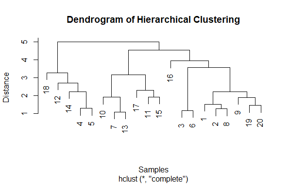
Visualizing Hierarchical Data with Dendrograms
First generate some random data using rnorm function to create a matrix with 100 random values organized into 5 columns.
- Second compute the distance matrix using the dist function, which calculates the Euclidean distance between each pair of rows in the data matrix.
- Then perform hierarchical clustering using hclust function, which applies agglomerative hierarchical clustering to the distance matrix.
- Finally, plot the dendrogram using plot function. The main, xlab, and ylab arguments are used to provide a title and labels for the plot.
Understanding Hierarchical Clustering
Hierarchical clustering is a popular technique in data analysis and machine learning used to group similar objects into clusters. It’s called “hierarchical” because it creates a hierarchy of clusters. At its core, hierarchical clustering starts by considering each data point as its own cluster and then iteratively merges the closest clusters together until all points belong to just one cluster, forming a tree-like structure known as a dendrogram.
There are two main types of hierarchical clustering
1.Agglomerative hierarchical clustering
This approach starts with each data point as its own cluster and then merges the closest pairs of clusters until only one cluster remains. The process involves calculating the distances between clusters and determining which ones to merge based on a chosen linkage clustering, such as “complete-linkage,” “single-linkage,” or “average-linkage.”
2.Divisive hierarchical clustering
In contrast to agglomerative clustering, divisive hierarchical clustering begins with all data points in one cluster and then recursively splits the cluster into smaller clusters until each data point is in its own cluster. While conceptually straightforward, divisive clustering can be computationally intensive and less commonly used in practice compared to agglomerative clustering.
Single linkage clustering
Single linkage clustering, also known as minimum linkage clustering, is a method of hierarchical clustering where the distance between two clusters is defined as the shortest distance between any two points in the two clusters. In other words, the distance between two clusters is determined by the closest pair of points from each cluster.
Suppose we have the following set of points in a two-dimensional space
A(1, 1), B(2, 2), C(2, 4), D(3, 3), E(6, 5), F(7, 6)
Step 1: Calculate distances between points using Euclidean distance
- Distance(A, B) = √((2-1)² + (2-1)²) = √2
- Distance(A, C) = √((2-1)² + (4-1)²) = √5
- Distance(A, D) = √((3-1)² + (3-1)²) = √8
- Distance(A, E) = √((6-1)² + (5-1)²) = √41
- Distance(A, F) = √((7-1)² + (6-1)²) = √61
- Distance(B, C) = √((2-2)² + (4-2)²) = 2
- Distance(B, D) = √((3-2)² + (3-2)²) = √2
- Distance(B, E) = √((6-2)² + (5-2)²) = √29
- Distance(B, F) = √((7-2)² + (6-2)²) = √34
- Distance(C, D) = √((3-2)² + (3-4)²) = √2
- Distance(C, E) = √((6-2)² + (5-4)²) = √25
- Distance(C, F) = √((7-2)² + (6-4)²) = √29
- Distance(D, E) = √((6-3)² + (5-3)²) = √13
- Distance(D, F) = √((7-3)² + (6-3)²) = √18
- Distance(E, F) = √((7-6)² + (6-5)²) = √2
Step 2: Merge closest points
Start by merging the closest pair of points into clusters:
- Merge A and B: Distance(A, B) = √2
- Merge C and D: Distance(C, D) = √2
- Merge E and F: Distance(E, F) = √2
Step 3: Repeat until all points are in one cluster
- Merge A-B cluster with C-D cluster: Distance(A-B, C-D) = min(√2, √2) = √2
- Merge A-B-C-D cluster with E-F cluster: Distance(A-B-C-D, E-F) = min(√2, √2) = √2
Now, all points are in one cluster.
The resulting single linkage clustering can be visualized as a dendrogram in R
R
# Define the points
points <- data.frame(
  x = c(1, 2, 2, 3, 6, 7),
  y = c(1, 2, 4, 3, 5, 6)
)

# Perform single linkage clustering
d <- dist(points)
hc <- hclust(d, method = "single")

# Plot the dendrogram
plot(hc, main = "Single Linkage Clustering Dendrogram", xlab = "Points",
                                                        ylab = "Distance")

# Add labels to the points
text(points$x, points$y, labels = LETTERS[1:6], pos = 1)
Output:
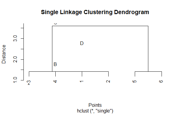
Visualizing Hierarchical Data with Dendrograms
Complete linkage clustering
Complete linkage clustering, also known as farthest neighbor clustering, is a method of hierarchical clustering where the distance between two clusters is defined as the maximum distance between any two points in the two clusters. In other words, the distance between two clusters is determined by the farthest pair of points from each cluster.
Suppose we have the following set of points in a two-dimensional space
A(1, 1), B(2, 2), C(4, 4), D(5, 5), E(7, 7), F(8, 8)
Step 1: Calculate distances between points using Euclidean distance
- Distance(A, B) = √((2-1)² + (2-1)²) = √2
- Distance(A, C) = √((4-1)² + (4-1)²) = √18
- Distance(A, D) = √((5-1)² + (5-1)²) = √32
- Distance(A, E) = √((7-1)² + (7-1)²) = √72
- Distance(A, F) = √((8-1)² + (8-1)²) = √98
- Distance(B, C) = √((4-2)² + (4-2)²) = √8
- Distance(B, D) = √((5-2)² + (5-2)²) = √13
- Distance(B, E) = √((7-2)² + (7-2)²) = √32
- Distance(B, F) = √((8-2)² + (8-2)²) = √50
- Distance(C, D) = √((5-4)² + (5-4)²) = √2
- Distance(C, E) = √((7-4)² + (7-4)²) = √18
- Distance(C, F) = √((8-4)² + (8-4)²) = √32
- Distance(D, E) = √((7-5)² + (7-5)²) = √8
- Distance(D, F) = √((8-5)² + (8-5)²) = √18
- Distance(E, F) = √((8-7)² + (8-7)²) = √2
Step 2: Merge closest points
Start by merging the closest pair of points into clusters:
- Merge A and B: Distance(A, B) = √2
- Merge C and D: Distance(C, D) = √2
- Merge E and F: Distance(E, F) = √2
Step 3: Repeat until all points are in one cluster
- Merge A-B cluster with C-D cluster: Distance(A-B, C-D) = max(√18, √2) = √18
- Merge A-B-C-D cluster with E-F cluster: Distance(A-B-C-D, E-F) = max(√32, √2) = √32
Now, all points are in one cluster.
This example shows how complete linkage clustering merges clusters based on the maximum distance between any two points in the clusters. The result can be visualized as a dendrogram in R
R
# Define the points
points <- data.frame(
  x = c(1, 2, 4, 5, 7, 8),
  y = c(1, 2, 4, 5, 7, 8)
)

# Perform complete linkage clustering
d <- dist(points)
hc <- hclust(d, method = "complete")

# Plot the dendrogram
plot(hc, main = "Complete Linkage Clustering Dendrogram", xlab = "Points",
     ylab = "Distance")

# Add labels to the points
text(points$x, points$y, labels = LETTERS[1:6], pos = 1)
Output:
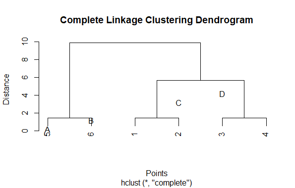
Visualizing Hierarchical Data with Dendrograms
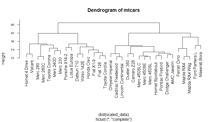
Here, we use a real dataset “mtcars” which already available in R. Which contains fuel consumption and 10 aspects of automobile design and performance for 32 automobiles.
R
# Load the mtcars dataset
data("mtcars")

# Scale the data
scaled_data <- scale(mtcars)

# Compute hierarchical clustering
hc <- hclust(dist(scaled_data))

# Plot dendrogram
plot(hc, main = "Dendrogram of mtcars")
Output:
Visualizing Hierarchical Data with Dendrograms
We load the “mtcars” dataset using the data() function. This dataset contains information on various attributes of different car models.
- The dataset is then scaled using the scale() function. Scaling the data standardizes each variable by subtracting its mean and dividing by its standard deviation. This step is essential for hierarchical clustering as it ensures that all variables are on the same scale.
- Hierarchical clustering is performed using the hclust() function. We compute the Euclidean distance between the rows of the scaled dataset and then perform hierarchical clustering on the resulting distance matrix.
- Finally, we plot the dendrogram using the plot() function. The hierarchical clustering result (hc) is passed as input, and the resulting dendrogram is displayed with the title “Dendrogram of mtcars”.
Dendrograms can be customized in various ways to improve readability and visual appeal
We can Customize the dendrograms using “ggraph”, it helps to adjust various aspects such as node size, edge width, node labels, and colors.
R
install.packages("ggraph")
library(ggraph)
library(igraph)

# Generate sample gene expression data
set.seed(123)
genes <- c("Gene1", "Gene2", "Gene3", "Gene4", "Gene5")
samples <- c("Sample1", "Sample2", "Sample3", "Sample4", "Sample5")
expression_data <- matrix(rnorm(length(genes) * length(samples)),
                          nrow = length(genes), dimnames = list(genes, samples))

# Perform hierarchical clustering
distances <- dist(expression_data)
hclust_results <- hclust(distances, method = "complete")

# Convert hclust result to a dendrogram object
dendrogram <- as.dendrogram(hclust_results)

# Define a custom layout for the dendrogram
layout <- ggraph::create_layout(dendrogram, layout = "dendrogram")

# Plot dendrogram using ggraph
ggraph(layout, circular = FALSE) +
  geom_edge_diagonal(color = "gray50", size = 0.5) +  # Customize edge appearance
  geom_node_point(color = "steelblue", size = 3) +     # Customize node appearance
  geom_node_text(aes(label = label), size = 3, hjust = -0.1, vjust = -0.1) +
  theme_void() +                                      # Remove background and grid
  theme(panel.background = element_rect(fill = "white"),  # Customize panel background
        legend.position = "none")                       # Remove legend
Output:
Visualizing Hierarchical Data with Dendrograms
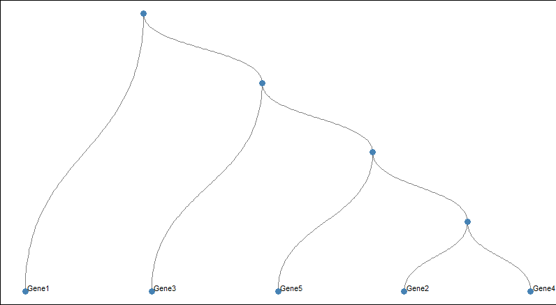
We generate sample gene expression data and perform hierarchical clustering as before.
- Then create a custom layout for the dendrogram using create_layout.
- Use geom_edge_diagonal to customize the appearance of edges (lines connecting nodes).
- Use geom_node_point to customize the appearance of nodes (circles representing genes or samples).
- Use geom_node_text to customize the appearance of node labels (gene or sample names).
- Then theme_void is use to remove the background and grid from the plot, providing a clean canvas for customization.
- At last customize the panel background to be white and remove the legend.
Now we take another example and create more attractive Dendrograms
R
# Load libraries
library(ggraph)
library(igraph)
library(tidyverse)

# Create a data frame
data <- data.frame(
  level1 = "Parent",
  level2 = c(rep("Manager", 4), rep("Supervisor", 4)),
  level3 = paste0("Employee_", 1:8)
)

# Transform it to an edge list
edges_level1_2 <- data %>% select(level1, level2) %>% unique() %>% rename(from = level1,
                                                                          to = level2)
edges_level2_3 <- data %>% select(level2, level3) %>% unique() %>% rename(from = level2,
                                                                          to = level3)
edge_list <- rbind(edges_level1_2, edges_level2_3)

# Create a graph
mygraph <- graph_from_data_frame(edge_list)

# Plot the graph with ggraph
ggraph(mygraph, layout = 'dendrogram', circular = FALSE) +
  geom_edge_diagonal(color = "#999999", alpha = 0.5) +
  geom_node_point(color = "#69b3a2", size = 3) +
  geom_node_text(
    aes(label = c("Parent", "Manager", "Supervisor", LETTERS[8:1])),
    hjust = c(1, 0.5, 0.5, rep(0, 8)),
    nudge_y = c(-0.02, 0, 0.02, rep(0, 8)),
    nudge_x = c(0, 0.3, 0.3, rep(0, 8)),
    color = "black", size = 4, fontface = "bold"
  ) +
  theme_void() +
  theme(
    plot.margin = margin(2, 2, 2, 2, "cm"),
    panel.background = element_rect(fill = "white", color = "#EEEEEE", size = 0.5)
  ) +
  coord_flip() +
  scale_y_reverse()
Output:
Visualizing Hierarchical Data with Dendrograms
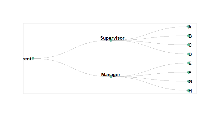
Create a hierarchical structure of “Parent”, “Manager”, and “Supervisor” levels with corresponding employees and generate an edge list.
- Using the edge list, we construct a graph object representing the hierarchy.
- ggraph is use to plot the hierarchy, positioning nodes hierarchically with a dendrogram layout.
- Nodes are displayed as points with teal color, and edges are represented diagonally with gray color.
- Node labels are added with adjusted alignment, position, color, size, and font style.
- Customize the plot by removing unnecessary elements, adjusting margins, and applying background color for clarity and aesthetics.
- Coordinate flipping and scaling ensure proper orientation and ordering of nodes.
R
# Libraries
library(ggraph)
library(igraph)
library(tidyverse)
library(viridis)

set.seed(1)

# create a data frame giving the hierarchical structure of your individuals
d1=data.frame(from="origin", to=paste("category", seq(1,10), sep=""))
d2=data.frame(from=rep(d1$to, each=10), to=paste("category", seq(1,100), sep="_"))
edges=rbind(d1, d2)

# create a vertices data.frame. One line per object of our hierarchy
vertices = data.frame(
  name = unique(c(as.character(edges$from), as.character(edges$to))) ,
  value = runif(111)
)
# Let's add a column with the category of each name. It will be useful later to color

vertices$category = edges$from[ match( vertices$name, edges$to ) ]


#Let's add information concerning the label we are going to add: angle, horizontal
#calculate the ANGLE of the labels
vertices$id=NA
myleaves=which(is.na( match(vertices$name, edges$from) ))
nleaves=length(myleaves)
vertices$id[ myleaves ] = seq(1:nleaves)
vertices$angle= 90 - 360 * vertices$id / nleaves

# calculate the alignment of labels: right or left
# If I am on the left part of the plot, my labels have currently an angle < -90
vertices$hjust<-ifelse( vertices$angle < -90, 1, 0)

# flip angle BY to make them readable
vertices$angle<-ifelse(vertices$angle < -90, vertices$angle+180, vertices$angle)

# Create a graph object
mygraph <- graph_from_data_frame( edges, vertices=vertices )

# prepare color
mycolor <- sample(viridis_pal()(10))

# Make the plot
ggraph(mygraph, layout = 'dendrogram', circular = TRUE) +
  geom_edge_diagonal(colour="grey") +
  scale_edge_colour_distiller(palette = "RdPu") +
  geom_node_text(aes(x = x*1.15, y=y*1.15, filter = leaf, label=name, angle = angle,
                     hjust=hjust, colour=category), size=2.7, alpha=1) +
  geom_node_point(aes(filter = leaf, x = x*1.07, y=y*1.07, colour=category, size=value,
                      alpha=0.2)) +
  scale_colour_manual(values= mycolor) +
  scale_size_continuous( range = c(0.1,7) ) +
  theme_void() +
  theme(
    legend.position="none",
    plot.margin=unit(c(0,0,0,0),"cm"),
  ) +
  expand_limits(x = c(-1.3, 1.3), y = c(-1.3, 1.3))
Output:
-21-03-2024-10_46_52.png)
Load the necessary libraries like ggraph, igraph, tidyverse, and viridis. These libraries provide functions and tools for data manipulation, plotting, and color generation.
- Then create a hierarchical structure of individuals using the edges data frame.
- d1 contains the connection from “origin” to groups named “category1” through “category10”.
- d2 replicates each of the categories from d1 ten times, creating a deeper hierarchy.
- edges is formed by combining d1 and d2.
- We create a vertices data frame where each row represents an individual in the hierarchy.
- A graph object representing the hierarchical structure is created.
- Colors for categories are generated using the Viridis colormap.
- A circular dendrogram plot is generated with labeled nodes and colored branches.
Conclusion
In summary, dendrograms offer a clear and intuitive way to visualize hierarchical data, revealing how items or groups are related. Whether it’s understanding evolutionary relationships in biology or segmenting customers in marketing, dendrograms provide valuable insights. They help us see patterns and connections that might not be obvious otherwise. So, whether we exploring data for research or making business decisions, dendrograms are a useful tool for uncovering hierarchical relationships in a straightforward and visual manner.
Share your thoughts in the comments
Please Login to comment...