Data Visualisation with Chartify
Last Updated :
10 Jul, 2020
Chartify is an open-source data visualization library from Spotify that makes it easy for data analysts to create charts and graphs. Chartify is built on top of Bokeh, which is a very popular data visualization library. This article gives a brief introduction to this technology.
Modules Needed
Install the latest version of Chartify and Pandas. To install these modules type the below command in the terminal.
pip install chartify
pip install pandas
Pandas is required for data cleaning and manipulation in this context. So let’s import these on to our Python code. It is recommended to use the Jupyter notebook or Google Colab for any kind of data visualization or analysis.
Python3
import chartify
import pandas as pd
|
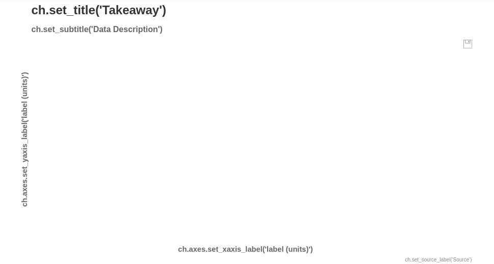
Chartify makes it very easy for anyone to start up. The following code helps set up a simple chart and displays it in the notebook.
Python3
ch = chartify.Chart()
ch.show()
|
Output:
However, this is just an empty chart with no data in it. Let’s try to fill this chart with data to see this visualization tool come alive. Chartify comes with its own dataset examples that you can use to learn from. Thus we are going to load the example data and display it.
Python3
data = chartify.examples.example_data()
data.head()
|
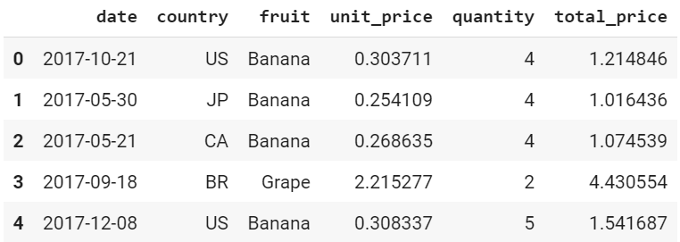
data.head()
If we analyze this dataset, we can come to the conclusion that it is time-series data. Time(or date), by convention, is displayed on the X-axis. Thus, let’s set the type of the X-axis to DateTime.
Python3
ch = chartify.Chart(x_axis_type='datetime')
|
Now there are various kinds of plots you can draw with this tool. However, in this article we are going to use only two, that is, scatter plot and histogram.
First, let’s build a scatter plot. The easiest way to do this is by using the scatter method. The arguments that should be passed are the data_frame which has the data to be plotted, x_column which specifies X-axis and y_column which specifies Y-axis. All other arguments are optional(that is, a default value is assigned to them when not specified). The color_column argument colors the plot of the basis of the column specified. Let’s say in the above dataset we set color_column to be the column “fruit”. Chartify assigns different colors to different fruit names in the column. A list of values within the color_column argument is used for specific sorting of the colors. alpha is the transparency(alpha value) of a plot. Here 1.0 is completely opaque, which 0.0 is completely transparent. marker refers to the mark on the plot for values. The markers can be a circle, asterisk, diamond, triangle, and various other shapes.
Syntax: scatter(data_frame, x_column, y_column, size_column=None, color_column=None, color_order=None, alpha=1.0, marker=’circle’)
Now let’s set the title, subtitle, and other attributes for our chart.
Python3
ch.set_title("Quantity Fruit vs Date")
ch.set_subtitle("Quantity of fruits grown all around the world")
ch.axes.set_xaxis_label("Date")
ch.axes.set_yaxis_label("Quantity")
ch.set_source_label("Source:Chartify Examples")
|
Now let’s make a scatter plot using the following and display it onto the notebook. data or the example dataset we got from Chartify will be our data_frame. The X-axis will be date and Y-axis will be quantity. The color_column will be fruit.
Python3
ch.plot.scatter(data_frame=data, x_column='date',
y_column='quantity',
color_column='fruit')
ch.show()
|
Output:
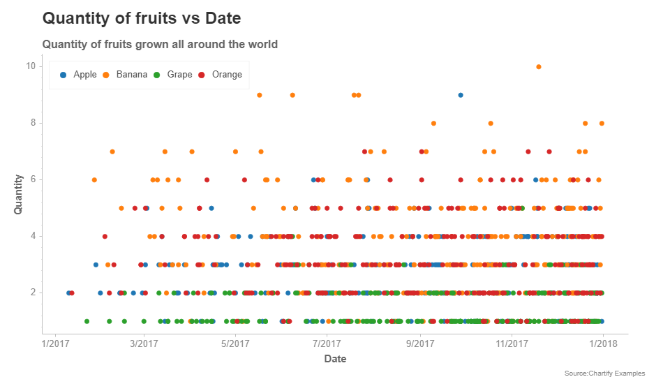
Scatter Plot
Thus, we have built a simple scatter plot. Now let’s make a histogram using the same dataset. Let’s plot a histogram that visualizes the density of data with respect to quantity.
Python3
ch = chartify.Chart(y_axis_type='density')
|
To plot the histogram we are going to use the histogram method. Just like the scatter plot, even the histogram takes in a data_frame argument. color_column and color_order work in the same way as it did in the scatter plot. The method argument takes in a method and calculates the density of the graph on that basis. The count is the default method.
Syntax: histogram(data_frame, values_column, color_column=None, color_order=None, method=’count’, bins=’auto’)
Now let’s set the attributes of our chart.
Python3
ch.set_title("Quantity vs Count")
ch.axes.set_xaxis_label("Quantity")
ch.axes.set_yaxis_label("Count")
ch.set_source_label("Source:Chartify Examples")
|
Now let’s plot the histogram using the method mentioned earlier.
Python3
ch.plot.histogram(data_frame=data, values_column='quantity')
ch.show()
|
Output:
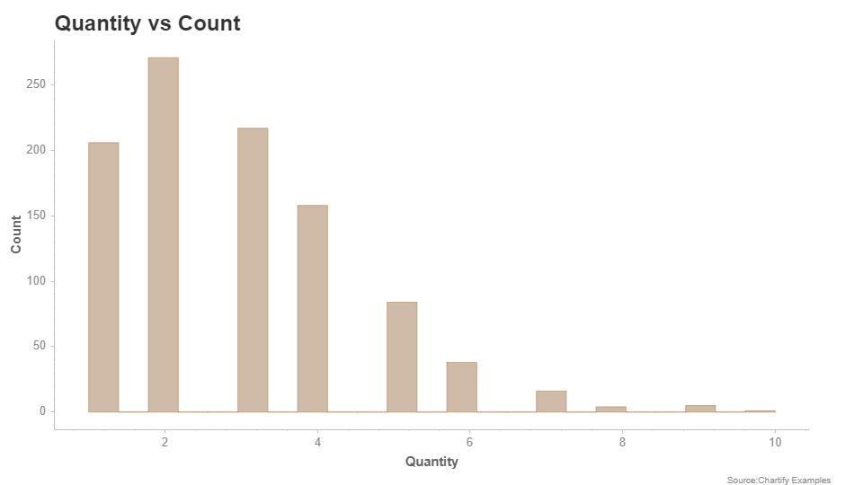
Histogram
Thus, in this article, we have plotted a histogram and a scatter plot using Spotify’s Chartify. This is just a beginner article and the same knowledge can be extended further to build more complex visualizations.
Like Article
Suggest improvement
Share your thoughts in the comments
Please Login to comment...