Histograms are graphical representations of data distributions, where data is divided into equal intervals called bins and the number of data points falling in each bin is represented by a bar. Histograms are useful for understanding the shape of the data distribution, identifying outliers, and finding patterns or trends.ggplot2 is a plotting package that provides helpful commands to create complex plots from data in a data frame For a detailed explanation of ggplot2 check Data visualization with R and ggplot2.
The R ggplot2 plotting system’s extensions and functionalities are contained in the ggExtra package. It offers additional features to improve the visualizations made using ggplot2. The package includes ggMarginal(), a function that adds marginal density plots or histograms to a ggplot2 scatterplot.
The ggMarginal() function takes a ggplot2 object as its input and adds marginal density plots or histograms to it. The marginal plots show the data distribution along each of the X and Y axes. The function can be used to add either density plots or histograms to the marginal areas, depending on the data and the desired visualization.
The differences between regular histograms and marginal histograms:
Plotting the frequency of one variable along one axis yields a regular histogram. A continuous or categorical variable can be used. The plot that results displays the data distribution for that variable down the axis, with the height of the bars denoting the frequency of data points falling in each bin.
On the other hand, marginal histograms are produced by extending additional histograms outside the borders of a scatterplot. The link between two variables can be visualized using marginal histograms. They offer a method for seeing the scatterplot’s x and y axes and the distribution of the data for each variable.
In a scatterplot with marginal histograms, the main plot area shows the relationship between the two variables, while the marginal histograms show the distribution of the data for each variable. The histograms in the margins are created by calculating the frequency of data points for each variable separately along the corresponding axis.
The main differences between regular histograms and marginal histograms are:
- While marginal histograms plot the frequency of each variable separately along the corresponding axis of a scatterplot, regular histograms plot the frequency of a single variable.
- Marginal histograms are helpful for illustrating the link between two variables and their respective distributions, whereas regular histograms are beneficial for comprehending the distribution of a single variable.
- Regular histograms use a single axis to display the frequency of data points for a single variable, whereas marginal histograms display the frequency of data points for each variable separately using extra axes.
Installation:
First, let’s install and load the ggplot2 and ggExtra packages:
install.packages("ggplot2")
install.packages("ggExtra")
You can also download the latest development version from GitHub:
install.packages("devtools")
devtools::install_github("daattali/ggExtra")
R uses the function ggMarginal() to marginal histogram charts.
The primary function of the code using ggMarginal() is to create a scatterplot with marginal histograms or density plots that show the distribution of data for each variable along the x and y axes. This can help to visualize the relationship between two variables and better understand their distributions.
Sytax:
ggMarginal( p, data, x, y, type = c("density", "histogram", "boxplot", "violin", "densigram"), margins = c("both", "x", "y"), size = 5, ..., xparams = list(), yparams = list(), groupColour = FALSE,  groupFill = FALSE )

Parameters:
P: A ggplot2 scatterplot to add marginal plots to. If p is not provided, then all of the data, x, and y must be provided.
data: The data.frame to use for creating the marginal plots. Ignored if p is provided.
x: The name of the variable along the x-axis. Ignored if p is provided.
y: The name of the variable along the y-axis. Ignored if p is provided.
type.arg: What type of marginal plot to show? One of [density, histogram, boxplot, violin, densigram] (a "densigram" is when a density plot is overlaid on a histogram).
margins: Along which margins to show the plots. One of: [both, x, y].
size: Integer describing the relative size of the marginal plots compared to the main plot. A size of 5 means that the main plot is 5x wider and 5x taller than the marginal plots.
...,: Extra parameters to pass to the marginal plots. Any parameter that geom_line(), geom_histogram(), geom_boxplot(), or geom_violin() accepts can be used. For example, color = "red" can be used for any marginal plot type, and binwidth = 10 can be used for histograms.
xparams: List of extra parameters to use only for the marginal plot along the x-axis.
yparams: List of extra parameters to use only for the marginal plot along the y-axis.
groupColor: If TRUE, the color (or outline) of the marginal plots will be grouped according to the variable mapped to color in the scatter plot. The variable mapped to color in the scatter plot must be a character or factor variable. See the examples below.
groupFill: If TRUE, the fill of the marginal plots will be grouped according to the variable mapped to color in the scatter plot. The variable mapped to color in the scatter plot must be a character or factor variable. See the examples below.
Next, we’ll create a sample data set:
R
p <- ggplot(mtcars, aes(wt, mpg)) + geom_point()
ggMarginal(p)
|
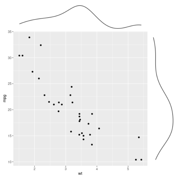
Normal ggMarginal Plot
As a simple first example, let’s create a dataset with 500 points where the x values are normally distributed and the y values are uniformly distributed, and plot a simple ggplot2 scatterplot.
R
set.seed(123)
df <- data.frame(x = rnorm(500, 50, 10), y = runif(500, 0, 50))
p2 <- ggplot(df, aes(x, y)) + geom_point()
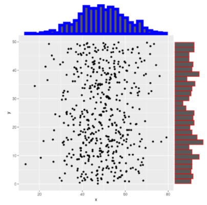
ggMarginal(p2, type = "histogram")
|
This will create a scatterplot with marginal histograms on the X and Y axes:
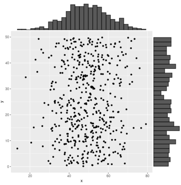
marginal histogram
Code Description:
- The first two lines of code load the required packages, ggplot2, and ggExtra, into the R environment.
- The next step creates a sample dataset with two variables, x, and y, each with 100 observations. The set.seed(123) function sets the random number generator seed to ensure that the data is reproducible.
- The next step creates a scatterplot of the data using ggplot2. The ggplot() function initializes the plot, data specifies the dataset to use, and aes() specifies the aesthetic mapping of the x and y variables to the plot.
- The geom_point() function is added to the plot to specify the type of plot to create. This creates a scatterplot of the data points.
- Finally, the ggMarginal() function is used to add marginal histograms or density plots to the scatterplot. The p argument specifies the plot to add the marginal histograms or density plots to, type = “histogram” specifies that we want to add histograms to the marginal areas, and margins = “both” specifies that we want to add histograms to both the x and y axes. Other options for the type argument include “density” and “boxplot”, and other options for the margins argument include “x”, “y”, and “none”.
You can customize the appearance of the scatterplot and the histograms by adding additional ggplot2 layers and modifying the ggMarginal() function arguments.
R
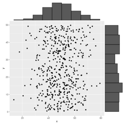
ggMarginal(p2,type="histogram", size = 2)
|
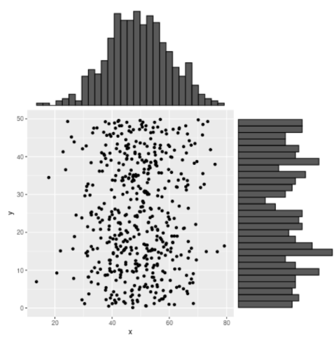
marginal histogram
In the above example, size = 2 means that the main scatterplot should occupy twice as much height/width as the margin plots (default is 5). The col and fill parameters are simply passed to the ggplot layer for both margin plots.
If you want to specify some parameter for only one of the marginal plots, you can use the xparams or yparams parameters, like this:
R
ggMarginal(p2, colour = "red", xparams = list(colour = "blue", size = 3))
ggMarginal(p2,type="histogram", size = 3,colour = "red",
xparams = list(colour = "blue", size = 3))
|
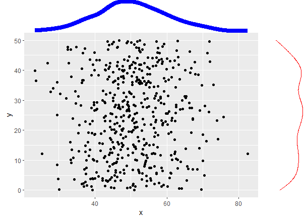
marginal histogram
marginal histogram
you can change the size of the histogram with the help of the bandwidth parameter:
R
ggMarginal(p2, type = "histogram", bins = 10)
|
histogram bandwidth of 10
you can change the histogram colors and add transparency to the scatterplot:
R
p <- ggplot(df, aes(x = x, y = y)) +
geom_point(alpha = 0.5) +
theme_bw() +
labs(x = "X Axis", y = "Y Axis", title = "Scatterplot with Marginal Histograms")
ggMarginal(p, type = "histogram", bins = 10, fill = "steelblue", alpha = 0.5)
|
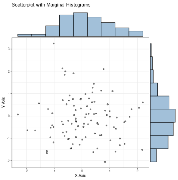
scatterplot with marginal histograms
This will create a scatterplot with marginal histograms that have different colors and transparency:
You can also create other types of marginal plots, such as density plots or box plots, using the ggExtra package. Simply change the type argument in the ggMarginal() function to the desired plot type.
Share your thoughts in the comments
Please Login to comment...