Draw Multiple Overlaid Histograms with ggplot2 Package in R
Last Updated :
13 Jun, 2023
In this article, we are going to see how to draw multiple overlaid histograms with the ggplot2 package in the R programming language.
To draw multiple overlaid histograms with the ggplot2 package in R, you can use the geom_histogram() layer multiple times, each with different data and mapping specifications.
Here is an example to create multiple histograms with different fill colors:
set.seed(123)
data1 <- rnorm(100, mean = 5, sd = 1)
data2 <- rnorm(100, mean = 7, sd = 2)
data3 <- rnorm(100, mean = 9, sd = 1.5)
# Create a ggplot object
p <- ggplot() +
 geom_histogram(aes(x = data1, fill = "data1"), alpha = 0.5) +
 geom_histogram(aes(x = data2, fill = "data2"), alpha = 0.5) +
 geom_histogram(aes(x = data3, fill = "data3"), alpha = 0.5) +
 scale_fill_manual(values = c("data1" = "red", "data2" = "green", "data3" = "blue")) +
 labs(title = "Multiple Overlaid Histograms", x = "Value", y = "Frequency")
# Show the plot
p
In this example, the geom_histogram() layer is used three times, each with different sample data (data1, data2, and data3). The fill aesthetic is mapped to a categorical variable (“data1”, “data2”, “data3”) to differentiate the histograms. The scale_fill_manual() function is used to set the fill colors for each category. The labs() function is used to add a title and axis labels to the plot.
You can also adjust the binwidth, color, and transparency of the histograms to achieve the desired visualization.
We will be drawing multiple overlaid histograms using the alpha argument of the geom_histogram() function from the ggplot2 package. In this approach for drawing multiple overlaid histograms, the user first needs to install and import the ggplot2 package on the R console and call the geaom_histogram function by specifying the alpha argument of this function to a float value between 0 to 1 which will lead to the transparency of the different histogram plots on the same plot with the set of the data-frame as this function parameter to get multiple overlaid histograms in the R programming language.
geom_histogram() function: This function is an in-built function of ggplot2 module.
Syntax: geom_histogram(mapping = NULL, data = NULL, stat = “bin”, position = “stack”, …)
Parameters:
- mapping: The aesthetic mapping, usually constructed with aes or aes_string. Only needs to be set at the layer level if you are overriding the plot defaults.
- data: A layer-specific dataset – only needed if you want to override the plot defaults.
- stat: The statistical transformation to use on the data for this layer.
- position: The position adjustment to use for overlapping points on this layer
To install and import the ggplot2 package in the R console, the user needs to follow the following syntax:
install.packages("ggplot2")
library("ggplot2")
The alpha argument: This is a graphical parameter is a number from 0 to 1 opaque to transparent, it adjusts the transparency of the plot.
Example 1:
In this example, we will be taking 2 different 100 random data set to create 2 different histograms on the single plot using the alpha argument of the geom_histogram() function from the ggplot2 package in the R programming language.
R
library("ggplot2")
data <- data.frame(values = c(rnorm(100),
rnorm(100)),
group = c(rep("A", 100),
rep("B", 100)))
ggplot(data, aes(x = values, fill = group)) +
geom_histogram(position = "identity", alpha = 0.4, bins = 50)
|
Output:
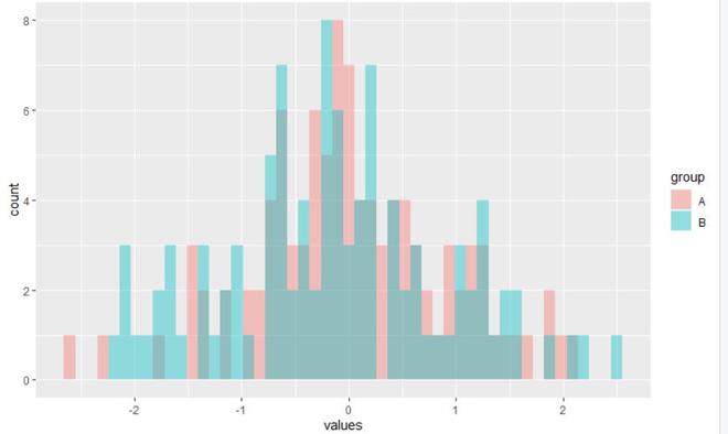
Multiple Overlaid Histograms with ggplot2 Package in R
- The ggplot2 library must be loaded in the first line before any plots can be produced.
- The data. frame() function is then used to build a dataset named data. “Values” and “Group” are two columns in this dataset. The “group” column uses rep() to assign the value “A” to the first 100 values and “B” to the following 100 values, while the “values” column is created by concatenating two sets of 100 random normal values using rnorm().
- The plot is initialized using the ggplot() function. The aes() function is used to set the aesthetic mappings and the dataset data is supplied as the data source. The “values” column is assigned to the x-axis by the formula x = values, and the “group” column is given the fill color of the histogram bars by the formula fill = group.
- The histograms are produced by adding the geom_histogram() layer. The histograms are not stacked but rather are superimposed immediately on top of one another thanks to the position = “identity” parameter. The histogram bars’ transparency level is set to 0.4 (40% opaque) via the alpha = 0.4 option. The histogram’s number of bins (intervals) is specified by the bins = 50 option.
- The resulting figure will show the two groups’ histograms overlayed on top of one another, with the bars’ fill colors reflecting the groups. You can modify the transparency and bin settings to suit your tastes.
Example 2:
In this example, we will be taking 3 different data to create 3 different histograms on a single plot using the alpha argument of the geom_histogram() function from the ggplot2 package in the R programming language.
R
library("ggplot2")
data <- data.frame(values = c(c(6,2,5,4,1,6,1,5,4,7),
c(4,1,4,4,5,5,4,6,2,4),
c(9,1,5,7,1,10,6,4,1,7)),
group = c(rep("A", 10),
rep("B", 10),
rep("C", 10)))
ggplot(data, aes(x = values, fill = group)) +
geom_histogram(position = "identity", alpha = 0.4, bins = 50)
|
Output:
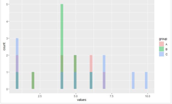
Multiple Overlaid Histograms with ggplot2 Package in R
Example 3:
R
library(ggplot2)
data <- data.frame(values = c(rnorm(100),
rnorm(100)),
group = c(rep("A", 100),
rep("B", 100)))
ggplot(data) +
geom_histogram(aes(x = values, fill = group),
binwidth = 0.5,
alpha = 0.5,
position = "identity") +
labs(title = "Overlaid Histograms",
x = "Values",
y = "Frequency") +
scale_fill_manual(values = c("A" = "blue", "B" = "green"))
|
Output:

Multiple Overlaid Histograms with ggplot2 Package in R
- Geom_histogram (aes (x = values, fill = group), bin width [0.5], alpha [0.5], position [“identity”)]): Additional parameters for the geom_histogram() layer are specified in the code that is placed after the ggplot() line.
aes(x=values, fill=group) The aesthetic mappings are set using the aes() function. The “values” column is assigned to the x-axis by the formula x = values, and the “group” column is given the fill color of the histogram bars by the formula fill = group.
- binwidth = 0.5: The width of each bin (interval) in the histogram is determined by this parameter. It is set to 0.5 in this instance.
- alpha = 0.5: The histogram bars’ transparency level is determined by the alpha parameter. The bars are 50% opaque with the value set to 0.5.
- position = “identity”: To ensure that the histograms are superimposed directly on the background, the position option is set to “identity.”.
- scale_fill_manual (values = c(“A” = “blue”, “B” = “green”) The fill colors for each group are individually specified using the scale_fill_manual() method.
- values = c(“A” = “blue”, “B” = “green” Each group’s fill color is set with this. The color “blue” is assigned to group “A,” whereas the color “green” is given to group “B.”
You can change the appearance of the histogram by adding these lines of code, which allow you to control the bin width, transparency, location, title, axis labels, and fill colors for each group.
In the final plot, the histograms for the two groups are displayed overlaid, with the bars having the desired fill colors, a translucent look, and the pertinent labels and titles.
Like Article
Suggest improvement
Share your thoughts in the comments
Please Login to comment...