R ggplot2 – Marginal Plots
Last Updated :
13 Jun, 2023
A marginal plot is a scatterplot that has histograms, boxplots, or dot plots in the margins of the x- and y-axes. It allows studying the relationship between 2 numeric variables. The base plot visualizes the correlation between the x and y axes variables. It is usually a scatterplot or a density plot. The marginal charts are commonly plotted on the top and right margin of the base plot and they show the distribution of x and y axes variables using a histogram, barplot, or density plot. This helps us to visualize the distribution intensity at different values of variables along both axes.
To plot a marginal plot in the R Language, we will use the ggExtra package of the R Language. The ggExtra is a collection of functions and layers to enhance ggplot2. The ggMarginal() function can be used to add marginal histograms/boxplots/density plots to ggplot2 scatterplots.
Installation:
To install the ggExtra package we use:
install.packages("ggExtra")
Creation of Marginal plots
To create marginal plots we use the following function to make a marginal histogram with a scatter plot.
Syntax: ggMarginal( plot, type )
Parameters:
- plot: Determines the base scatter plot over which marginal plot has to be added.
- type: Determines the type of marginal plot i.e. histogram, boxplot and density.
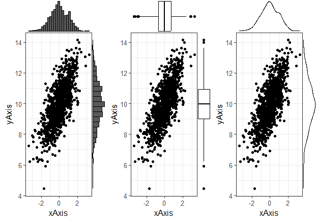
Example: Basic scatter plot with marginal histogram, density plot, and box plot all arranged on a page using the grid.arrange() function of the ggExtra package.
R
library(tidyverse)
library(ggExtra)
library(gridExtra)
theme_set(theme_bw(12))
xAxis <- rnorm(1000)
yAxis <- rnorm(1000) + xAxis + 10
sample_data <- data.frame(xAxis, yAxis)
plot <- ggplot(sample_data, aes(x=xAxis, y=yAxis))+
geom_point()+
theme(legend.position="none")
plot1 <- ggMarginal(plot, type="histogram")
plot2 <- ggMarginal(plot, type="boxplot")
plot3 <- ggMarginal(plot, type="density")
grid.arrange( plot1, plot2, plot3, ncol=3)
|
Output:
Marginal Plots using ggplot2
- The code begins by loading the required packages: tidyverse for data manipulation, ggExtra for additional ggplot functionalities, and gridExtra for arranging multiple plots in a grid.
- The theme_set() function sets the theme to “theme_bw” with a base font size of 12, determining the visual style of the plots.
- Two vectors, xAxis and yAxis, are created using the rnorm() function. These vectors represent the x and y coordinates for the scatter plot.
- A sample data frame named sample_data is created using the data.frame() function, combining the xAxis and yAxis vectors.
- The ggplot() method is used to produce the scatter plot. The aes() function is used to map the xAxis variable to the x-axis and the yAxis variable to the y-axis. The sample_data data frame is supplied as the data source. The scatter plot’s data points are represented by additional points added using the geom_point() function.
- To alter the plot’s visual style, use the theme() function. Legend. position = “none” is used in this instance to remove the legend from the plot.
- Three further plots are produced using the ggMarginal() function from the ggExtra package: plot1, plot2, and plot3. The type option is set to “density” for plot 3, “boxplot” for plot 2, and “histogram” for plot1. Based on the data, these functions produce density plots, boxplots, and marginal histograms, respectively.
- The plots of a grid are combined using the grid.arrange() function from the gridExtra library. Plot1, Plot2, and Plot3 are supplied as parameters, and ncol = 3 indicates that the grid should contain three columns.
The scatter plot with marginal histograms, scatter plot with marginal boxplots, and scatter plot with marginal density plots are included in the final grid of plots, which is shown.
Color and size customization
We can customize the parameter of the gg-marginal () function to create the desired look for our marginal plot. We can use the size, fill, and color parameter of the gg-marginal () function to change the relative size, background fill color, and routine color of the marginal plot respectively.
Syntax: ggMarginal( plot, type, fill, color, size )
Parameters:
- plot: Determines the base scatter plot over which marginal plot has to be added.
- type: Determines the type of marginal plot i.e. histogram, boxplot, and density.
- fill: Determines the background fill color of the marginal plot
- color: Determines the outline color of the marginal plot
- size: determines the relative size of plot elements.
Example: Here, we have modified the plot from the above example with custom colors and size parameters.
R
library(tidyverse)
library(ggExtra)
library(gridExtra)
theme_set(theme_bw(12))
xAxis <- rnorm(1000)
yAxis <- rnorm(1000) + xAxis + 10
sample_data <- data.frame(xAxis, yAxis)
plot <- ggplot(sample_data, aes(x=xAxis, y=yAxis))+
geom_point()+
theme(legend.position="none")
plot1 <- ggMarginal(plot, type="histogram", fill= "green", size=10)
plot2 <- ggMarginal(plot, type="boxplot", color="yellow" )
plot3 <- ggMarginal(plot, type="density", color="green")
grid.arrange( plot1, plot2, plot3, ncol=3)
|
Output:

Marginal Plots using ggplot2
- The necessary libraries, tidyverse, gridExtra, and ggExtra, are loaded in the first three lines.
- The theme of the plots is set to a black and white theme with a base font size of 12 by the theme_set(theme_bw(12)) line.
- xAxis and yAxis are two vectors produced by the rnorm function. The yAxis vector is created by summing the values from xAxis and adding 10 to each value, whereas the xAxis vector contains 1000 random integers drawn from a typical normal distribution.
- The data. frame function is used to build the sample_data data frame, containing the columns xAxis and yAxis.
- The ggplot function from ggplot2 is used to build the plot object. It states that the x values are taken from the sample_data’s xAxis column and the y values are taken from the yAxis column. The data points are plotted in a scatter plot using the geom_point function. The legend is dropped from the story by setting the legend. position to “none” in the theme function.
- Three extra plots are made using the plot object and the ggMarginal method from ggExtra. With “histogram” as the type, “green” as the fill color, and “10” as the point size, the initial call to ggMarginal generates a marginal plot of a histogram. The second call constructs a boxplot as a marginal plot with “boxplot” as the type and “yellow” as the color. The third function generates a density plot as a marginal plot with “density” as the type and “green” as the color.
The grid is created by combining the four plots (plot 1, plot 2, plot 3, and plot) using the grid. arrange function from gridExtra. To arrange the plots in a row, the ncol option is set to 3.
Marginal plot for only one axis
Sometimes we need a marginal plot at only one axis either the x-axis or the y-axis. In that situation, we use the margins parameter of the gg-marginal () function. The axis where we want the marginal plot to appear is given as the value of argument margins.
Syntax: ggMarginal( plot, type, margins )
Parameters:
- plot: Determines the base scatter plot over which marginal plot has to be added.
- type: Determines the type of marginal plot i.e. histogram, boxplot, and density.
- margins: Determines the axis where the marginal plot is required
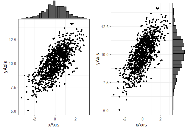
Example: Here, are two plots one with the marginal plot on the x-axis other on the y-axis.
R
library(tidyverse)
library(ggExtra)
library(gridExtra)
theme_set(theme_bw(12))
xAxis <- rnorm(1000)
yAxis <- rnorm(1000) + xAxis + 10
sample_data <- data.frame(xAxis, yAxis)
plot <- ggplot(sample_data, aes(x=xAxis, y=yAxis))+
geom_point()+
theme(legend.position="none")
plot1 <- ggMarginal(plot, type="histogram", margins='x')
plot2 <- ggMarginal(plot, type="histogram", margins='y')
grid.arrange( plot1, plot2, ncol=2)
|
Output:
Marginal Plots using ggplot2
- xAxis and yAxis are two vectors produced by the rnorm function. The yAxis vector is created by summing the values from xAxis and adding 10 to each value, whereas the xAxis vector contains 1000 random integers drawn from a typical normal distribution.
- The data. frame function is used to build the sample_data data frame, containing the columns xAxis and yAxis.
- The ggplot function from ggplot2 is used to build the plot object. It states that the x values are taken from the sample_data’s xAxis column and the y values are taken from the yAxis column. The data points are plotted in a scatter plot using the geom_point function. The legend is dropped from the story by setting the legend. position to “none” in the theme function.
- The two more plots are built using the plot object and the ggMarginal method from ggExtra. With the type set to “histogram” and the margins parameter set to “x,” the initial call to ggMarginal generates a marginal histogram on the x-axis. With the type set to “histogram” and the margins parameter set to “y,” the second function generates a marginal histogram on the y-axis.
The two plots (plot 1 and plot 2) are combined into a grid using the grid. arrange function from gridExtra. The plots are organized in 2 columns using the ncol option, which is set to 2.
Share your thoughts in the comments
Please Login to comment...