React styled-components Module
Last Updated :
10 Nov, 2023
React Styled-component Module allows us to write CSS within JavaScript in a very modular and reusable way in React. Instead of having one global CSS file for a React project, we can use styled-component to enhance the developer experience. It also removes the mapping between components and styles – using components as a low-level styling construct
Features of styled-component:
- Automatic vendor prefixing
- Replacement of writing style prop everywhere.
- Support for media query (unlike style prop).
- Easy to maintain
Prerequisites:
Approach:
React-styled component is used to create react-reusable components with defined CSS. These components are created using JavaScript syntax with styling in multiline strings. Here’s an example to do it.
Steps to create React Application And Installing Module:
Step 1: Create a React application using the following command:
npx create-react-app styled
Step 2: After creating your project i.e. styled, move to the same directory:
cd styled
Step 3: Use the command given below to install styled-components in your React application.
With npm:
npm i --save styled-components
With yarn:
yarn add styled-components
Project Structure:

Project Structure
The updated dependencies in package.json file will look like.
"dependencies": {
        "@testing-library/jest-dom": "^5.17.0",
        "@testing-library/react": "^13.4.0",
        "@testing-library/user-event": "^13.5.0",
        "react": "^18.2.0",
        "react-dom": "^18.2.0",
        "react-scripts": "5.0.1",
        "styled-components": "^6.1.0",
        "web-vitals": "^2.1.4"
}
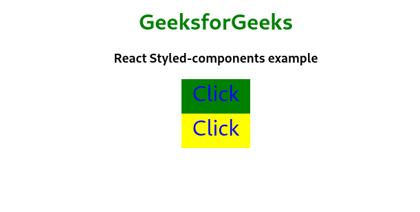
Example: This example shows simple inplementation of styled-components to create reusable button components with paramete background color.
Javascript
import Button from "./Button";
function App() {
return (
<div
style={{
textAlign: "center",
margin: "auto",
}}
>
<h1 style={{ color: "green" }}>
GeeksforGeeks
</h1>
<h3>React Styled-components example</h3>
<Button bg="green"> Click </Button>
<Button bg="yellow"> Click </Button>
</div>
);
}
export default App;
|
Javascript
import styled from "styled-components";
const Button = styled.div`
height: 50px;
width: 100px;
cursor: pointer;
text-decoration: none;
color: blue;
background-color: ${(props) =>
props.bg === "green" ? "green" : "yellow"};
margin: auto;
font-size: 2rem;
`;
export default Button;
|
Step to Run Application: Run the application using the following command from the root directory of the project:
npm start
Output: Now open your browser and go to http://localhost:3000/, you will see the following output:
Share your thoughts in the comments
Please Login to comment...