React MUI Styled Engine
Last Updated :
17 Feb, 2023
The Material UI library provides a way to style applications using material design principles. The “Styled Engine” refers to the way that Material UI allows you to customize the styles of your components using a CSS-in-JS approach, which involves writing JavaScript objects that represent CSS styles.
The Material UI Styled Engine is built on top of the JSS (JavaScript Style Sheets) library, which provides a way to define styles using JavaScript. When you use the Material UI Styled Engine, you can write styles that are automatically scoped to the components that you are styling, which helps to prevent style collisions and makes it easier to manage your styles.
Syntax: The syntax of the Material UI Styled Engine is based on the JSS (JavaScript Style Sheets) library, which provides a way to define styles using JavaScript.
In JSS, you define styles as JavaScript objects, where each key represents a CSS class, and the value is an object that defines the styles for that class. You can use JavaScript expressions within your styles to create dynamic styles, such as using variables or computed values.
const useStyles = makeStyles({
    root: {
        background: "linear-gradient(45deg, #FE6B8B 30%, #FF8E53 90%)",
        color: "white",
        height: 48,
        padding: "0 30px"
    }
});
Installing React App:
Step 1: Create a React app using the following command.
npx create-react-app mui-example
Step 2: Now get into the project directory
cd mui-example
Installing Material-UI: Installing Material-UI’s source files via npm/yarn, and they take care of injecting the CSS needed.
npm install @material-ui/core
OR
yarn add @material-ui/core
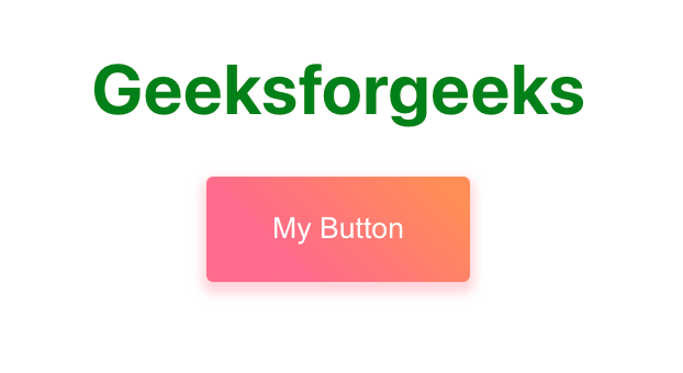
Example 1: Using the Material UI Styled Engine to style a button component.
App.js
Javascript
import { makeStyles } from "@material-ui/core/styles";
const useStyles = makeStyles({
root: {
textAlign: "center",
marginTop: "50px",
},
btn: {
background: "linear-gradient(45deg, #FE6B8B 30%, #FF8E53 90%)",
border: 0,
borderRadius: 3,
boxShadow: "0 3px 5px 2px rgba(255, 105, 135, .3)",
color: "white",
height: 48,
padding: "0 30px",
},
header: {
color: "green",
},
});
function App() {
const classes = useStyles();
return (
<div className={classes.root}>
<h1 className={classes.header}>Geeksforgeeks</h1>
<button className={classes.btn}>My Button</button>
</div>
);
}
export default App;
|
Output:
React MUI Styled Engine
In the above example, the makeStyles function is used to create a useStyles hook that returns an object with the styles for the button component. The root style is applied to the container and btn style is applied to the button using the className prop.
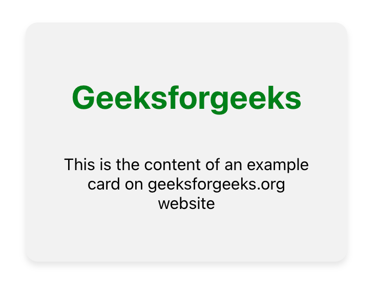
Example 2: Another example of using the Material UI Styled Engine to style a component. This time, let’s style a custom card component.
App.js
Javascript
import { makeStyles } from "@material-ui/core/styles";
const useStyles = makeStyles({
root: {
textAlign: "center",
margin: "50px 250px",
},
card: {
background: "#f2f2f2",
borderRadius: 12,
boxShadow: "0 4px 6px rgba(0, 0, 0, 0.1)",
display: "flex",
flexDirection: "column",
maxWidth: "250px",
padding: 32,
},
header: {
color: "green",
},
content: {
flex: 1,
fontSize: 16,
},
});
function App() {
const classes = useStyles();
return (
<div className={classes.root}>
<div className={classes.card}>
<h1 className={classes.header}>
Geeksforgeeks
</h1>
<p className={classes.content}>
This is the content of an example
card on geeksforgeeks.org website
</p>
</div>
</div>
);
}
export default App;
|
Output:
React MUI Styled Engine
In this example, the useStyles hook returns an object with styles for the custom card component. The root style is applied to the main container div, while the header and content styles are applied to the h1 and p elements, respectively.
Reference: https://material-ui.com/styles/api/#makestyles-styles-options-hook
Share your thoughts in the comments
Please Login to comment...