React Native Animated Fade In Fade Out Effect
Last Updated :
05 Oct, 2023
In this article, we will dwell on the implementation of fade-in and fade-out effects in React Native using the Animated module.
The fade-in and fade-out effect, a timeless animation technique utilized to seamlessly transition an element from invisibility to visibility and vice versa, holds a significant place in the animations.
Pre-requisites
- Introduction to React Native
- React Native Components
- React Hooks
- Expo CLI
- Node.js and npm (Node Package Manager)
Steps to Create a React Native Application
Step 1: Create a react native application by using this command
npx create-expo-app <<Project-Name>>
Step 2: After creating your project folder, i.e. react-native-reanimated, use the following command to navigate to it:
cd <<Project-Name>>
Project Structure
The project structure will look like this.
.png)
Approach 1: Using react-native-reanimated library
In this approach, we will use the react-native-reanimated library to create fadeIn and fadeOut effects in a React Native app. To achieve this, an animated Value is initialized to represent opacity. When the respective button is pressed, the set function updates its value, resulting in smooth transitions between opacity values and the desired fade-in and fade-out animations.
To install the react-native-reanimated library use the following command
npm install react-native-reanimated
package.json for libraries and dependency versions.
{
    "dependencies": {
        "react-native-paper": "4.9.2",
        "@expo/vector-icons": "^13.0.0",
        "react-native-reanimated": "^3.5.0",
    }
}
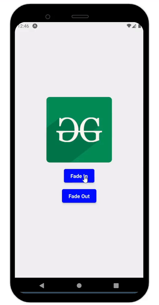
Example 1: In this React Native example, an engaging fade-in and fade-out effect is demonstrated using a clickable button. The animation state is managed by a react-native-reanimated called ‘App,’ which effectively utilizes the Animated module to control the opacity of an image, creating a smooth fading transition. When the user presses the “Fade In” button, the image gradually appears, while pressing “Fade Out” causes it to fade away. This interactive demonstration showcases an appealing visual experience within a container featuring rounded corners, button shadow, and text color and a light blue background.
Javascript
import React from "react";
import {
View,
Text,
TouchableOpacity,
StyleSheet,
Image,
} from "react-native";
import Animated, {
useSharedValue,
withTiming,
Easing,
useAnimatedStyle,
} from "react-native-reanimated";
const App = () => {
const fadeInOpacity = useSharedValue(0);
const fadeIn = () => {
fadeInOpacity.value = withTiming(1, {
duration: 1000,
easing: Easing.linear,
});
};
const fadeOut = () => {
fadeInOpacity.value = withTiming(0, {
duration: 1000,
easing: Easing.linear,
});
};
const animatedStyle = useAnimatedStyle(() => {
return {
opacity: fadeInOpacity.value,
};
});
const imageUrl =
return (
<View style={styles.container}>
<Animated.View
style={[
styles.imageContainer,
animatedStyle,
]}
>
<Image
source={{ uri: imageUrl }}
style={styles.image}
/>
</Animated.View>
<TouchableOpacity
onPress={fadeIn}
style={styles.button}
>
<Text style={styles.buttonText}>
Fade In
</Text>
</TouchableOpacity>
<TouchableOpacity
onPress={fadeOut}
style={styles.button}
>
<Text style={styles.buttonText}>
Fade Out
</Text>
</TouchableOpacity>
</View>
);
};
const styles = StyleSheet.create({
container: {
flex: 1,
alignItems: "center",
justifyContent: "center",
backgroundColor: "#f0f0f0",
},
imageContainer: {
alignItems: "center",
},
image: {
width: 200,
height: 200,
borderRadius: 10,
},
button: {
marginTop: 20,
backgroundColor: "blue",
paddingVertical: 10,
paddingHorizontal: 20,
borderRadius: 5,
shadowColor: "black",
shadowOffset: { width: 0, height: 2 },
shadowOpacity: 0.4,
shadowRadius: 4,
elevation: 4,
},
buttonText: {
color: "white",
fontWeight: "bold",
fontSize: 16,
},
});
export default App;
|
Steps to Run
To run react native application use the following command:
npx expo start
npx react-native run-android
npx react-native run-ios
Output:
Approach 2: Using react-native-animatable Library
In this approach, we’ll use the `react-native-animatable` library to introduce fadeIn and fadeOut effects within a React Native application. This technique involves enclosing the desired component with an `Animatable.View` as well as utilizing functions such as `fadeIn` and `fadeOut`. By pressing the corresponding button, these animations are triggered, modifying the component’s opacity.
To install the react-native-animatable library use the following command
npm install react-native-animatable
package.json
{
    "dependencies": {
        "react-native-paper": "4.9.2",
        "@expo/vector-icons": "^13.0.0",
        "react-native-animatable": "*"
    }
}
Example: In this Example, the ‘App’ utilizes a functional component with hooks to manage the animation state. By leveraging the react-native-animatable module, the opacity of a visually appealing card containing a heading and paragraph. When users click on the “Fade In” button, they can smoothly reveal the card, whereas clicking on the “Fade Out” button makes it disappear.
Javascript
import React, { useState } from "react";
import {
View,
Text,
TouchableOpacity,
StyleSheet,
} from "react-native";
import * as Animatable from "react-native-animatable";
const App = () => {
const [isContentVisible, setIsContentVisible] =
useState(false);
const fadeIn = () => {
setIsContentVisible(true);
};
const fadeOut = () => {
setIsContentVisible(false);
};
return (
<View style={styles.container}>
<Animatable.View
animation={
isContentVisible ? "fadeIn" : "fadeOut"
}
duration={1000}
style={styles.card}
>
<Text style={styles.heading}>
Welcome to Geeksforgeeks!!
</Text>
<Text style={styles.paragraph}>
A Computer Science portal for geeks. It
contains well-written, well-thought, and
well-explained computer science and
programming articles.
</Text>
</Animatable.View>
<TouchableOpacity
onPress={fadeIn}
style={styles.button}
>
<Text style={styles.buttonText}>
Fade In
</Text>
</TouchableOpacity>
<TouchableOpacity
onPress={fadeOut}
style={styles.button}
>
<Text style={styles.buttonText}>
Fade Out
</Text>
</TouchableOpacity>
</View>
);
};
const styles = StyleSheet.create({
container: {
flex: 1,
alignItems: "center",
justifyContent: "center",
backgroundColor: "#f0f0f0",
},
card: {
backgroundColor: "white",
padding: 20,
borderRadius: 10,
elevation: 4,
shadowColor: "black",
shadowOffset: { width: 0, height: 2 },
shadowOpacity: 0.2,
shadowRadius: 5,
alignItems: "center",
},
heading: {
fontSize: 20,
fontWeight: "bold",
marginBottom: 10,
color: "green",
},
paragraph: {
fontSize: 14,
textAlign: "center",
paddingHorizontal: 20,
color: "gray",
},
button: {
marginTop: 20,
backgroundColor: "green",
paddingVertical: 10,
paddingHorizontal: 20,
borderRadius: 5,
},
buttonText: {
color: "white",
fontWeight: "bold",
fontSize: 16,
},
});
export default App;
|
Output:

Share your thoughts in the comments
Please Login to comment...