React-Bootstrap Checks Radios
Last Updated :
06 Nov, 2023
In this article, we’ll learn about React-Bootstrap’s Checks and Radio components. Checks and Radios, in the context of React-Bootstrap, are specialized components tailored for managing user selections, with a primary focus on checkboxes and radio buttons.
Different Types of Checkboxes and Radio Buttons:
Default (Stacked) Radio Buttons: Radio buttons are used when you want the user to select one option from a list of choices. In React-Bootstrap, you can create a stacked set of radio buttons by using the Form.Check component.
Syntax:
<Form>
    <Form.Check
        type="*" />
<Form/>
Note: replace * with the radio/checkbox/switch
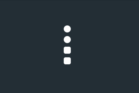
Example: Here’s an example of how to create a simple stacked radio button group using React-Bootstrap:
Javascript
import React from 'react';
import { Form } from 'react-bootstrap';
import './App.css'
function App() {
return (
<div className="App">
<Form>
<Form.Check
type="radio"
label="Default Radio"
name="radioGroup"
id="option1"
/>
<Form.Check
disabled
type="radio"
label="Disabled Radio"
name="radioGroup"
id="option2"
/>
<Form.Check
type="checkbox"
label="Default Checkbox"
name="checkboxGroup"
id="option3"
/>
<Form.Check
disabled
type="checkbox"
label="Disabled Checkbox"
name="checkboxGroup"
id="option4"
/>
</Form>
</div>
);
}
export default App;
|
CSS
.App {
background-color: #152128de;
color: white;
display: flex;
justify-content: center;
align-items: center;
height: 100vh;
}
|
Output:
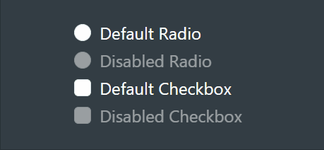
Output
Switches:
Switches, often called toggle switches, are vital UI components. They let users control binary states, like turning a feature on or off. They’re prevalent in modern web and mobile apps, providing a user-friendly way to interact with settings and choices, such as a simple “yes” or “no” selection.
Syntax:
<Form>
    <Form.Check
        type="switch" />
<Form/>
Example: Here’s an example of how to create a simple toggle switch button using React-Bootstrap:
Javascript
import React from 'react';
import Form from 'react-bootstrap/Form';
import "./App.css"
function App() {
return (
<div className='App'>
<Form>
<Form.Check
type="switch"
id="switch"
label="Turn this switch"
/>
<Form.Check
disabled
type="switch"
label="disabled switch"
id="disabled-switch"
/>
</Form>
</div>
);
}
export default App;
|
CSS
.App {
background-color: #152128de;
color: white;
display: flex;
justify-content: center;
align-items: center;
height: 100vh;
}
|
Output:
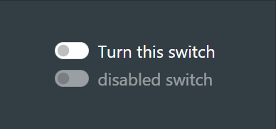
Output
Inline:
Creating inline radio buttons and checkboxes in React-Bootstrap is a straightforward way to display options side by side, which can be really handy when you want to conserve vertical space and create a more compact form or survey.
Syntax:
<Form>
    <Form.Check
        inline
        type="radio" />
<Form/>
Example: Here’s an example of how to create Inline radio buttons and checkboxes using React-Bootstrap:
Javascript
import React from 'react';
import { Form } from 'react-bootstrap';
import './App.css'
function App() {
return (
<div className="outer">
<div className='App'>
<h2 className='h2'>
Inline Radio Buttons
</h2>
<Form>
<Form.Check
inline
type="radio"
label="Option 1"
name="inlineRadioOptions"
id="inlineRadio1"
/>
<Form.Check
inline
type="radio"
label="Option 2"
name="inlineRadioOptions"
id="inlineRadio2"
/>
<Form.Check
inline
disabled
type="radio"
label="Option 3 (Disabled)"
name="inlineRadioOptions"
id="inlineRadio3"
/>
</Form>
<h2 className='h2'>
Inline Checkboxes
</h2>
<Form>
<Form.Check
inline
type="checkbox"
label="Checkbox 1"
id="inlineCheckbox1"
/>
<Form.Check
inline
type="checkbox"
label="Checkbox 2"
id="inlineCheckbox2"
/>
<Form.Check
inline
disabled
type="checkbox"
label="Checkbox 3 (Disabled)"
id="inlineCheckbox3"
/>
</Form>
</div>
</div>
);
}
export default App;
|
CSS
.outer {
display: flex;
align-items: center;
justify-content: center;
background-color: #152128f0;
height: 100vh;
color: rgb(191, 210, 210);
}
.App .h2 {
color: rgb(57, 217, 231);
}
|
Output:
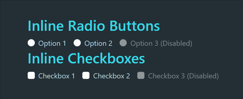
Output
Reverse:
Think of a typical set of radio buttons and checkboxes where users can choose only one or more option from a list. To reverse this order in React-Bootstrap, you can simply rearrange the code by just passing reverse prop Form.Check component.
Syntax:
<Form>
    <Form.Check
         reverse
         type="radio" />
<Form/>
Example: Here’s an example of how to create Reverse radio buttons and checkboxes using React-Bootstrap:
Javascript
import React from 'react';
import { Form } from 'react-bootstrap';
import './App.css'
function App() {
return (
<div className="outer">
<div className='App'>
<h2 className='h2'>Reverse Radio Buttons</h2>
<Form>
<Form.Check
reverse
type="radio"
label="Option 1"
name="ReverseRadioOptions"
id="ReverseRadio1"
/>
<Form.Check
reverse
type="radio"
label="Option 2"
name="ReverseRadioOptions"
id="ReverseRadio2"
/>
<Form.Check
reverse
disabled
type="radio"
label="Option 3 (Disabled)"
name="ReverseRadioOptions"
id="ReverseRadio3"
/>
</Form>
<h2 className='h2'>Reverse Checkboxes</h2>
<Form>
<Form.Check
reverse
type="checkbox"
label="Checkbox 1"
id="ReverseCheckbox1"
/>
<Form.Check
reverse
type="checkbox"
label="Checkbox 2"
id="ReverseCheckbox2"
/>
<Form.Check
reverse
disabled
type="checkbox"
label="Checkbox 3 (Disabled)"
id="ReverseCheckbox3"
/>
</Form>
</div>
</div>
);
}
export default App;
|
CSS
.outer {
display: flex;
align-items: center;
justify-content: center;
background-color: #152128f0;
height: 100vh;
color: rgb(191, 210, 210);
}
.App .h2 {
color: rgb(57, 217, 231);
}
|
Output:
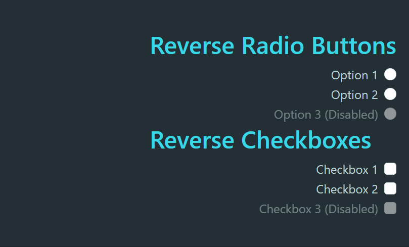
Output
Without labels:
Radio buttons and checkboxes without visible labels by excluding the label property or using an empty label.
Example: Here’s an example of how to create Without label radio buttons and checkboxes using React-Bootstrap:
Javascript
import React from 'react';
import { Form } from 'react-bootstrap';
import './App.css'
function App() {
return (
<div className="App">
<Form>
<Form.Check type="radio" name='radio' id="radio1" />
<Form.Check type="radio" name='radio' id="radio2" />
<Form.Check type="checkbox" id="radio3" />
<Form.Check type="checkbox" id="radio4" />
</Form>
</div>
);
}
export default App;
|
CSS
.App {
display: flex;
align-items: center;
justify-content: center;
background-color: #152128f0;
height: 100vh;
color: rgb(191, 210, 210);
}
|
Output:
Output
Customizing FormCheck rendering:
Customizing the rendering of Form.Check components in React-Bootstrap empowers you with the ability to tailor their appearance and functionality to match your unique design and user experience needs. This means you can take full control of how these form elements look and behave
Syntax:
<Form>
    <Form.Check
        type="radio"
        id="custom-radio" />
<Form/>
Example: Here’s an example of how to create Customizing FormCheck rendering radio buttons and checkboxes using React-Bootstrap:
Javascript
import React from 'react';
import { Form } from 'react-bootstrap';
import './App.css'
function CustomRadioAndCheckbox() {
return (
<div className="outer">
<div className='App'>
<h2>Custom Radio Button</h2>
<div className="mb-3">
<Form.Check type="radio"
id="custom-radio">
<Form.Check.Input
type="radio" isValid />
<Form.Check.Label>
Custom Radio Button
</Form.Check.Label>
<Form.Control.Feedback type="valid">
You did it!
</Form.Control.Feedback>
</Form.Check>
</div>
<h2>Custom Checkbox</h2>
<div className="mb-3">
<Form.Check type="checkbox"
id="custom-checkbox">
<Form.Check.Input
type="checkbox" isValid />
<Form.Check.Label>
Custom Checkbox
</Form.Check.Label>
<Form.Control.Feedback type="valid">
You did it!
</Form.Control.Feedback>
</Form.Check>
</div>
</div>
</div>
);
}
export default CustomRadioAndCheckbox;
|
CSS
.outer {
display: flex;
align-items: center;
justify-content: center;
background-color: #152128f0;
height: 100vh;
color: rgb(191, 210, 210);
}
.App .h2 {
color: rgb(57, 217, 231);
}
|
Output:
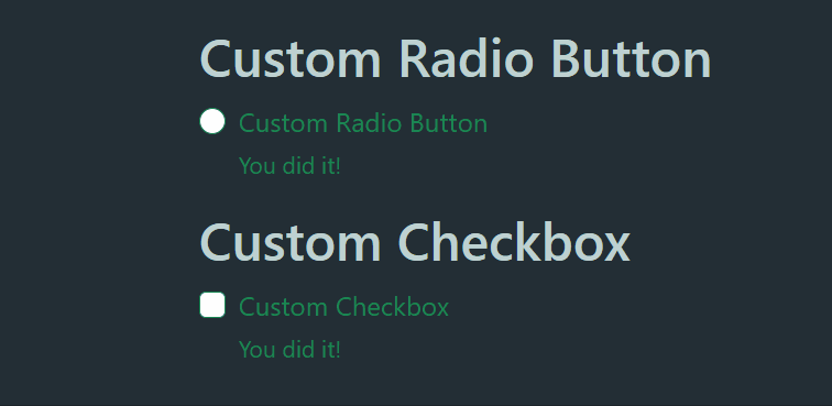
Output
Share your thoughts in the comments
Please Login to comment...