In this article, we will learn to create Pie and Donut Charts using Power BI.
Pie charts
Pie and Donut Charts are mostly created to show the contributions of different values to a total amount. They are easy to read on charts. Donut charts work best to compare a particular section to the whole rather than comparing individual sections with each other though both show a relation of part to whole.
When to use pie charts
- Whenever the user needs to show approximate values in relation to other values.
- Mostly used in business and statistics. It’s good for showing the relationship between individual proportions to the whole data.
- It’s simply used for visualizing the percentage of the part to the whole total unit.
- Pie charts are commonly used in business presentations like sales, operations, survey results, resources, etc as they provide a quick summary.
Common examples
1. Total sales amount split by item (percentage contribution of each item)
2. Total sales amount split by brands of different items.

Features of the pie chart
- Drill down for details by double-clicking a slice.
- Pie charts can have sub-slices within a larger pie chart or slice.
- You can cross filter a chart with another chart. Suppose you click any bar or column in a chart, that particular area of pie chart will get highlighted and rest of the pie is grayed or faded.
Let us start understanding and creating those charts in a very simple way.
Pre-requisite: You can refer to Power BI interactive dashboards for easy implementation of the following charts.
Difference between Pie and Donut charts
- Similar to a pie chart, a doughnut chart also shows the relationship of parts to a whole, but a doughnut chart can contain multiple data series unlike pie charts
- Each data series in a doughnut chart adds a ring to the chart. The center may hold the first data series.
- Donut charts have a better visual appeal and data intensity ratio.
Types of Pie charts
There are so many different types of Pie and Donut charts. Some of them are as follows, We will will implementing a very few basic pie and donut charts using Power BI to get the basic hang of its implementations using the tool.
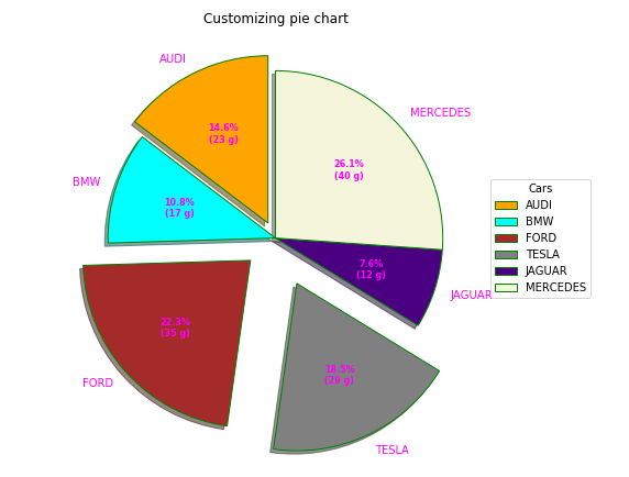
- Exploded pie chart: Pie charts with exploded pie helps in showing a focused part or give emphasis to a slice for some particular information.
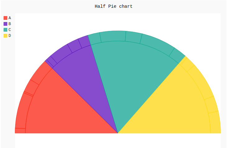
- Half pie chart: Half pie charts are semi circles which are used to totally focus on visualizing one or more percentages adding upto 100%. It works like a normal pie chart.
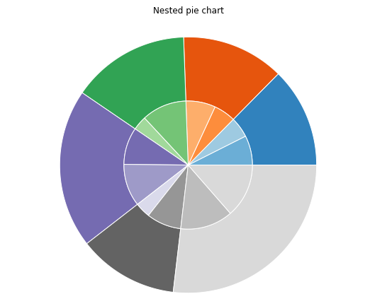
- Nested pie chart: Nested pie charts are used to represent hierarchical data with multiple levels of categories and subcategories. It helps in showing the proportion of each subcategory with repect to the parent category. It helps to compare the distribution of subcategories across different categories.
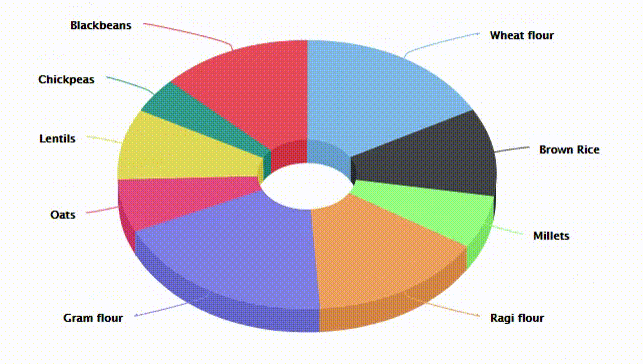
3D pie chart: It is a type of graphical representation of data which is more appealing to users. It shows slices with relative sizes of data .

Dataset
The dataset used is “SalesData.xlsx“. Upload the dataset in Power BI and refer to the dataset to follow along with the below-given sections of the article.

The user can take a general idea about the data fields of the above dataset.
Data
We will be working with “SaleData.xlsx” data with data fields as shown in the above image. The major variables used to show the charts are as follows.
- Item: This is the item names. This is the variable for which the sale is shown in the form of pie or donuts.
- Brand: This is the brand name for any particular item.One item can belong to different variety of brands.
- SaleAmt: This is the total amount sold ( shown in Indian “Rs”).
- Region: Whether the sale is in the “Central”, “East” or “West” region.
Load Data in Power BI Desktop
Open Power BI Desktop
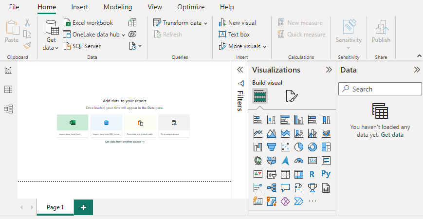
Click the “Get Data” option and select “Excel” for data source selection and extraction.
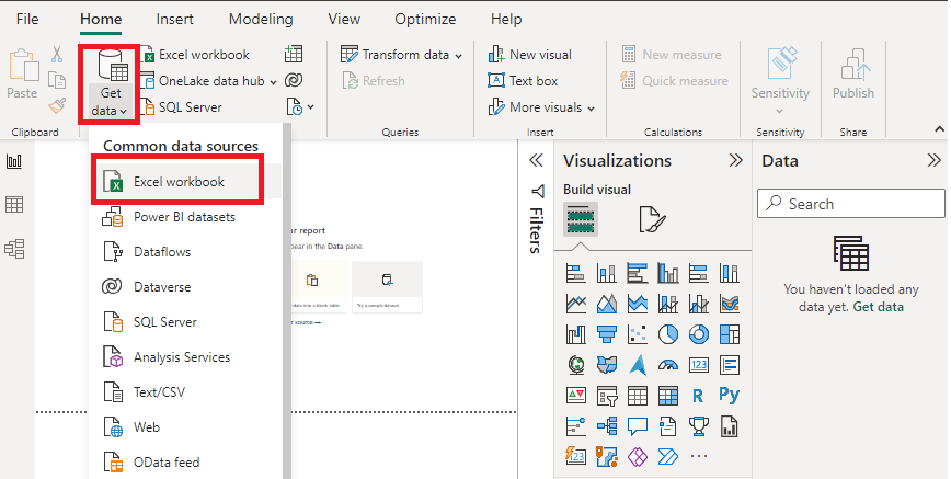
Select the relevant desired file from the folder for data load. In this case, the file is “SaleData.xls”. click the “Load” button once the preview is shown for the Excel data file.

The dashboard is seen once the file is loaded with the “Visualizations” Pane and “Data fields” Pane which stores the different variables of the data file.
Data Pane:

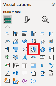
In the “Visualizations” pane, we can select the chart type needed for our visual representation of business data. In the following image, the red colored square represents the “pie” and “donut” chart that can be dragged for the “Report” view for further process.
We are dealing with simple examples for both the charts. Kindly refer to the following articles for formatting changes and setting for a different look and feel as per your requirement.
For format of Pie charts, refer to the link.
Pie Chart in Power BI
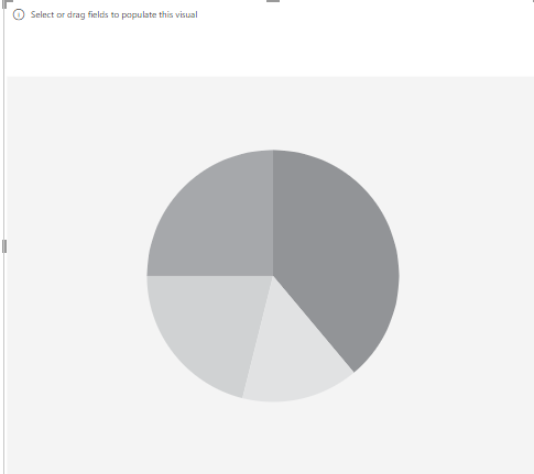
Drag the Pie chart icon from the “Visualizations” pane to the Report view Canvas of Power BI desktop. The initial pie chart in the canvas looks like the following.
Initial chart:
Example 1
In this example, we will learn to get a pie chart which shows Sum of “Sale_amt” based on different brands “Brand”. Set the “Visualizations” pane as shown below by dragging the relevant fields from the “Data” pane from the “SaleData” dataset as mentioned earlier in the previous section of this article.

Output: We get the following pie chart which provides details about different brands in multiple colors with the percentage value contribution for each brand.

Example 2
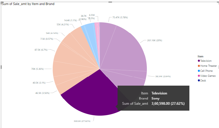
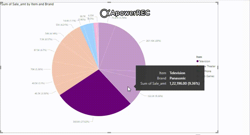
The following example demonstrates Sum of “Sale_amt” categorized by “Item” further categorized by respective “Brand” of that particular item. The following shows the setting of the visual pane.

Output: The following shows the Sum of “Sale_amt by Item and Brand” with respective details. the user can hover on any pie for selective information.
Video output:
Example 3
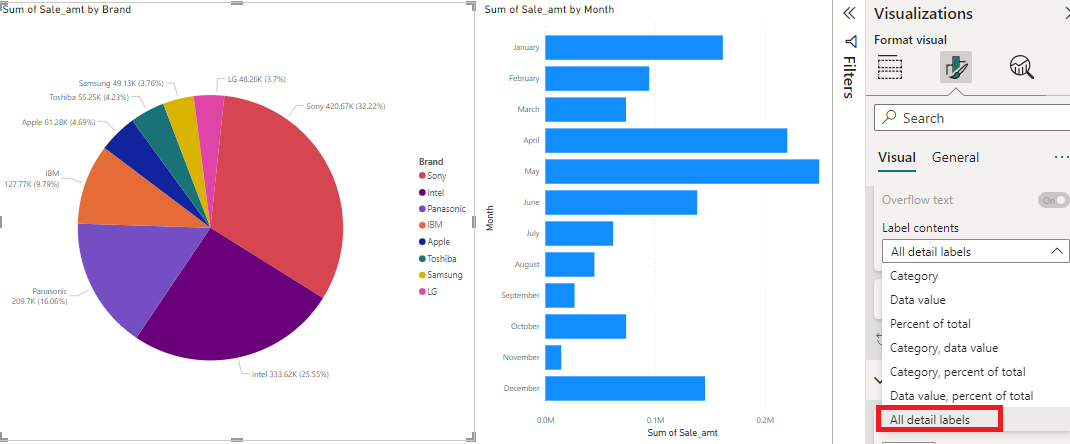
This example shows that the pie charts can be displayed in combination with any other Power BI charts for implementig cross-filter feature. Refer to the “Power BI – filters” article for better understanding before starting this.
Let us consider a pie chart of “Sum of Sale_amt by brand” and “by Month”. For “Sum of Sale_amt by month” , we will be considering Power BI bar charts. Drag the bar chart icon to the report canvas next to the pie chart of “Sum of Sale_amt by brand” and set the visual plane as shown below by dragging relevant fields from data pane.

Output: We get the following result clicked on “October” and pie chart result is based on the month selection.

Video output: The following shows the changes that take place when the user changes month from the bar chart. Refer to the article “Understanding filter in Power BI”. Notice the changes when the months selection is changed.

The above pie chart label contents can be changed by setting following “Visualizations” pane for some change in UI pie chart.
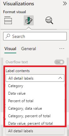
Output:
Donut Charts
Donut charts are very similar to pie charts other than the data displayed in rings , where the ring represents a data series.
When to use Donut Charts
- When the user has more than one data series.
- There should not be any negative value or zero value.
- Not more than seven categories per data series.
- It is useful in visualizing high level data
- It is very useful in containing more than one data/information arrangement.
- Use the hole for some company/organization’s name or logo.
Reference: The formatting changes of the following implementations can be done using the article “Power BI – Format Donut Charts“
Types of Donut charts
Some Donut chart examples are given below
- 3D pie Donut charts: 3D pie donut charts are more appealing for user interface purpose and fulfills the benefits from both pie and donut charts showing nice labels and individual slices with repect to the whole unit.
Example
The similar steps of pie chart to be followed for the implementation with little change. Initially drag the donut chart icon from the “Visualizations” pane to report pane.

Initial Canvas: The initial canvas will look like the following.

Start doing the settings considering the steps in implementing pie charts earlier in this article.
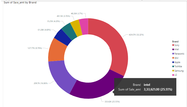
Let us consider donut chart for “Sum of Sale_amt by Brand”.

Output:
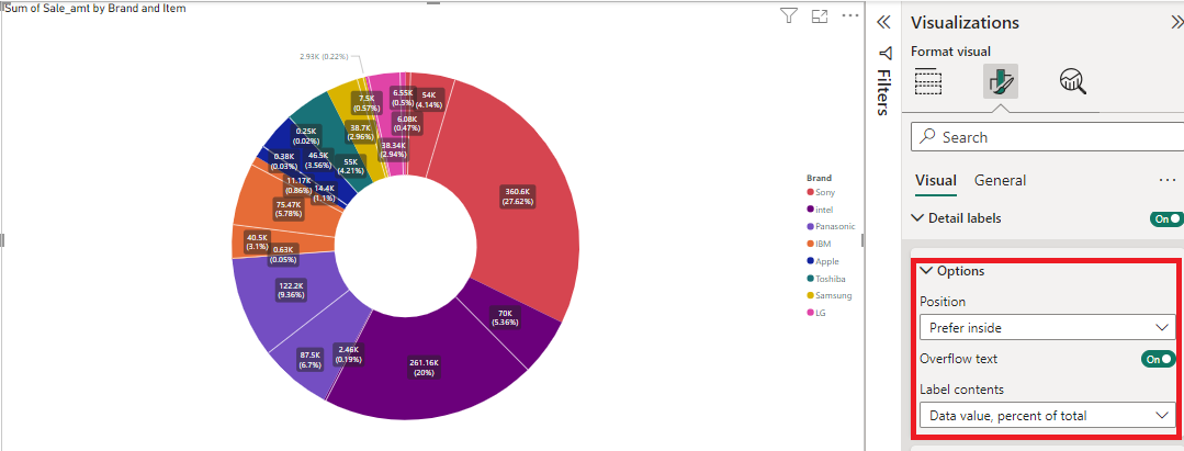
If we want to further drill down to “Sum of Sale_amt by Brand and Item”, set the following in the visual pane.

Output:

We can also change the labelling of the details by setting the options according to the requirement.
Similarly the following shows the donut chart for “Sum of Sale_amt by Item”, follow the similar steps as implemented for pie charts.

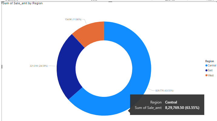
Donut chart of “Sum of Sale_amt by Region”.
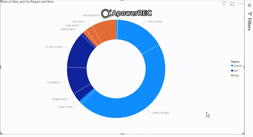
The same can be implemented for “Sum of Sale_amt categorized by Region and further categorized by Item”.

Output:
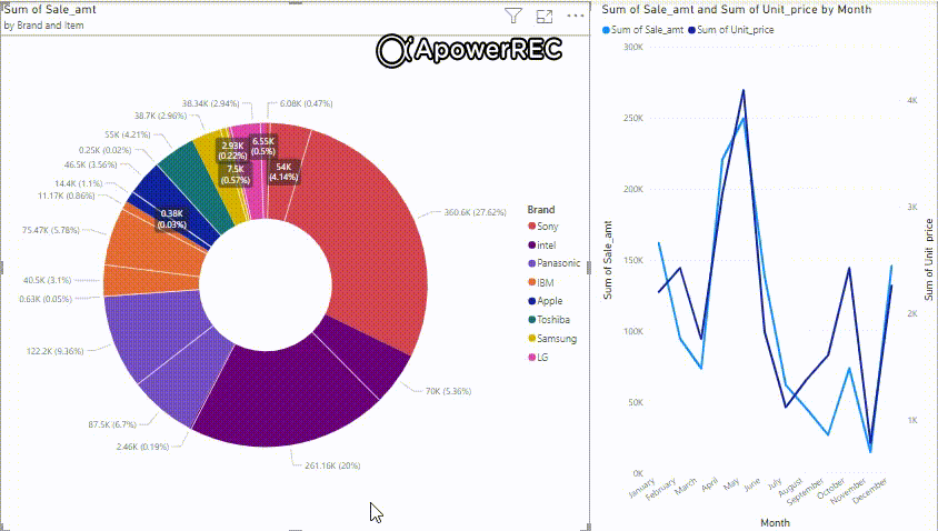
Even the donut charts are displayed with combination of other charts. In this example, we will show donut chart with Power BI line charts. The line chart shows the “Sum of Sale_amt and sum of Unit_price by month”. On different datapoints selection by the user, the donut chart and its values get changes to show you the result with respect to the line chart selection of month.

Output:

Video Output:

Limitations
- Due to circular nature, doughnut charts are not easy to read, especially when they display multiple data series.
- Avoid small slices out of so many categories which is difficult to read analyze.
- Data points on outer rings may appear larger than data points on inner rings while their actual values may be smaller.
- Displaying values or percentages in data labels is very useful in a doughnut chart, but if you want to compare the data points side by side, you should use a stacked column or stacked bar chart instead.
Share your thoughts in the comments
Please Login to comment...