Power BI – Cluster Bar and Column Charts
Last Updated :
24 Aug, 2023
In this article, we will learn to implement basic bar charts and column charts using Power BI. This discusses some important concepts used to create the very common bar and column charts so as to make large business intelligence decisions. We will be discussing the following topics and their implementation in the Power BI desktop.
- Column charts: A column chart is a chart that shows comparisons of data or some value trend over a period of time. Column charts can be Clustered column charts also showing groups or clusters of vertical bars for every primary category which measure data over multiple dimensions. Column charts are also known as vertical bar charts. The complexity of the chart visualization increases with the increased number of categories.
- Bar charts: These are column charts showing data using horizontal bars or columns over a period of time.
Pre-requisite: You can refer to Power BI interactive dashboards for easy implementation of the following charts.
Column Charts and Clustered Column Charts
The charts measure data over time and are used for comparative analysis of business needs. Here is the difference between Column Charts and Clustered Column Charts:
|
Comparisons are based on one variable.
|
Comparisons are based on more than one variable.
|
| We can compare one variable with the same set of other variables |
We can compare one set of a variable with another set of variables within the same variable.
|
Both charts represent business data with rectangular bars where the size of the bars is directly proportional to the quantity of data values. In the column chart the fixed dimension is represented in the horizontal x-axis and the variable dimension is represented in the vertical y-axis. The reverse representation of the x-axis and y-axis shows us the bar chart.
Dataset used:
The dataset used is “FoodSales“. Upload the dataset in Power BI and refer to the dataset to follow along with the below-given sections of the article.
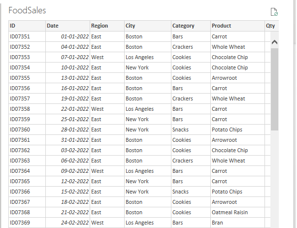
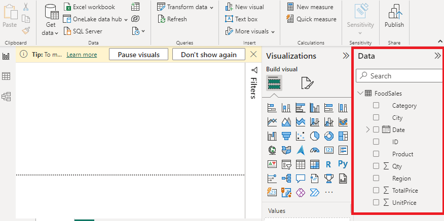
Data: We will be working with “FoodSales” data with data fields as shown in the above image. The major variables used to show the charts are as follows.
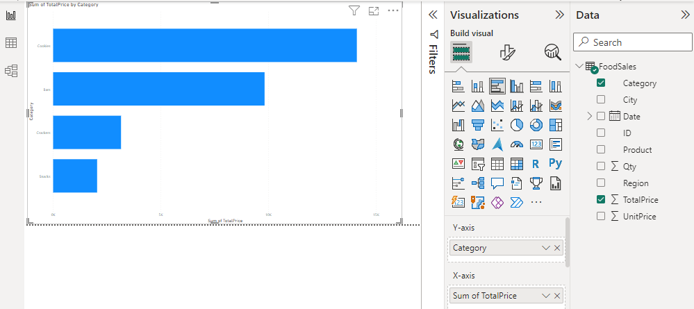
- Category: This is the category of food item that is shown in the x-axis initially. This is the variable for which the sale is shown in the form of rectangular columns or bars.
- TotalPrice: This is the total amount sold ( shown in Indian “Rs”).
- Region: Whether the sale is in the “East” or “West” region.
Load Data in Power BI Desktop
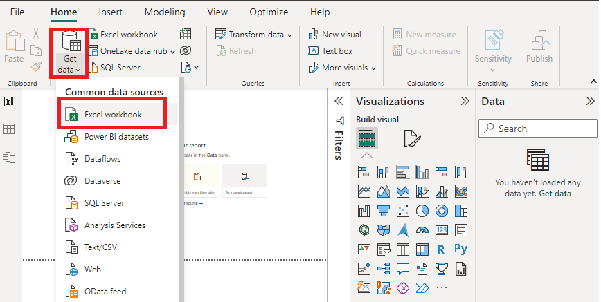
Open Power BI Desktop
Click the “Get Data” option and select “Excel” for data source selection and extraction.
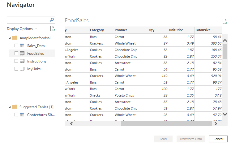
Select the relevant desired file from the folder for data load. In this case, the file is “sampledatafoodsales.xls”. click the “Load” button once the preview is shown for the Excel data file.
The dashboard is seen once the file is loaded with the “Visualizations” Pane and “Data fields” Pane which stores the different variables of the data file.
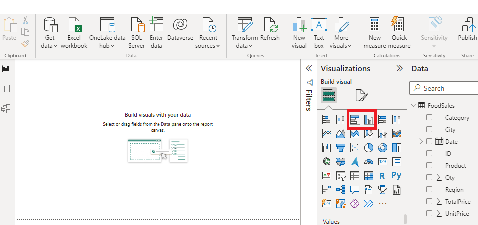
In the “Visualizations” pane, we can select the chart type needed for our visual representation of business data. In the following image, the red colored square represents the “bar” and “column” chart that can be dragged for the “Report” view for further process.
Column Charts in Power BI
Click on the “Clustered column chart” (the second one from the above red square box) in the “Visualizations” pane. This creates a chart box in the canvas. Resize after the drag as per the user’s requirement and set options for the x-axis, y-axis, values, and other fields. You can also set “Title”, and change the “Font color”, “Alignment”, and “Text size” arguments as per your preference.
It is easier to make a “clustered column chart” by adding "Region" field in the “Legend” position of the default column chart.
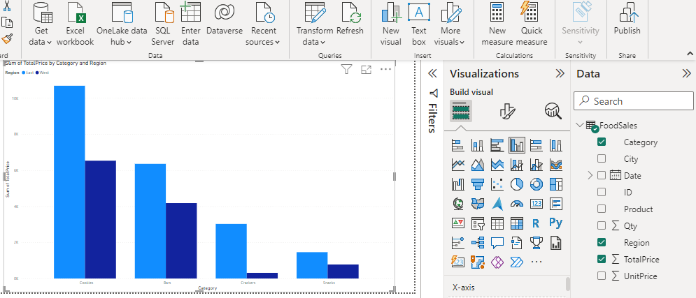
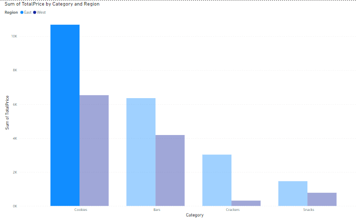
Output:
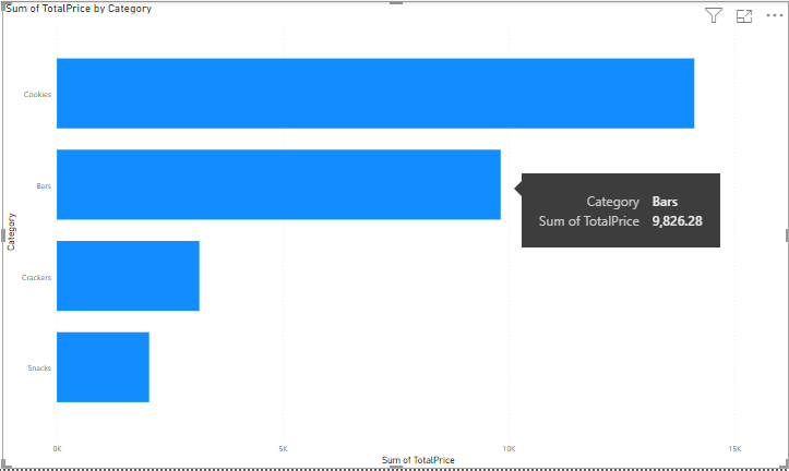
Bar Chart in Power BI
Click on the “bar chart” (the first one from the above red square box) in the “Visualizations” pane. Set other options as explained for clustered column chart in the above section.
Output:
Share your thoughts in the comments
Please Login to comment...