Power BI – Line Charts
Last Updated :
19 Jul, 2023
Power BI is a powerful data visualization and analytics tool that can help you quickly make sense of your data by extracting it from different data sources.
A line chart is a series of data points connected by a straight line. It shows a set of data points based on some number information having x-axis and y-axis. The line chart can have one or many lines having continuous data sets. It is used to show data that is in some current trend or some change in information with time or the comparison of two data sets. Foe more you can refer to Power BI interactive dashboards for easy implementation of the following charts.
Line charts in Power BI Uses
- Power BI Line Chart is used to show data that is in some current trend or some change in information with time or to show the comparison of two data sets.
- It connects many points using a line or segment. It helps in analyzing or predicting future markets and opportunities.
- Line charts are mostly used over column charts to look at or track some data trends over time for multiple groups.
Dataset Used
DataSet has data with date, year, and courses (AI/ML, DSA, JAVA) columns. The different courses show the number of people who applied. The major variables used to show the charts are as follows.
- Year: This variable is taken for the common x-axis.
- AI/ML: The sum of the AI/ML applicants is taken as one variable for the y-axis.
- Java: The sum of the Java applicants is taken as another variable for the y-axis.
- DSA: The sum of the DSA applicants is taken as another variable for the y-axis.
Now, We will be showing the steps to create a line chart using the Power BI Desktop tool by using a “DataSet” Excel sheet file as given above in the “Dataset” section.
Getting Data in Power BI
Open the Power BI desktop. Click the “Get Data” option and select “Excel” for data source selection and extraction.
Select the relevant desired file from the folder for data load. In this case, the file is “DataSet.xlsx”. click the “Load” button once the preview is shown for the Excel data file.
The dashboard is seen once the file is loaded with the “Visualizations” Pane and “Data fields” Pane which stores the different variables of the data file.
Create Line Charts in Power BI
In the “Visualizations” dialog, we can select the chart type needed for our visual representation of business data. In the following image, the red-colored square represents the “line” chart that can be dragged for the “Report” view for further process.
Click on the “line chart” (the first one from the second row) in the “Visualizations” pane. This creates a chart box in the canvas. Resize after the drag as per the user’s requirement and set options for the x-axis, y-axis, values, and other fields. You can also set other attributes as per the preference for customizing the line chart’s look and feel. Refer to the Power BI format line charts article for more customization.
Output:
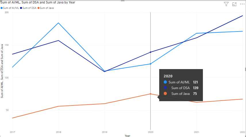
The total number of applicants on all three courses are taken by their sum over the yearly time period from 2017 to 2022.
On hovering over the data points of the line chart, we get the following details.
In the year 2020, the number of applicants for AI/ML courses is 121, 139 for DSA, and 75 for Java.
Conclusion:
- Line charts detect changes over time for data analysis and comparison.
- They are mostly used in financial reports or reports based on multiple variables in the business.
Share your thoughts in the comments
Please Login to comment...