Power BI Slicers are the interactive filters used to format and analyze the parts of the data more effectively. They are basically filters for visuals. A slicer chart helps in sorting or slicing or filtering some unwanted stuff and viewing only the required important information in the visual pane.
It narrows down the dataset portion as per the need. It helps in controlling the portion of visuals which are affected by slicers.
Common examples:
- Overall sales metrics with highlighted performance for managers and different time frames.
- Sales metrics for any particular year where “year” will be the slicing filter.
When to use slicers:
- Whenever the user wants easy access to commonly used filtered reports.
- To get the current status after the filtering data.
- To get columns after filtering unwanted fields.
- To get focused reports for different needs.
In this article, we will learn to implement Slicer Chart in Power BI.
Pre-requisite: You can refer to Power BI interactive dashboards for easy implementation of the following charts.
DataSet Used:
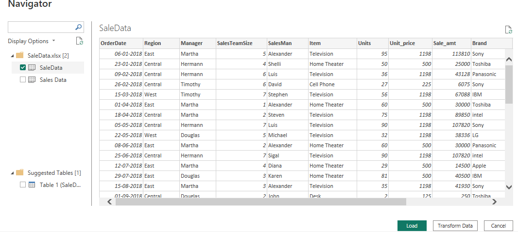
The dataset used is “SaleData“. Upload the dataset in Power BI and refer to the dataset to follow along with the below-given sections of the article.

Data: We will be working with “SaleData.xlsx” with data fields as shown in the above image.
Load Data in Desktop:
Open Power BI Desktop
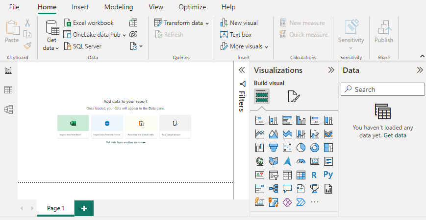
Click the “Get Data” option and select “Excel” for data source selection and extraction.
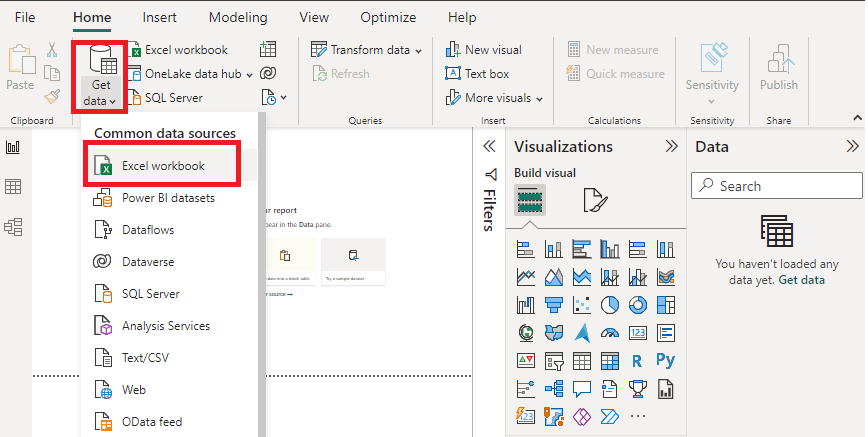
Select the relevant desired file from the folder for data load. In this case, the file is “SaleData.xls”. click the “Load” button once the preview is shown for the Excel data file.
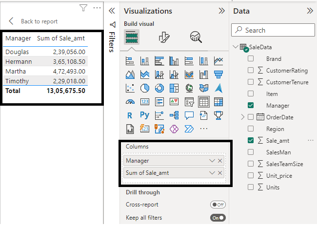
The dashboard is seen once the file is loaded with the “Visualizations” Pane and “Data fields” pane which stores the different variables of the data file. In the “Visualizations” pane, we can select the chart type needed for our visual representation of business data. In the following image, the red-colored square represents the “Slicer” chart that can be dragged for the “Report” view for further process.

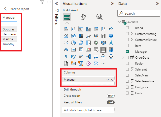
Let us first understand Slicer Chart.
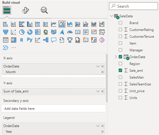
Suppose we want to focus on information based on different managers, we will drag the “Manager” field to the “Visualizations” pane as shown below. The Manager list is shown on the left-hand side in the red box.
The next slicer chart shows the different managers along with the total sale amount handled by them. The report only focuses on the required information from the dataset.
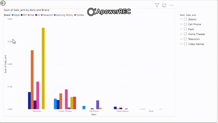
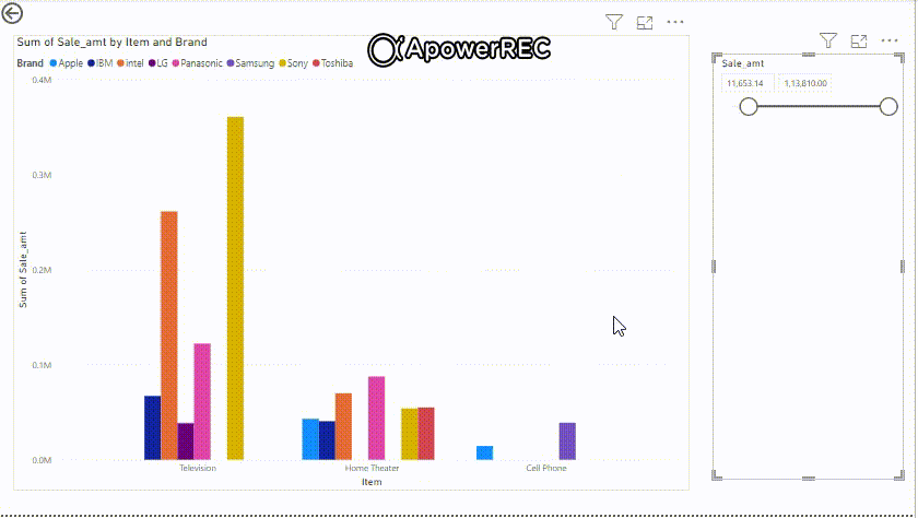
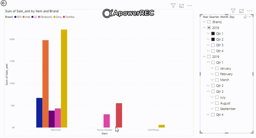
Slicer with Clustered Column Chart: As shown above, the user or developer can select field names based on which the data is needed to be shown after slicing. The “Item” is dragged to the “Field” column in the visualization pane for data based on slicing. For Clustered column chart, use the following visual pane.

Using the slicer and Cluster column chart, we get the following result. It shows the total sale amount for different items and brands. One cluster represents data or information for one single item like “Television”, “Home Theatre” and so on. The different colors in one single cluster represent different brands for that particular item. The slicer is based on “Item” to show focused data on the items as shown below.
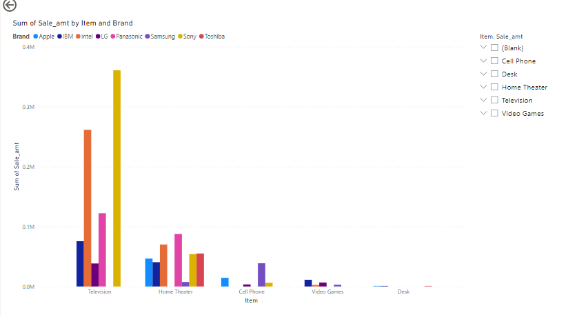
Output: The following shows sliced data (total sale amount ) for the item selected on the right-hand side.
Another example: Similarly, we can create various reports based on the slicer or according to the user’s need. Using the above steps, the following shows sliced information for total sales handled by different managers selected. The different colors represent different brands and the chart shows total sales over a period of time (months of a year in the x-axis).
Slicer with Area Chart: Like clustered column charts, other types of charts can also be created along with a slicer. The slicer is based on the “Item” field, so the main canvas shows a report based on the selected item. The report shows area charts for total sales by month for 2 different years (2018 and 2019). The field for the x-axis is OrderDate (month), y-axis ( Sum of Sale_amt), and Legend ( year).
After setting all the required fields.
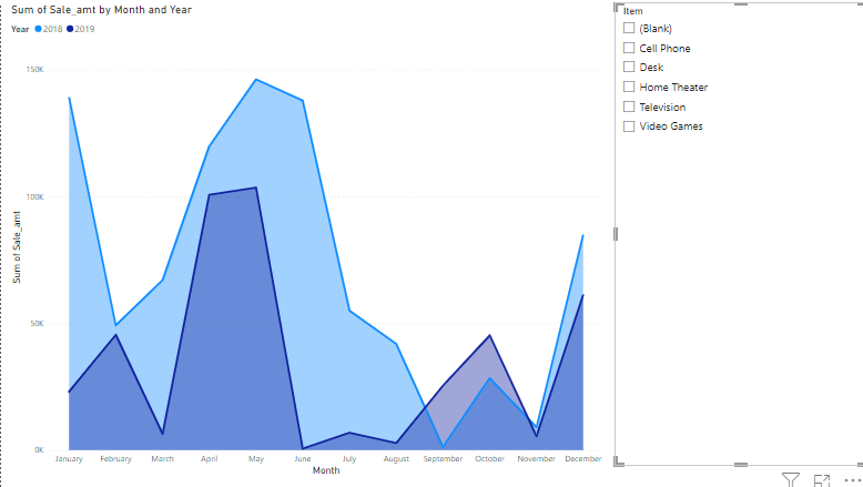
Output: Observe the output on any item selection.

Slicers types: There are different types of slicers available on the Power BI desktop.
1. Numeric range slicers: These are the slicers that help in deciding the start and ending value for any numerical data range. A very common example is “Low and high value of sales”.
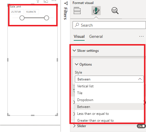
We can get reports based on a numeric data range selected. The total sale amount is shown for items and brands within that range of “Sale_amt”.
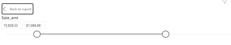

When the “sale_amt” range is changed the report in the main canvas also gets changed according to the filter input by the user.
2. Relative date/time slicers: These are the slicers that help in deciding the start and ending value for any date range. On clicking on the date icon, the full calendar is shown for easy access to dates.

Observe the change in sliced data when the date ranges are changed. You can follow similar steps for creating Power BI area charts.

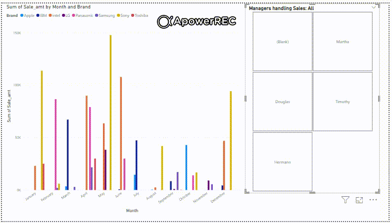
3. Responsive resizeable slicers: Responsive slicers resize to fit any screen size with different shapes and sizes. According to the value chosen by the user, the result of the chart changes focusing on the sliced important part. It can be rearranged to smaller or larger sizes.
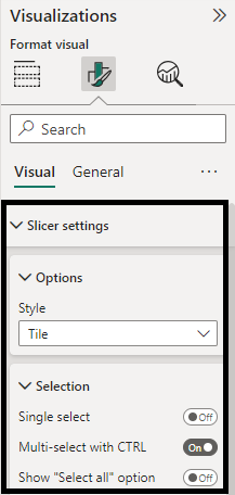
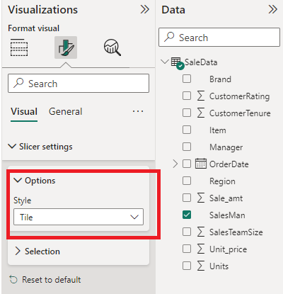
Keep trying different option settings in the visualizations pane both in the “Visual” as well as “General” tabs. Set “Responsive” in the “Advanced options” dropdown section given below.

This creates a responsive slicer that can fit into any screen size. Drag and drop the tiles slicer to see the effect of responsiveness. The report shows a responsive slicer for the Manager handling sales. The total sale amount is shown for the “month” cluster having various colored “Brands” for the selected manager.

Responsive slicer

4. Hierarchy slicers: These are the slicers that help in deciding the chart where the slicer is selected from the data hierarchy. Here the hierarchy starts from the year as the root.
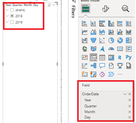
Use the dropdown to expand the “OrderDate” hierarchy.
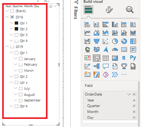
The sliced data is shown for the particular date or quarter or year selected. Multiple selection is also possible.
5. Sync slicers: The Power BI desktop can have multiple pages each having some set of charts. Sync slicers help in creating reporting visuals on other pages based on one setting. Every page on the report will respond to the changes made on one slicer.

The user can select or deselect the pages according to the need of having a slicer effect on those pages. The slicer can be made visible or invisible on any number of pages.
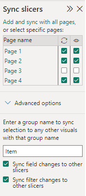
The sync-up effect from one slicer can be seen on other pages too. All the pages respond or give results according to the slicer.

Output:

Conclusion: Power BI Slicers helps in easy access to detailed and focused information for better business analysis.
Share your thoughts in the comments
Please Login to comment...