How to Add Padding to All Sides in Tailwind CSS ?
Last Updated :
14 Feb, 2024
Tailwind CSS is a utility-first CSS framework that provides a vast array of classes to design your website directly in your markup. It emphasizes speed, efficiency, and reduces the time you spend styling in CSS files. One of the most common styling tasks in web development is adding padding to elements, which creates space around an element’s content, inside of any defined borders. Tailwind CSS offers a basic and flexible approach to add padding to all sides of an element or each side individually.
Uniform Padding to All Sides
To add padding to all sides of an element equally in Tailwind CSS, you can use the p-{size} syntax, where {size} represents the scale of the padding you wish to apply. Tailwind’s default configuration offers a scale from 0 to 7, with additional sizes available if configured in tailwind.config.js.
Example: This example adds uniform padding to the element.
HTML
<!DOCTYPE html>
<html lang="en">
<head>
<meta charset="UTF-8">
<meta name="viewport" content=
"width=device-width, initial-scale=1.0">
<title>Uniform Padding</title>
<link href=
rel="stylesheet">
</head>
<body class="m-4">
<div class="p-8 w-48 h-24 bg-green-200">
GeeksforGeeks
</div>
</body>
</html>
|
Output

In this example, p-4 applies a padding of 1rem (16px) around the entire content of the <div> element. The size of the padding increases as the number after p- increases.
Individual Side Padding
Tailwind also allows you to specify padding for individual sides of an element using pt-, pr-, pb-, and pl- for padding-top, padding-right, padding-bottom, and padding-left, respectively.
Example: This example adds Individual Side Padding to the element.
HTML
<!DOCTYPE html>
<html lang="en">
<head>
<meta charset="UTF-8">
<meta name="viewport" content=
"width=device-width, initial-scale=1.0">
<title>Individual Side Padding Example</title>
<link href=
rel="stylesheet">
</head>
<body class="m-4">
<div class="pt-2 pr-4 pb-2 pl-4 w-48 h-24 bg-green-200">
This div has different padding on each side.
</div>
</body>
</html>
|
Output
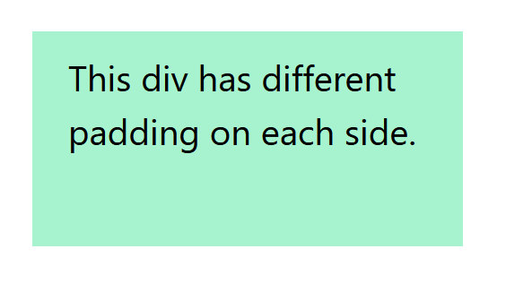
This example applies 0.5rem (8px) of padding to the top and bottom (pt-2 and pb-2) and 1rem (16px) of padding to the right and left sides (pr-4 and pl-4).
Responsive Padding
Tailwind CSS excels in creating responsive designs with minimal effort. You can apply different paddings at various breakpoints (e.g., sm:, md:, lg:, xl:, 2xl:) to ensure your layout adapts to different screen sizes.
Example: This example adds the Responsive Padding.
HTML
<!DOCTYPE html>
<html lang="en">
<head>
<meta charset="UTF-8">
<meta name="viewport" content=
"width=device-width, initial-scale=1.0">
<title>Responsive Padding Example</title>
<link href=
rel="stylesheet">
</head>
<body class="m-4">
<div class="p-2 md:p-4 lg:p-8 w-48 h-24 bg-green-200">
This div's padding changes with the screen size.
</div>
</body>
</html>
|
Output
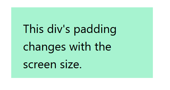
Here, the <div> starts with a padding of 0.5rem (8px) on all sides. As the screen width reaches the md breakpoint, the padding increases to 1rem (16px), and at the lg breakpoint, it further increases to 2rem (32px).
Padding X and Y
For scenarios where you want to apply the same padding value to the top and bottom (Y-axis) or right and left (X-axis), Tailwind offers px- and py- utilities.
Example: This example adds the padding on X and Y axis.
HTML
<!DOCTYPE html>
<html lang="en">
<head>
<meta charset="UTF-8">
<meta name="viewport" content=
"width=device-width, initial-scale=1.0">
<title>X and Y Axis Padding</title>
<link href=
rel="stylesheet">
</head>
<body class="m-4">
<div class="px-6 py-4 w-48 h-24 bg-green-200">
This div has uniform padding
on the X-axis and Y-axis.
</div>
</body>
</html>
|
Output
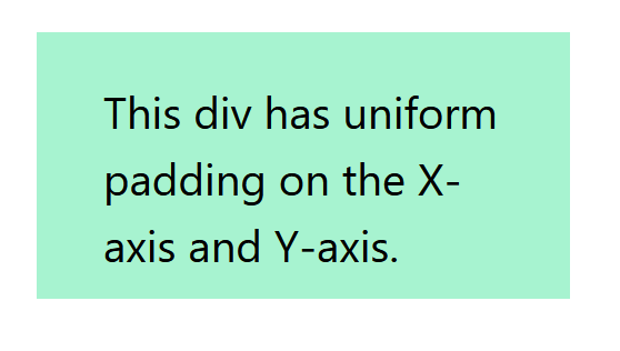
The px-6 class applies a padding of 1.5rem (24px) to both the right and left sides, while py-4 applies a padding of 1rem (16px) to both the top and bottom sides.
Share your thoughts in the comments
Please Login to comment...