How to Make Rounded or Custom Border Radius in React Native ?
Last Updated :
05 Oct, 2023
React Native offers a simple solution to achieving this effect through the borderRadius property. In this article, we’ll see how we can apply border-radius to the react native components.
Border Radius holds a significant role. It acts as a styling attribute that controls the curvature of corners for various UI elements. With this attribute, we can round the edges of buttons, cards, images, and any other element.
Properties of Border Radius
Before we dive into examples, let’s understand the key properties associated with borderRadius:
- borderRadius: This property specifies the radius of all four corners of the element equally, creating rounded corners.
- borderTopLeftRadius: This property allows you to define a specific radius for the top-left corner.
- borderTopRightRadius: This property allows you to define a specific radius for the top-right corner.
- borderBottomLeftRadius: This property allows you to define a specific radius for the bottom-left corner.
- borderBottomRightRadius: This property allows you to define a specific radius for the bottom-right corner.
Syntax:
<Component style={{ borderBottomRightRadius: value }} />
<Component style={{ borderBottomLeftRadius: value }} />
...
Steps to install & configure React Native
Step 1: Create a react native application by using this command:
npx create-expo-app borderRadius
Step 2: After creating your project folder, i.e. borderRadius, use the following command to navigate to it:
cd borderRadius
Project Structure
The project structure will look like this.
.png)
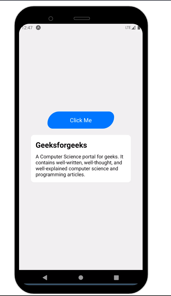
Example 1: In this example, there is a centered container that contains two main components: a button and a card. The button with blue background and rounded corners (top-left and bottom-right corners are more rounded than the others) and white text.
Javascript
import React from "react";
import {
View,
TouchableOpacity,
Text,
StyleSheet,
} from "react-native";
const App = () => {
return (
<View style={styles.container}>
<TouchableOpacity style={styles.button}>
<Text style={styles.buttonText}>
Click Me
</Text>
</TouchableOpacity>
<View style={styles.card}>
<Text style={styles.cardHeading}>
Geeksforgeeks
</Text>
<Text style={styles.cardText}>
A Computer Science portal for geeks. It
contains well-written, well-thought, and
well-explained computer science and
programming articles.
</Text>
</View>
</View>
);
};
const styles = StyleSheet.create({
container: {
flex: 1,
justifyContent: "center",
alignItems: "center",
backgroundColor: "#f0f0f0",
padding: 20,
},
button: {
backgroundColor: "#007BFF",
padding: 15,
borderTopLeftRadius: 55,
borderTopRightRadius: 25,
borderBottomLeftRadius: 25,
borderBottomRightRadius: 55,
justifyContent: "center",
alignItems: "center",
width: "60%",
},
buttonText: {
color: "white",
fontSize: 18,
},
card: {
backgroundColor: "white",
borderRadius: 10,
marginTop: 20,
padding: 15,
width: "90%",
shadowColor: "rgba(0, 0, 0, 0.1)",
shadowOffset: {
width: 0,
height: 2,
},
shadowOpacity: 1,
shadowRadius: 4,
elevation: 3,
},
cardHeading: {
fontSize: 24,
fontWeight: "bold",
marginBottom: 10,
},
cardText: {
fontSize: 16,
},
});
export default App;
|
Step 4: Go to the Terminal and type the following command to run the react native application:
npx expo start
npx react-native run-android
npx react-native run-ios
Output:
Example 2: In this example, The image is displayed within a container that is centered on the screen. By applying borderRadius properties, the image has custom rounded corners. To fetch and display the image from a specific URL, the Image component’s source prop is utilized.
Javascript
import React from "react";
import { View, Image, StyleSheet } from "react-native";
const App = () => {
const imageUrl =
return (
<View style={styles.container}>
<Image
source={{ uri: imageUrl }}
style={styles.profileImage}
/>
</View>
);
};
const styles = StyleSheet.create({
container: {
flex: 1,
justifyContent: "center",
alignItems: "center",
},
profileImage: {
width: 300,
height: 300,
borderTopLeftRadius: 105,
borderTopRightRadius: 25,
borderBottomLeftRadius: 25,
borderBottomRightRadius: 105,
},
});
export default App;
|
Output:

Share your thoughts in the comments
Please Login to comment...