How to label specific points in scatter plot in R ?
Last Updated :
13 Jul, 2021
Scatter plots in the R programming language can be plotted to depict complex data easily and graphically. It is used to plot points, lines as well as curves. The points can be labeled using various methods available in base R and by incorporating some external packages.
Method 1: Using ggplot package
The ggplot() method can be used in this package in order to simulate graph customizations and induce flexibility in graph plotting.
Syntax:
ggplot(data = <DATA>, mapping = aes(<MAPPINGS>)) + <GEOM_FUNCTION>()
The data can be binded into the scatter plot using the data attribute of the ggplot method. The mapping in the function can be induced using the aes() function to create aesthetic mapping, by filtering the variables to be plotted on the scatter plot. We can also specify how to depict different components in the graph, for instance, the x and y axes positions, the labels to assign to these points or characteristics such as size, shape, color, etc.
This method also allows the addition of various geoms- that is the components of graph. geom_point() is used for creation of scatter plot. geom_label() is used to understand the aesthetics specified to the ggplot.
Example:
R
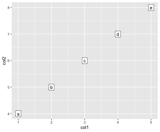
library(ggplot2)
df <- data.frame(col1 = c(1:5),
col2 = c(4:8),
col3 = letters[1:5]
)
print ("Original DataFrame")
ggplot(aes(x=col1, y=col2, label=col3), data=df) +
geom_point() +
geom_label()
|
Output
Method 2 : Using text() method
The plot() method in Base R is used to plotting the R objects, namely, lists or data frames.
Syntax:
plot(x, y, data , col)
Parameter :
x,y – The x and y coordinates of the points
col – The color to assign to the points. The color is specified using a character string.
data – The data frame points to be plotted in the graph
The text method can be used to customize the plots to add string names to the plotted points.
Syntax:
text (x, y , labels , data)
Parameter :
x, y – The coordinates of the points to label
labels – the vector of labels to be added
data – the data to use for plotting
Example:
R
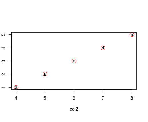
df <- data.frame(col1 = c(1:5),
col2 = c(4:8),
col3 = letters[1:5]
)
print ("Original DataFrame")
plot(col1 ~col2 , col="red", cex=2, data= df )
text(col1 ~ col2, labels= col3 ,data=df , cex=0.9)
|
Output
Share your thoughts in the comments
Please Login to comment...