Scatter plots are one of the most frequently used charts for data analysis. There can be situations when you want to highlight a particular data point from the scatter chart that contains hundreds of data points. This seems to be a tedious task but it could be achieved very easily in excel. We will learn about how to find, highlight and label a data point in an excel Scatter plot.
Use Hover for Small Data
For table size less than equal to 10, this technique is quite efficient. For example, you are given a Pressure Vs Temperature plot. The number of rows in the table is 6.
Simply hover on the data points in the scatter chart. Here we can see that the point hovered has a pressure of 5 and a temperature of 12.
This method is not efficient when we have more than 2 columns in our table or the number of rows greater than 10.
Using Data Labels
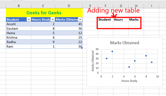
To highlight the data points for more information we can use data labels. These help us to make data more understandable. This technique is efficient if the number of rows in the given data source is less than 20. It’s been observed that if the number of rows is high then the data labels make complete chaos. The data labels start overlapping and the observation starts fading. For example, given a data source of students, the number of hours they study, and the marks obtained. Make data labels as students’ names on the given scattered graph for better observations.
Following are the steps:
Step 1: Select the chart and click on the plus button. Check the box data labels.
Step 2: The data labels appear. By default, the data labels are the y-coordinates.
Step 3: Right-click on any of the data labels. A drop-down appears. Click on the Format Data Labels… option.
Step 4: Format Data Labels dialogue box appears. Under the Label Options, check the box Value from Cells.
Step 5: Data Label Range dialogue-box appears.
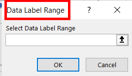
Step 6: Select the range for which you want to add your custom data labels. For example, B4:B9. Click Ok.
Step 7: Uncheck the rest of the boxes under Label Options.
Step 8: Data labels as student name appears.
We can observe that the highest and second-highest marks obtained by students are Arushi and Gautam respectively.
Using Color Separation Technique
This is one of the most used techniques to highlight a data point in Excel. When we are having hundreds or thousands of data points in excel, the use of data labels is inefficient as it creates chaos and neatness starts fading from the scatter chart. To solve this problem, you can highlight a data point that you want to access. The chart we will create now will be a dynamic chart that finds and highlights a data point and changes according to the custom input. For example, you are given the same data source as above. Student name, study hours, and marks obtained. Highlight the cell you want as a custom input.
Following are the steps:
Step 1: Add a new table with three new columns in it. This table helps you input the cell you want to highlight.
Step 2: Enter the Student name you want to highlight in your scatter chart. For example, Arushi. Now, our task is to find the Hours studied and Marks Obtained from the student name entered. You can use the VLOOKUP function for this. The formula written for cell G4 is =VLOOKUP(F4, B4:D9, 2, FALSE). You will obtain the Hours of study for the corresponding student’s name.
Step 3: Also use the VLOOKUP function for adding the Marks obtained. The formula written for cell H4 is =VLOOKUP(F4, B4:D9, 3, FALSE). You will obtain the Marks obtained corresponding to the student’s name.
Step 4: Enter the Student’s name to be highlighted. For example, Arushi.
Step 5: Select the Chart. Go to the Chart Design tab. Click on the Select Data.
Step 6: Select the Data Source dialogue box that appears. Click on Add.
Step 7: Edit Series dialogue box appears. In the Series name, select cell F3. In the Series X value, select the cell G4 and in the Series Y value, select the cell H4. Click Ok.
Step 8: A series name Student is added in the Legend Entries. Click Ok.
Step 9: You can see that the data point is highlighted. To add the data label, repeat the same process done in method 2. Select the highlighted cell, click on the plus button. Check the box Data Labels.
Step 10: Now, right-click inside the highlighted cell. Click on Format Data Series…
Step 11: Format Data Series dialogue box appears. Under Series Options, click on the Marker. Here, you can customize the data point. You can change the color of the data point. You can also add a border color of the data point.
Step 12: Click on the Marker Options. Here you can customize, the type of data point and its size.
Step 13:To add the Student name as the data label. Right-click inside the data label, of the highlighted cell. Click on Format Data Labels.
Step 14: Format Data Labels dialogue-box appears. Under Label Options, check the box Value from Cells.
Step 15: Data Label Range dialogue-box appears. Select cell F4. Click Ok.
Step 16: Uncheck the rest of the boxes.
Step 17: Here the highlighted data point is Arushi.
Step 18: The chart you have created is dynamic. Changing the name to Gautam. Changes the highlighted cell.
Add position Lines in the highlighted data point
You may require adding the position of the highlighted point on the x-axis and the y-axis. Consider the above data set, with the highlighted student name as Arushi.
Following are the steps:
Step 1: Select the highlighted point in your scattered chart. Click on the plus icon. Under the Charts Elements, click on the Error Bars. Then, select the percentage.
Step 2: Select the highlighted data point.
Step 3: Right-click on it. A drop-down appears. You can see that the series name of the highlighted data point is Student. Click on it. A drop-down appears.
Step 4: Click on Series “Student” X Error Bars. This helps us add the X position line of the highlighted data point. Series “Student” Y Error Bars, adds the Y position line of the highlighted data point.
Step 5: This is the most important step. The X error line is selected. This line is so small that it’s not visible with your naked eyes. So, right-click on the light blue dot of the cell. Note, do not click on the highlighted data point.
Step 6: A drop-down appears. Click on the Format Error Bars…
Step 7: Format Error Bars dialogue box appears. In the Horizontal Error Bar, under Direction click on Minus. In the Error Amount, set the Percentage to 100%.
Step 8: Horizontal Position line appears.
Step 9: Repeat the same steps to add a Vertical Position line.
Share your thoughts in the comments
Please Login to comment...