Add Correlation Coefficients with P-values to a Scatter Plot in R
Last Updated :
30 Jan, 2022
In this article, we will discuss how to add correlation coefficients with P-value to a scatter plot in the R Programming Language.
To add correlation coefficient with P-value to a scatter plot, we use the stat_cor() function of the ggpubr package in the R Language. The ggpubr package provides some easy-to-use functions for creating and customizing ggplot2 plots. The stat_cor() function is used to add correlation coefficients with p-values to a scatter plot. The stat_cor() function takes method as an argument to decide which correlation coefficient we need to add on scatter plot, for example, Pearson, Spearman, or Kendall coefficient. To adjust the position of the label on the scatter plot, we use the label.x and label.y argument.
Syntax:
plot + stat_cor( method, label.x, label.y )
Parameters:
- method: determines the method used for correlation coefficient, such as, Pearson, Spearman or Kendall.
- label.x: determines the x-axis position of label.
- label.y: determines the y-axis position of label.
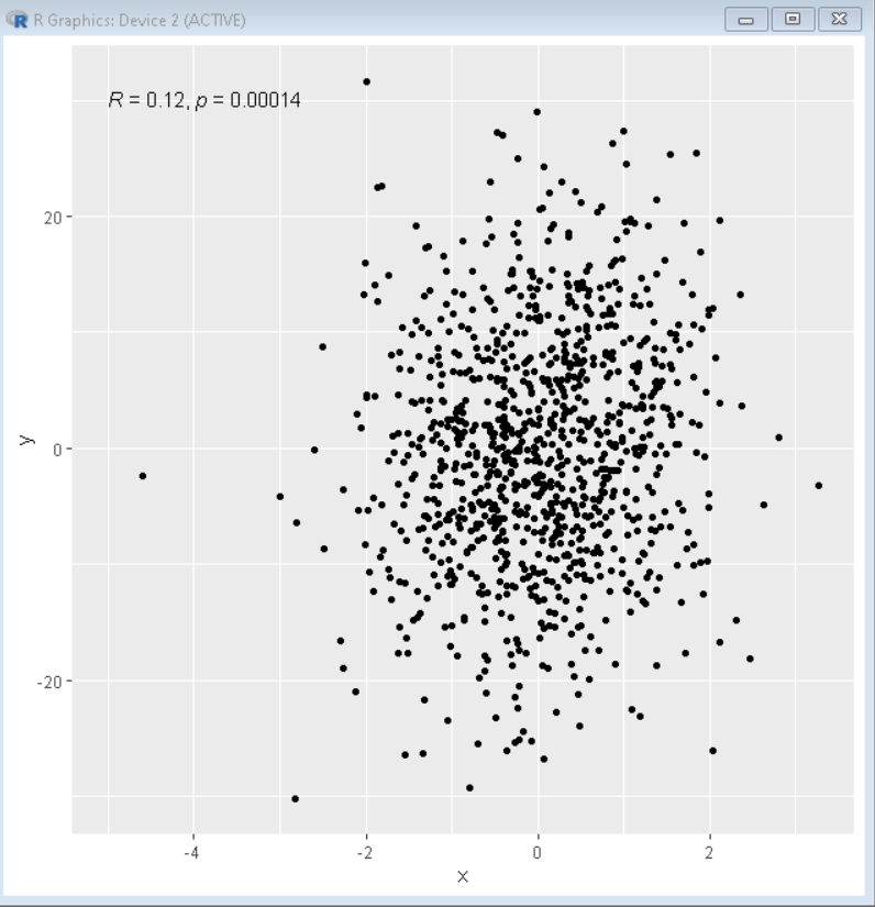
Example 1: Pearson correlation coefficient
Here, is a scatter plot with the Pearson correlation coefficient.
R
library(ggplot2)
library(ggpubr)
x= rnorm(1000)
y= x+rnorm(1000,0,10)
sample_data<- data.frame(x,y)
ggplot( sample_data, aes( x=x, y=y ))+
geom_point()+
stat_cor(method = "pearson", label.x = -5, label.y = 30)
|
Output:
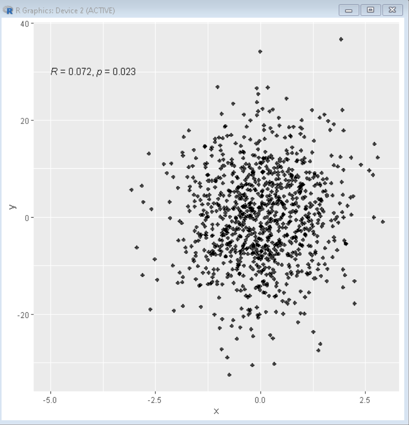
Example 2: Spearman correlation coefficient
Here, is a scatter plot with the Spearman correlation coefficient.
R
library(ggplot2)
library(ggpubr)
x= rnorm(1000)
y= x+rnorm(1000,0,10)
sample_data<- data.frame(x,y)
ggplot( sample_data, aes( x=x, y=y ))+
geom_point(pch=10)+
stat_cor(method = "spearman", label.x = -5, label.y = 30)
|
Output:
Like Article
Suggest improvement
Share your thoughts in the comments
Please Login to comment...