How To Create Custom Dashboards In GCP ?
Last Updated :
20 Mar, 2024
Google Cloud Platform (GCP) Monitoring is a comprehensive solution for monitoring cloud services and applications’ health, performance, and availability. By providing real-time insights into application performance, resource metrics, and user experience, it assists businesses in guaranteeing the dependability and effectiveness of their cloud infrastructure. Users may customize dashboards, alarms, and logs to observe, analyze, and debug their cloud environments with GCP Monitoring. It makes proactive monitoring and quicker problem response possible by offering a uniform view of metrics and logs from all GCP services. With its smooth integration with other GCP services, GCP Monitoring offers a strong foundation for large-scale cloud resource management and monitoring. In this article, we will learn about how to create a custom dashboard using the GCP console.
Steps to Create Custom Dashboards in GCP
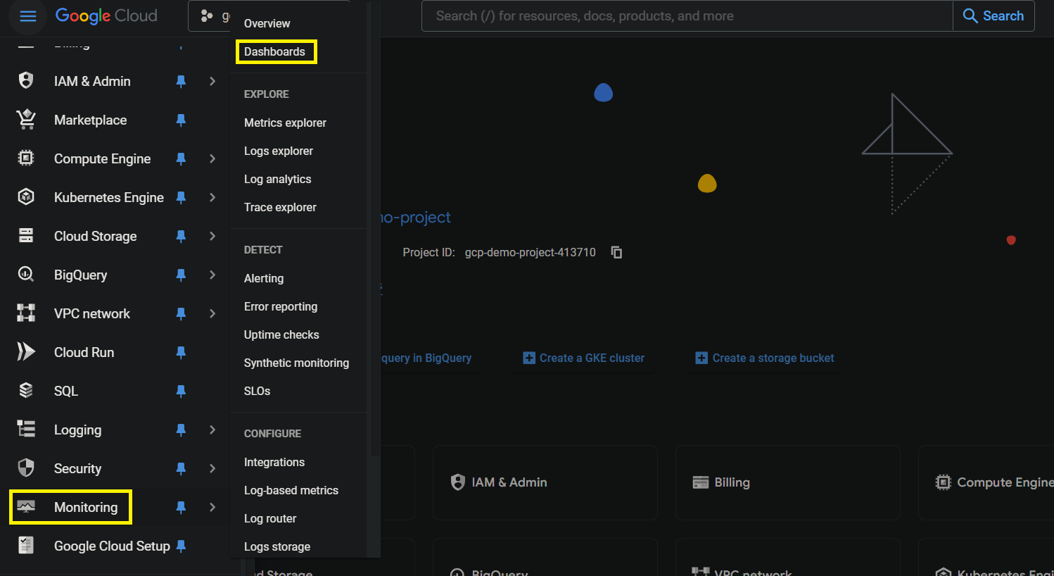
Step 1: Log in to the GCP console, click on monitoring, and click on dashboards
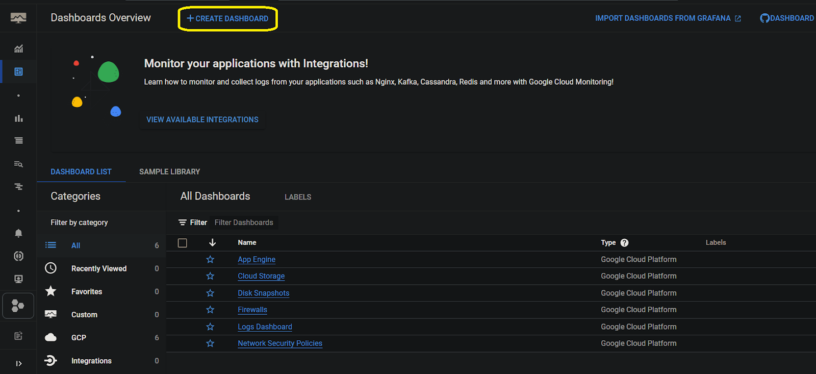
Step 2: Click on create dashboard
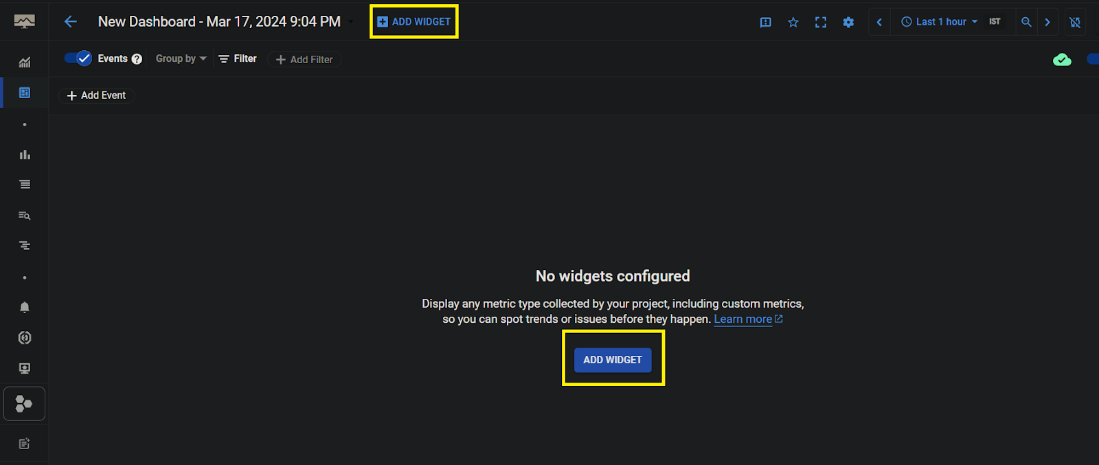
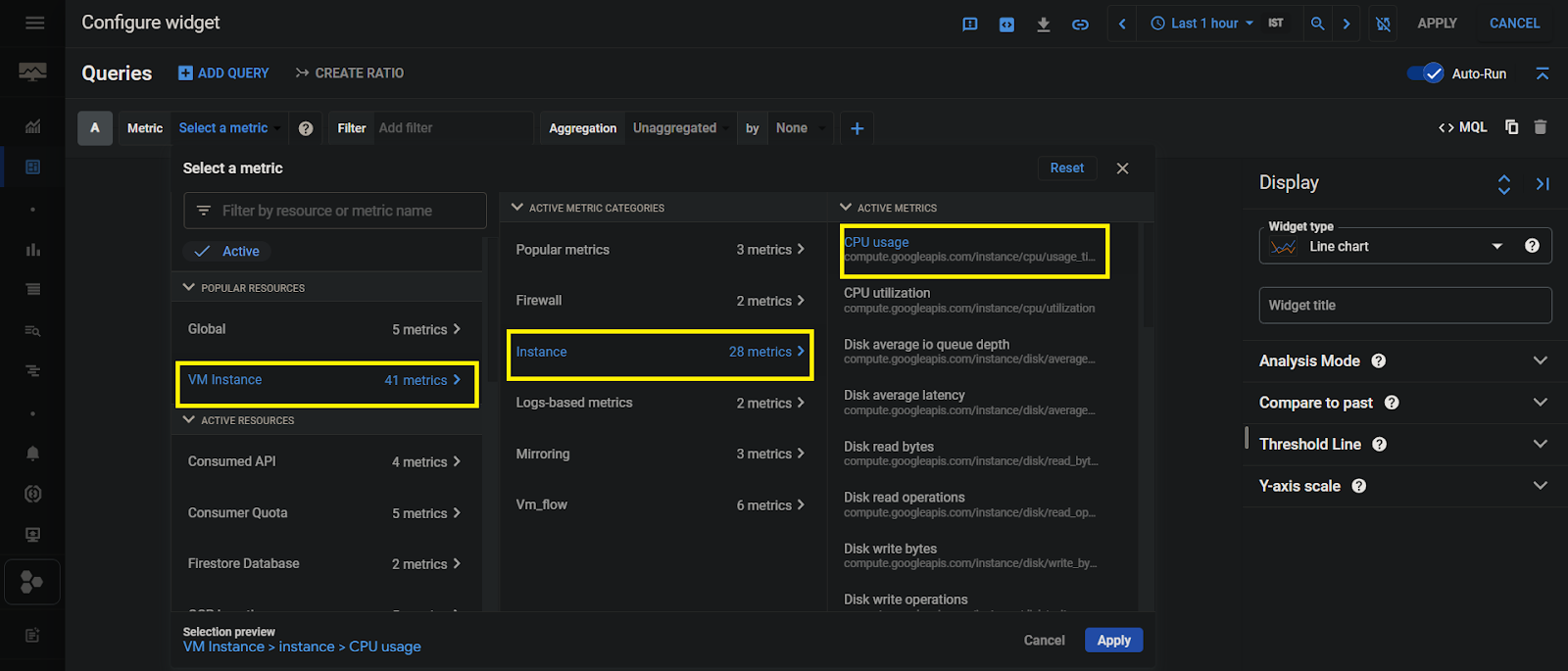
Step 3: Click on Add widget
widget typically used to describe the data being displayed or provide context to the viewer.
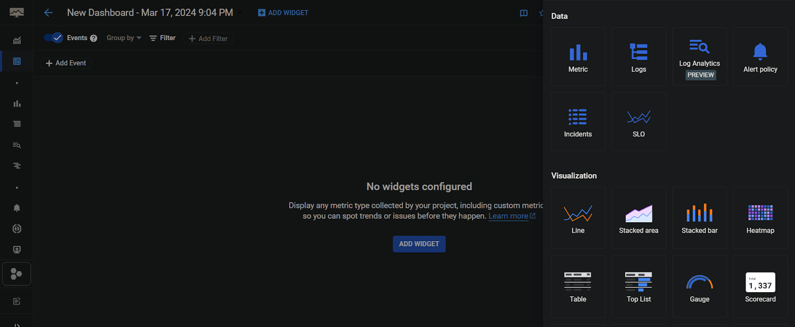
Step 4: Selct the type of widget which is shows on right side
Step 5: Click on select metrics and select the resource, metric and active metics(ie., cpu, memory) then click on apply.
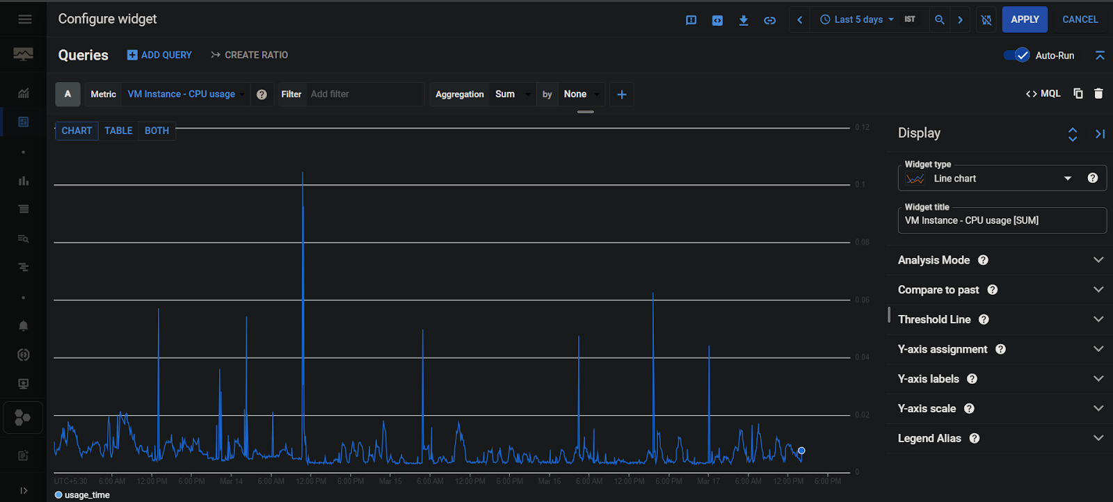
Step 6: Data is visualized in dashboard with line then click on apply dashboard is saved.
Metrics: These are numerical assessments of the functionality or condition of GCP resources, such as CPU or network traffic. They assist with monitoring and troubleshooting and provide insights into the behavior of resources.
Aggregation: Using statistical procedures like average or sum, aggregation entails integrating several data points into a single result. It provides condensed information for analysis and display, simplifying complex data sets.
Events: Important incidents or occurrences inside a system or application that merit notice are referred to as events in monitoring. Error messages, alerts, status updates, and other noteworthy occurrences that can affect the functionality or accessibility of the resources under observation can be included in this category.
Filter: For setting standards or conditions that must be satisfied for data to be included in the analysis, filtering enables you to restrict the scope of monitoring data. A variety of criteria, including time range, resource type, status, severity level, and particular keywords, can be used to apply filters. Filtering minimizes noise in dashboards or monitoring reports and helps concentrate attention on pertinent facts.
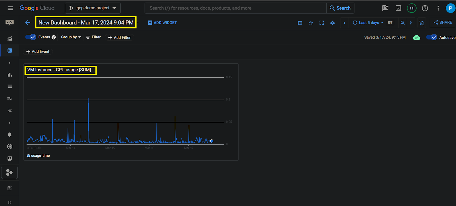
Step 7: Custom dashboard is saved with default names. Double Click on newdashboard and you can save with custom name.
Common Termonology used on Dashboard
- Widget type: It is the kind of graphical display—line, bar, or gauge charts—that is utilized to show data in a dashboard.
- Line chart: This type of widget is helpful for illustrating trends or changes over time since it shows data points as a sequence of connected line segments.
- Widget title: Widget types are usually used to give the viewer context or to describe the data that is being presented.
- VM Instance – CPU utilization [MEAN]: This indicator, which is typically defined as a percentage of the total CPU capacity utilized during a particular period of time, assesses the amount that a virtual machine (VM) instance uses its CPU resources.
- Analysis Mode: It’s how we make sense of data, like predicting trends, finding oddities, or looking at recent data compared to what happened before.
- Compare to past: By comparing contemporary data with historical data, this strategy analyzes current data and looks for patterns, trends, or discrepancies over time.
- Threshold Line: When shown as a horizontal line on a chart, it helps see when data rises or falls below predetermined levels by indicating a predetermined threshold or limit.
- Y-axis assignment: Describes the way that measures or data series are displayed and scaled on a chart according to how well they are aligned with the vertical (Y) axis.
- Y-axis labels: Y axis labels that are presented along the Y-axis to denote the scale or units of measurement applied to the data shown on the chart are referred to as Y-axis labels.
- Y-axis scale: The vertical line of the chart and the level of detail in the data visualization are determined by the scale or range of values displayed along the Y-axis.
- Legend Alias: The category shows the chart’s legend are given a legend alias or alternate name that gives each series a more descriptive a description.
For more information about Google Cloud refer this link
Coustom Dashboards in GCP – FAQ’s
How do I create a custom data dashboard?
For creating a personalized data dashboard within GCP Monitoring, access the Dashboard Editor, incorporate widgets that symbolize metrics or charts, personalize them with preferred data sources and visual aids, and store the dashboard for later utilization. This enables users to efficiently track pertinent metrics and customize monitoring displays to meet individual requirements.
How many types of visuals can you create in custom dashboard?
Users may construct a variety of graphics, including line charts, bar charts, scorecards, gauges, and histograms, in a custom dashboard in GCP Monitoring. With the help of these graphics, users can display and evaluate metrics in a variety of forms to gain more insights and improve their monitoring capabilities.
Share your thoughts in the comments
Please Login to comment...