How to create a translucent text input in ReactJS ?
Last Updated :
30 Nov, 2023
We are going to learn how to create a translucent text input in React JS. We are going to create a translucent animated text input using framer-motion and styled components.
Prerequisites:
Approach:
- We are going to create a translucent animated text input using framer-motion and styled components.
- Wrapper, Input, Label, Underline are the styled components used to make the text input box collectively in Component.jsx file.
- In Component.jsx file, we use framer-motion with custom animation variants from the Component.motion.js file to animate the text input box.
- React useState hook is used to manage the state of value that is used as a placeholder attribute & also to set it as a label when active.
- Framer-motion useCycle hook is similar to react useState hook. It cycles through a series of visual properties used for animation. It is used to toggle between or cycle through animation variants.
Steps to create React Application and Installing Modules:
Step 1: Now, you will start a new project using create-react-app so open your terminal and type:
npx create-react-app translucent-input-box
Step 2: After creating your project folder i.e. translucent-input-box , move to it using the following command.
cd translucent-input-box
Step 3: Add the npm packages you will need during the project:
npm install framer-motion styled-components
Project Structure:
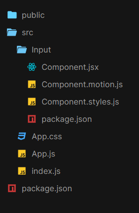
Project structure
The updated dependencies in package.json file will look like:
"dependencies": {
    "react": "^18.2.0",
    "react-dom": "^18.2.0",
    "react-scripts": "5.0.1",
    "web-vitals": "^2.1.4",
}
Example: Below is the implementation of the above approach
Javascript
import React, { useState } from "react";
import "./App.css";
import Input from "./Input";
const App = () => {
const [value, setValue] = useState("");
return (
<div className="App">
<div className="container">
{
}
<Input
value={value}
onChange={(id, value) => setValue(value)}
label={"First name"}
/>
</div>
</div>
);
};
export default App;
|
Javascript
import React from "react";
import {
Wrapper, Input,
Label, Underline
}
from "./Component.styles";
import {
motionLabel,
motionUnderline
}
from "./Component.motion";
import { useCycle } from "framer-motion";
export default ({ label, value, onChange, id, errors }) => {
const onTapStart = (event, info) => {
focus === "inactive" && cycleFocus();
return blur === "inactive" && cycleBlur();
};
const onBlur = event => {
value === "" && cycleFocus();
cycleBlur();
};
const [focus, cycleFocus] = useCycle("inactive", "active");
const [blur, cycleBlur] = useCycle("inactive", "active");
return (
<div>
{
}
<Wrapper>
<Input
onTap={onTapStart}
placeholder={label}
onBlur={e => onBlur(id)}
onChange={e => onChange(id, e.target.value)}
type={"text"}
required
value={value}
/>
<Label {...motionLabel(focus)}>{label}</Label>
<Underline {...motionUnderline(blur)} />
</Wrapper>
</div>
);
}
|
Javascript
const variantsWrapper = {
initial: {},
in: {},
out: {},
hover: {},
tap: {}
};
const variantsLabel = {
active: {
x: -15,
y: -20,
scale: 0.7
},
inactive: { x: 0, y: 0, scale: 1 }
};
const variantsUnderline = {
active: {
width: "100%",
transition: {
ease: "easeIn",
duration: 0.2
}
},
inactive: {
width: "0",
transition: {
ease: "easeIn",
duration: 0.1
}
}
};
export const motionLabel = state =& gt; {
return {
animate: state,
variants: variantsLabel
};
};
export const motionUnderline = state =& gt; {
return {
animate: state,
variants: variantsUnderline
};
};
export const animationWrapper = {
initial: "initial",
animate: "in",
exit: "out",
whileHover: "hover",
whileTap: "tap",
variants: variantsWrapper
};
|
Javascript
import styled from "styled-components";
import { motion } from "framer-motion";
export const Wrapper = styled(motion.div)`
position: relative;
width: 80%;
padding: 18px;
padding-bottom: 30px;
border-bottom: 1px solid #2f528f;
`;
export const Label = styled(motion.span)`
align-self: center;
position: absolute;
left: 0;
top: 50%;
grid-area: input;
font-family: Montserrat;
font-size: 18px;
line-height: 18px;
text-align: left;
pointer-events: none;
font-weight: normal;
`;
export const Input = styled(motion.input)`
height: 18px;
font-size: 18px;
-webkit-appearance: none;
background: transparent !important;
position: absolute;
left: 0;
top: 50%;
padding: 0;
padding-bottom: 5px;
margin: 0;
color: black;
border: none;
box-shadow: none !important;
font-weight: normal;
&:focus {
outline: none;
}
&::placeholder {
color: #f1f1f1;
}
`;
export const Underline = styled(motion.div)`
position: absolute;
background-color: #2f528f;
bottom: 0;
left: 0;
width: 100%;
height: 3px;
`;
|
CSS
.App {
font-family: "Times New Roman", Times, serif;
text-align: center;
width: auto;
height: 98vh;
display: flex;
justify-content: center;
align-items: center;
overflow: hidden;
background: #1e9600;
background: -webkit-linear-gradient(to right,
#ff0000,
#fff200,
#1e9600);
background: linear-gradient(to right,
#ff0000,
#fff200,
#1e9600);
}
.container {
border-radius: 25px;
width: 50vw;
height: 20vh;
display: flex;
justify-content: center;
align-items: center;
opacity: 0.5;
background-color: #f1f1f1;
}
Input {
text-decoration: none;
background-color: #f1f1f1;
width: 40%;
}
|
Step to Run Application: Run the application using the following command from the root directory of the project :
npm start
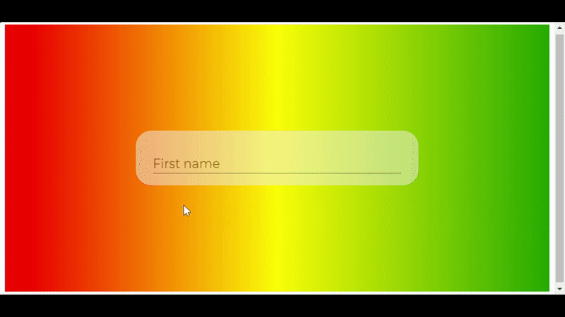
Output: Now open your browser and go to http://localhost:3000
Share your thoughts in the comments
Please Login to comment...