How to create a custom progress bar component in React.js ?
Last Updated :
10 Nov, 2023
A Progress Bar shows the measure of progress of any task or activity Linearly. It is the graphical representation of linear progression. We can make a custom reusable Progress bar component using React.js
Prerequisites:
Approach:
To create a custom progress bar component in React.js we will use the HTML div’s. The Progress component will take the parameters as progress, color, and height. The progress will be displayed using the width of the div element.
The <Progressbar /> component should do the following:
- Indicates the progress visually to the user via the colored bar.
- Shows the percentage numerically as a %
- Props that allow you to change the height, width, and background color of the progress bar.
Basically, the progress bar consists of a parent div, which represents the whole progress bar, and a child div in which the completed part of the bar along with the span will show the completed percentage number.
Props:
- bgcolor: It will change the background color of the progress bar .
- progress: It will have value between 1 to 100 .
- height: It is used to change the height of the progress bar .
Steps to create React Application And Installing Module:
Step 1: Create a React application using the following command
npx create-react-app progress_bar
Step 2: After creating your project folder i.e. folder name, move to it using the following command:
cd Progress_bar
Project Structure:
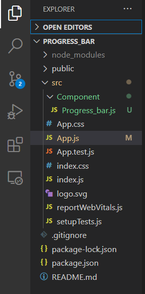
Folder structure
Example: This example implements multiple progress bars with different color and progress provided as parameters.
Javascript
import "./App.css";
import Progressbar from "./Component/Progress_bar";
function App() {
return (
<div className="App">
<h3 className="heading">Progress Bar</h3>
<Progressbar
bgcolor="orange"
progress="30"
height={30}
/>
<Progressbar
bgcolor="red"
progress="60"
height={30}
/>
<Progressbar
bgcolor="#99ff66"
progress="50"
height={30}
/>
<Progressbar
bgcolor="#ff00ff"
progress="85"
height={30}
/>
<Progressbar
bgcolor="#99ccff"
progress="95"
height={30}
/>
</div>
);
}
export default App;
|
Javascript
import React from 'react'
const Progress_bar = ({bgcolor,progress,height}) => {
const Parentdiv = {
height: height,
width: '100%',
backgroundColor: 'whitesmoke',
borderRadius: 40,
margin: 50
}
const Childdiv = {
height: '100%',
width: `${progress}%`,
backgroundColor: bgcolor,
borderRadius:40,
textAlign: 'right'
}
const progresstext = {
padding: 10,
color: 'black',
fontWeight: 900
}
return (
<div style={Parentdiv}>
<div style={Childdiv}>
<span style={progresstext}>{`${progress}%`}</span>
</div>
</div>
)
}
export default Progress_bar;
|
Step to Run Application: Run the application using the following command from the root directory of the project:
npm start
Output: Now open your browser and go to http://localhost:3000/, you will see the following output:
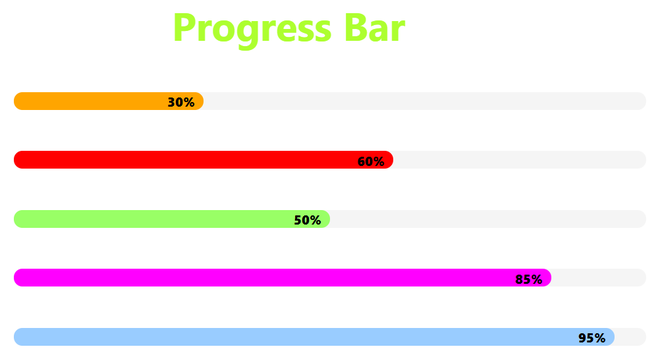
Progress bar in react
Share your thoughts in the comments
Please Login to comment...