Angular MDBootstrap Progress Bar Component
Last Updated :
02 Mar, 2022
MDBootstrap is a Material Design and bootstrap-based Angular UI library that is used to make attractive webpages with its seamless and easy-to-use component In this article, we will know how to use Progress Bar Component in Angular MDBootstap.
The Progress Bar Component is used to depict the progress of any task which is being carried out, along with containing the various available customizable options.
Properties:
- max: It is used to set the maximum total value of the progress element.
- type: It is used to provide one of the 4 supported contextual classes: `success`, `info`, `warning`, `danger`
- value: It is used to show the current value of the progress bar.
Syntax:
<div class="progress">
    <div class="progress-bar" role="progressbar"></div>
</div>
Approach:
- Download Angular MDBootstrap from the official site.
- Extract the files to the current working directory.
- Install npm in the current project using the following command:
npm install
- After creating your project folder i.e. appname, move to it using the following command:
cd appname
- Start the server using the following command:
ng serve
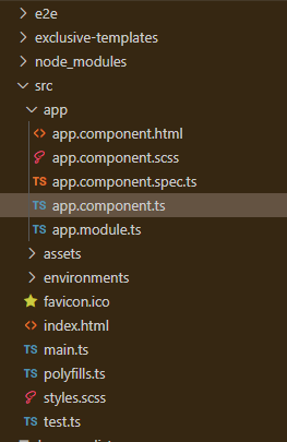
Project Structure: After complete installation, it will look like the following:
Example: This is the basic example that illustrates how to use the Progress Bar component in Angular MDBootstrap.
app.component.html
<div id='gfg'>
<h2>GeeksforGeeks</h2>
<h4>Angular MDBootstrap Progress Bar Component</h4>
<br />
<div class="progress">
<div class="progress-bar"
style="width: 30%"
min="0"
max="100">30
</div>
</div>
<br>
<div class="progress">
<div class="progress-bar"
style="width: 55%"
min="0"
max="100">55</div>
</div>
<br>
<div class="progress">
<div class="progress-bar"
style="width: 80%"
min="0"
max="100">80
</div>
</div>
<br>
<div class="progress">
<div class="progress-bar"
style="width: 100%"
min="0"
max="100">100
</div>
</div>
</div>
|
app.component.ts
import { Component } from '@angular/core';
@Component({
selector: 'my-app',
templateUrl: './app.component.html',
styleUrls: ['./app.component.css']
})
export class AppComponent{}
|
app.module.ts
import { BrowserModule } from '@angular/platform-browser';
import { NgModule } from '@angular/core';
import { BrowserAnimationsModule }
from '@angular/platform-browser/animations';
import { AppComponent } from './app.component';
import { MDBBootstrapModule } from 'angular-bootstrap-md';
import { FormsModule } from '@angular/forms';
@NgModule({
declarations: [
AppComponent
],
imports: [
BrowserModule,
BrowserAnimationsModule,
MDBBootstrapModule.forRoot(),
FormsModule,
],
providers: [],
bootstrap: [AppComponent]
})
export class AppModule{}
|
Output:

Angular MDBootstrap Progress Bar Component
Reference: https://mdbootstrap.com/docs/angular/components/progress-bar
Like Article
Suggest improvement
Share your thoughts in the comments
Please Login to comment...