Donut Chart using Matplotlib in Python
Last Updated :
27 Mar, 2023
Prerequisites: Pie Chart in matplotlib
Donut charts are the modified version of Pie Charts with the area of center cut out. A donut is more concerned about the use of area of arcs to represent the information in the most effective manner instead of Pie chart which is more focused on comparing the proportion area between the slices. Donut charts are more efficient in terms of space because the blank space inside the donut charts can be used to display some additional information about the donut chart.
For being a Donut chart it must be necessarily a Pie chart. If we look at the pie chart, we will focus on the center of the chart. Donut charts, on the other hand, eliminates the need to compare the size or area of the slice and shifts the focus on the length of the arc, which in turn is easy to measure.
Creating a Simple Donut Chart
Creating a Donut Chart involves three simple steps which are as follows :
- Create a Pie Chart
- Draw a circle of suitable dimensions.
- Add circle at the Center of Pie chart
Python3
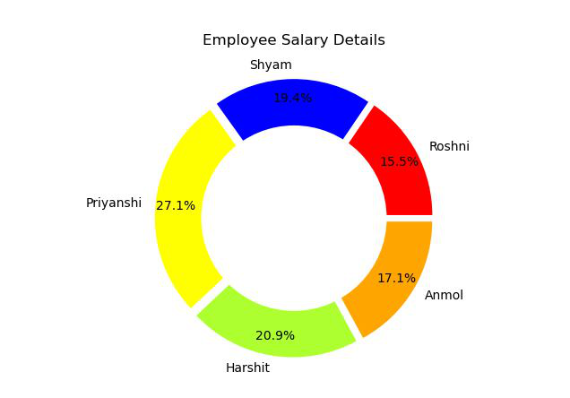
import matplotlib.pyplot as plt
Employee = ['Roshni', 'Shyam', 'Priyanshi',
'Harshit', 'Anmol']
Salary = [40000, 50000, 70000, 54000, 44000]
colors = ['#FF0000', '#0000FF', '#FFFF00',
'#ADFF2F', '#FFA500']
explode = (0.05, 0.05, 0.05, 0.05, 0.05)
plt.pie(Salary, colors=colors, labels=Employee,
autopct='%1.1f%%', pctdistance=0.85,
explode=explode)
centre_circle = plt.Circle((0, 0), 0.70, fc='white')
fig = plt.gcf()
fig.gca().add_artist(centre_circle)
plt.title('Employee Salary Details')
plt.show()
|
Output:
Customizing the Donut Chart
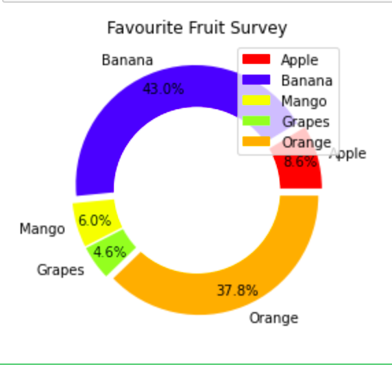
Adding Legends to the Donut Chart
A graph legend generally appears in form of a box to the right or left in the graph. It contains small samples of each color on the graph as well as a short description of what each color means in the graph.
To add legends we will simply write the following code.
plt.legend(labels, loc = "upper right")
Here plt.legend() takes two parameters the first is labels and loc is used to set the location of legend box.
Example:
Python3
import matplotlib.pyplot as plt
sizes = [100, 500, 70, 54, 440]
labels = ['Apple', 'Banana', 'Mango', 'Grapes', 'Orange']
colors = ['#FF0000', '#0000FF', '#FFFF00', '#ADFF2F', '#FFA500']
explode = (0.05, 0.05, 0.05, 0.05, 0.05)
plt.pie(sizes, colors=colors, labels=labels,
autopct='%1.1f%%', pctdistance=0.85,
explode=explode)
centre_circle = plt.Circle((0, 0), 0.70, fc='white')
fig = plt.gcf()
fig.gca().add_artist(centre_circle)
plt.title('Favourite Fruit Survey')
plt.legend(labels, loc="upper right")
plt.show()
|
Output:
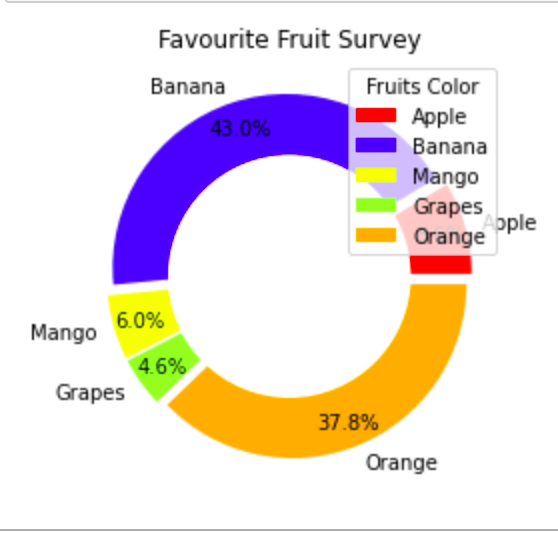
Adding Title to the Legend Box in Donut Chart
We can add a title to the Legend Box in Donut Chart by writing the following code:
plt.legend(labels, loc = "upper right",title="Fruits Color")
Example:
Python3
import matplotlib.pyplot as plt
sizes = [100, 500, 70, 54, 440]
labels = ['Apple', 'Banana', 'Mango', 'Grapes',
'Orange']
colors = ['#FF0000', '#0000FF', '#FFFF00', '#ADFF2F',
'#FFA500']
explode = (0.05, 0.05, 0.05, 0.05, 0.05)
plt.pie(sizes, colors=colors, labels=labels,
autopct='%1.1f%%', pctdistance=0.85,
explode=explode)
centre_circle = plt.Circle((0, 0), 0.70, fc='white')
fig = plt.gcf()
fig.gca().add_artist(centre_circle)
plt.title('Favourite Fruit Survey')
plt.legend(labels, loc="upper right", title="Fruits Color")
plt.show()
|
Output:
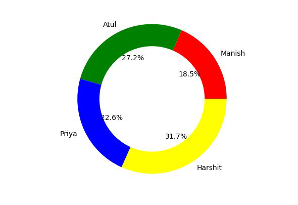
Example 2: Consider another situation that you have to prepare a report of marks obtained by different students in a test and visualize their performance by using a donut chart. To solve this problem we will use matplotlib library of python. The idea is that we will make a list of names of different students and another list of their respective marks and use this list to make a donut chart.
Python3
import matplotlib.pyplot as plt
names = ['Manish', 'Atul', 'Priya', 'Harshit']
marks = [45, 66, 55, 77]
my_circle = plt.Circle((0, 0), 0.7, color='white')
plt.pie(marks, labels=names, autopct='%1.1f%%',
colors=['red', 'green', 'blue', 'yellow'])
p = plt.gcf()
p.gca().add_artist(my_circle)
plt.show()
|
Output:
Share your thoughts in the comments
Please Login to comment...