Draw a horizontal bar chart with Matplotlib
Last Updated :
25 Aug, 2021
Matplotlib is the standard python library for creating visualizations in Python. Pyplot is a module of Matplotlib library which is used to plot graphs and charts and also make changes in them. In this article, we are going to see how to draw a horizontal bar chart with Matplotlib.
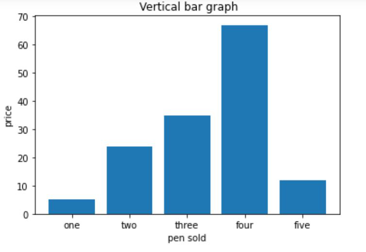
Creating a vertical bar chart
Approach:
- Importing matplotlib.pyplot as plt
- Creating list x for discrete values on x-axis
- Creating list y consisting only numeric data for discrete values on y-axis
- Calling plt.bar() function with parameters x,y as plt.bar(x,y)
- Setting x_label() and y_label()
- Setting title() for our bar chart
- Calling plt.show() for visualizing our chart
Below is the implementation:
Python3
import matplotlib.pyplot as plt
x=['one', 'two', 'three', 'four', 'five']
y=[5, 24, 35, 67, 12]
plt.bar(x, y)
plt.xlabel("pen sold")
plt.ylabel("price")
plt.title(" Vertical bar graph")
plt.show()
|
Output:
Creating a horizontal bar chart
Approach:
- Importing matplotlib.pyplot as plt
- Creating list y for discrete values on y-axis
- Creating list x consisting only numeric data for discrete values on x-axis
- Calling plt.barh() function with parameters y,x as plt.barh(y,x)
- Setting x_label() and y_label()
- Setting title() for our bar chart
- Calling plt.show() for visualizing our chart
Below is the implementation:
Python3
import matplotlib.pyplot as plt
y=['one', 'two', 'three', 'four', 'five']
x=[5,24,35,67,12]
plt.barh(y, x)
plt.ylabel("pen sold")
plt.xlabel("price")
plt.title("Horizontal bar graph")
plt.show()
|
Output:

Like Article
Suggest improvement
Share your thoughts in the comments
Please Login to comment...