Data analysis is a crucial part of any machine learning model development cycle because this helps us get an insight into the data at hand and whether it is suitable or not for the modeling purpose or what are the main key points where we should work to make data cleaner and fit for future uses so, that the valuable insights can be extracted from them. In this article, we will perform the Descriptive Statistical Data Analysis on the iris dataset using R Programming Language.
What is Descriptive Statistics?
Descriptive statistics is all about exploring the descriptive statistical measures of the data at hand. For example mean, mode, median, quantiles, and percentiles. Except for this numerical descriptive stats analysis we have graphical methods as well to analyze the statistical measures of the data for example Density Plot, Box Plot,
Quantitative Descriptive Statistical Analysis
Now we will try to analyze different statistical measures of the iris data using functions like summary(), groupby(), fivenum(), and other central tendencies.
R
data(iris)
df <- iris
head(df)
str(df)
|
Output:
  Sepal.Length Sepal.Width Petal.Length Petal.Width Species
1          5.1         3.5          1.4         0.2  setosa
2          4.9         3.0          1.4         0.2  setosa
3          4.7         3.2          1.3         0.2  setosa
4          4.6         3.1          1.5         0.2  setosa
5          5.0         3.6          1.4         0.2  setosa
6          5.4         3.9          1.7         0.4  setosa
'data.frame':    150 obs. of  5 variables:
$ Sepal.Length: num  5.1 4.9 4.7 4.6 5 5.4 4.6 5 4.4 4.9 ...
$ Sepal.Width : num  3.5 3 3.2 3.1 3.6 3.9 3.4 3.4 2.9 3.1 ...
$ Petal.Length: num  1.4 1.4 1.3 1.5 1.4 1.7 1.4 1.5 1.4 1.5 ...
$ Petal.Width : num  0.2 0.2 0.2 0.2 0.2 0.4 0.3 0.2 0.2 0.1 ...
$ Species     : Factor w/ 3 levels "setosa","versicolor",..: 1 1 1 1 1 1 1 1 1 1 ...
Now let’s print the minimum and the maximum value of the SepalLength feature in the iris dataset for this we can use min(), max() functions.
R
print(min(df$Sepal.Length))
print(max(df$Sepal.Length))
|
Output:
[1] 4.3
[1] 7.9
To find particular central tendencies like mean, mode, median, quantile, and percentile we have inbuilt functions for them by their name only which can be used to find a particular measure.
R
print(mean(df$Sepal.Length))
print(median(df$Sepal.Length))
print(quantile(df$Sepal.Length, 0.25))
print(quantile(df$Sepal.Length, 0.75))
print(IQR(df$Sepal.Length))
print(sort(-table(df$Sepal.Length))[1])
print(sort(table(df$Sepal.Length),
decreasing = TRUE)[1])
|
Output:
[1] 5.843333
[1] 5.8
25%
5.1
75%
6.4
[1] 1.3
  5
-10
 5
10
Similarly for the standard deviation and variance we have std() and var() functions in R Programming Language.
R
print(sd(df$Sepal.Length))
print(var(df$Sepal.Length))
|
Output:
[1] 0.8280661
[1] 0.6856935
The fivenum function in the R gives the five-number summary of the data which includes a minimum value, maximum value, median, first quartile, and third quartile.
R
data <- iris
fivenum(iris$Sepal.Length)
fivenum(iris$Sepal.Width)
|
Output:
4.35.15.86.47.9
22.833.34.4
We can use the summary() function as well to calculate all the above-mentioned statistical measures as shown below.
Output:
  Sepal.Length    Sepal.Width     Petal.Length    Petal.Width          Species
 Min.   :4.300   Min.   :2.000   Min.   :1.000   Min.   :0.100   setosa    :50
 1st Qu.:5.100   1st Qu.:2.800   1st Qu.:1.600   1st Qu.:0.300   versicolor:50
 Median :5.800   Median :3.000   Median :4.350   Median :1.300   virginica :50
 Mean   :5.843   Mean   :3.057   Mean   :3.758   Mean   :1.199
 3rd Qu.:6.400   3rd Qu.:3.300   3rd Qu.:5.100   3rd Qu.:1.800
 Max.   :7.900   Max.   :4.400   Max.   :6.900   Max.   :2.500
R
by(df, df$Species, summary)
|
Output:
df$Species: setosa
  Sepal.Length    Sepal.Width     Petal.Length    Petal.Width          Species
 Min.   :4.300   Min.   :2.300   Min.   :1.000   Min.   :0.100   setosa    :50
 1st Qu.:4.800   1st Qu.:3.200   1st Qu.:1.400   1st Qu.:0.200   versicolor: 0
 Median :5.000   Median :3.400   Median :1.500   Median :0.200   virginica : 0
 Mean   :5.006   Mean   :3.428   Mean   :1.462   Mean   :0.246
 3rd Qu.:5.200   3rd Qu.:3.675   3rd Qu.:1.575   3rd Qu.:0.300
 Max.   :5.800   Max.   :4.400   Max.   :1.900   Max.   :0.600
---------------------------------------------------------------------
df$Species: versicolor
  Sepal.Length    Sepal.Width     Petal.Length   Petal.Width          Species
 Min.   :4.900   Min.   :2.000   Min.   :3.00   Min.   :1.000   setosa    : 0
 1st Qu.:5.600   1st Qu.:2.525   1st Qu.:4.00   1st Qu.:1.200   versicolor:50
 Median :5.900   Median :2.800   Median :4.35   Median :1.300   virginica : 0
 Mean   :5.936   Mean   :2.770   Mean   :4.26   Mean   :1.326
 3rd Qu.:6.300   3rd Qu.:3.000   3rd Qu.:4.60   3rd Qu.:1.500
 Max.   :7.000   Max.   :3.400   Max.   :5.10   Max.   :1.800
---------------------------------------------------------------------
df$Species: virginica
  Sepal.Length    Sepal.Width     Petal.Length    Petal.Width          Species
 Min.   :4.900   Min.   :2.200   Min.   :4.500   Min.   :1.400   setosa    : 0
 1st Qu.:6.225   1st Qu.:2.800   1st Qu.:5.100   1st Qu.:1.800   versicolor: 0
 Median :6.500   Median :3.000   Median :5.550   Median :2.000   virginica :50
 Mean   :6.588   Mean   :2.974   Mean   :5.552   Mean   :2.026
 3rd Qu.:6.900   3rd Qu.:3.175   3rd Qu.:5.875   3rd Qu.:2.300
 Max.   :7.900   Max.   :3.800   Max.   :6.900   Max.   :2.500
We also have different packages as well which provide such functions which are mainly to get the descriptive statistics of the dataset. For example, we have stat.desc() function in the pastecs packages which provides all the statistical measures of the dataset.
R
library(pastecs)
stat.desc(df)
|
Output:
             Sepal.Length  Sepal.Width Petal.Length  Petal.Width Species
nbr.val      150.00000000 150.00000000  150.0000000 150.00000000      NA
nbr.null       0.00000000   0.00000000    0.0000000   0.00000000      NA
nbr.na         0.00000000   0.00000000    0.0000000   0.00000000      NA
min            4.30000000   2.00000000    1.0000000   0.10000000      NA
max            7.90000000   4.40000000    6.9000000   2.50000000      NA
range          3.60000000   2.40000000    5.9000000   2.40000000      NA
sum          876.50000000 458.60000000  563.7000000 179.90000000      NA
median         5.80000000   3.00000000    4.3500000   1.30000000      NA
mean           5.84333333   3.05733333    3.7580000   1.19933333      NA
SE.mean        0.06761132   0.03558833    0.1441360   0.06223645      NA
CI.mean.0.95   0.13360085   0.07032302    0.2848146   0.12298004      NA
var            0.68569351   0.18997942    3.1162779   0.58100626      NA
std.dev        0.82806613   0.43586628    1.7652982   0.76223767      NA
coef.var       0.14171126   0.14256420    0.4697441   0.63555114      NA
R
cor(df$Sepal.Length, df$Sepal.Width)
|
Output:
[1] -0.1175698
Another such example is the describe() function of the psych package which is similar to the describe() method available in the pandas library of Python.
R
install.packages("psych")
library(psych)
data <- iris
describe(iris)
|
Output:
             vars   n mean   sd median trimmed  mad min max range  skew kurtosis   se
Sepal.Length    1 150 5.84 0.83   5.80    5.81 1.04 4.3 7.9   3.6  0.31    -0.61 0.07
Sepal.Width     2 150 3.06 0.44   3.00    3.04 0.44 2.0 4.4   2.4  0.31     0.14 0.04
Petal.Length    3 150 3.76 1.77   4.35    3.76 1.85 1.0 6.9   5.9 -0.27    -1.42 0.14
Petal.Width     4 150 1.20 0.76   1.30    1.18 1.04 0.1 2.5   2.4 -0.10    -1.36 0.06
Species*        5 150 2.00 0.82   2.00    2.00 1.48 1.0 3.0   2.0  0.00    -1.52 0.07
Graphical Descriptive Statistical Analysis
Analyzing numbers requires some level of expertise in statistics. To tackle this problem we can create different types of visualizations as well to perform Descriptive Statistical Data Analysis.
Below is an example of some of such data visualizations that can be used for descriptive statistical analysis:
Histogram
A histogram is an approximate representation of the distribution of numerical data. In a histogram, each bar groups numbers into ranges. Taller bars show that more data falls in that range. A histogram displays the shape and spread of continuous sample data.
R
install.packages('ggplot2')
library(ggplot2)
hist(df$Sepal.Length)
|
Output:

Histogram for descriptive statistical analysis
Boxplot
A box graph is a chart that is used to display information in the form of distribution by drawing boxplots for each of them. This distribution of data is based on five sets (minimum, first quartile, median, third quartile, and maximum).
Output:
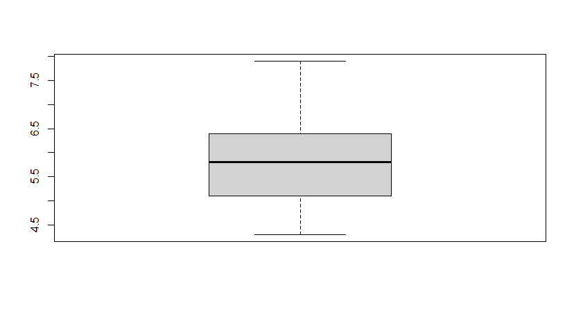
Boxplot for descriptive statistical analysis
Scatter Plot
A scatter plot is a set of dotted points to represent individual pieces of data on the horizontal and vertical axis. A graph in which the values of two variables are plotted along the X-axis and Y-axis, the pattern of the resulting points reveals a correlation between them.
R
plot(df$Sepal.Length, df$Petal.Length)
|
Output:

Scatter Plot for descriptive statistical analysis
QQ Plot
The quantile-quantile plot is a graphical method for determining whether two samples of data came from the same population or not. A q-q plot is a plot of the quantiles of the first data set against the quantiles of the second data set. By a quantile, we mean the fraction (or percent) of points below the given value.
R
set.seed(500)
x <- iris$Sepal.Length
qqnorm(x)
qqline(x, col = "red")
|
Output:

Normal QQ Plot for descriptive statistical analysis
Line Plot
In a line graph, we have the horizontal axis value through which the line will be ordered and connected using the vertical axis values. We are going to use the R package ggplot2 which has several layers in it.
R
plot(iris$Sepal.Length, type='o',
col = "red", xlab = "Size",
ylab = "Sepal length",
main = "Iris sepal length")
|
Output:

Line Plot for descriptive statistical analysis
Correlation Plot
Correlation refers to the relationship between two variables. It refers to the degree of linear correlation between any two random variables. This relation can be expressed as a range of values expressed within the interval [-1, 1]. The value -1 indicates a perfect non-linear (negative) relationship, 1 is a perfect positive linear relationship and 0 is an intermediate between neither positive nor negative linear interdependency.
R
library(corrplot)
data('iris')
data <- iris
head(data)
corrplot(cor(data.matrix(data)))
|
Output:

Correlation Plot for descriptive statistical analysis
Density Plot
Density Plot is a type of data visualization tool. It is a variation of the histogram that uses ‘kernel smoothing’ while plotting the values. It is a continuous and smooth version of a histogram inferred from a data.
R
library(readxl)
library(ggplot2)
data <- iris
den <- density(iris$Sepal.Length)
plot(den, col = "red",
main = "Density plot of sepal length")
|
Output:

Density Plot for descriptive statistical analysis
We can also plot the density plot as well as histogram on the same plot as well.
R
hist(iris$Sepal.Length, col="blue",
prob = TRUE, xlab = "Sepal length",
main = "Iris sepal length")
lines(density(iris$Sepal.Length),
lwd = 4, col = "red")
|
Output:

Histogram and Density Plot for descriptive statistical analysis
Share your thoughts in the comments
Please Login to comment...