CSS Grid Items
Last Updated :
29 Dec, 2023
CSS Grid Items are contained in the Grid Container, where for each row, the container will contain one grid item for each column, by default. The Grid Items can also be styled, which will span in multiple columns and/or rows.
Grid Item is a no of child boxes wrapped inside the grid container. There are various properties including, grid-column property, grid-row property, grid-area property, naming grid, and order of the items. These grid items are responsive and work well on all screen sizes.
The grid-column Property
The grid-column property in CSS describes the range of columns that a grid item takes inside the grid container. The property grid-columns value defines the starting and ending position of the grid items along the x-axis (horizontally). The values can be given in two ways including span and the column lines.
The following table illustrates the two ways to give grid-column property value along with syntax and description.
|
Syntax
|
Descriptions
|
| grid-column: 1/3 |
The values are defined as spans from the first column line to the third column line. |
| grid-column: 1/span 2 |
The values are defined as from the first column line and span across three columns. |
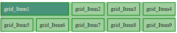
Example 1: The example illustrates a grid-column Property item 5 that starts with the second column line and ends on the fourth column line.
HTML
<!DOCTYPE html>
<html lang="en">
<head>
<meta charset="UTF-8">
<meta name="viewport"
content="width=device-width, initial-scale=1.0">
<link rel="stylesheet" href="style.css">
</head>
<body>
<div class="containergrid">
<div class="box" id="box1">grid_Item1</div>
<div class="box" id="box2">grid_Item2</div>
<div class="box" id="box3">grid_Item3</div>
<div class="box" id="box4">grid_Item4</div>
<div class="box" id="box5">grid_Item5</div>
<div class="box" id="box6">grid_Item6</div>
<div class="box" id="box7">grid_Item7</div>
<div class="box" id="box8">grid_Item8</div>
<div class="box" id="box9">grid_Item9</div>
<div class="box" id="box10">grid_Item10</div>
</div>
</body>
</html>
|
CSS
.containergrid {
display: grid;
grid-template-columns: 1fr 1fr 1fr;
gap: 10px;
background-color: rgb(159, 206, 159)
}
#box5 {
grid-column: 2/4;
background-color: rgb(73, 147, 122);
color: antiquewhite;
}
.containergrid>div {
padding: 10px;
font-size: 20px;
}
.box {
border: 2px solid green;
}
|
Output:
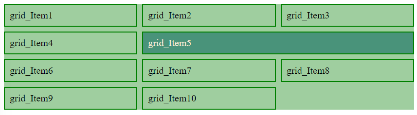
Output
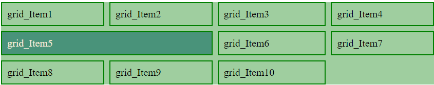
Example 2: The example illustrates grid-column Property item 5 starts with the first column line and spans to two columns
HTML
<!DOCTYPE html>
<html lang="en">
<head>
<meta charset="UTF-8">
<meta name="viewport"
content="width=device-width, initial-scale=1.0">
<link rel="stylesheet" href="style.css">
</head>
<body>
<div class="containergrid">
<div class="box" id="box1">grid_Item1</div>
<div class="box" id="box2">grid_Item2</div>
<div class="box" id="box3">grid_Item3</div>
<div class="box" id="box4">grid_Item4</div>
<div class="box" id="box5">grid_Item5</div>
<div class="box" id="box6">grid_Item6</div>
<div class="box" id="box7">grid_Item7</div>
<div class="box" id="box8">grid_Item8</div>
<div class="box" id="box9">grid_Item9</div>
<div class="box" id="box10">grid_Item10</div>
</div>
</body>
</html>
|
CSS
.containergrid {
display: grid;
grid-template-columns: repeat(4, auto);
gap: 10px;
background-color: rgb(159, 206, 159)
}
#box5 {
grid-column: 1/ span 2;
background-color: rgb(73, 147, 122);
color: antiquewhite;
}
.containergrid>div {
padding: 10px;
font-size: 20px;
}
.box {
border: 2px solid green;
}
|
Output:
The grid-row Property
The grid-row property in CSS describes the range of rows that a grid item takes inside the grid container. The property grid-rows value defines the starting and ending position of the grid items along the y-axis (vertically). The values can be given in two ways including span and the column lines.
The following table illustrates the two ways to give grid-row property value along with syntax and description.
|
Syntax
|
Descriptions
|
| grid-row: 1/3 |
The values are defined as spans from the first-row line to the third-row line. |
| grid-row: 2/span 2 |
The values are defined as from the second-row line and span across three rows. |
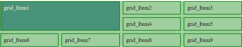
Example 1: The example illustrates grid-row Property item 10 starts with the second-row line and spans to the two rows.
HTML
<!DOCTYPE html>
<html lang="en">
<head>
<meta charset="UTF-8">
<meta name="viewport"
content="width=device-width, initial-scale=1.0">
<link rel="stylesheet" href="style.css">
</head>
<body>
<div class="containergrid">
<div class="box" id="box1">grid_Item1</div>
<div class="box" id="box2">grid_Item2</div>
<div class="box" id="box3">grid_Item3</div>
<div class="box" id="box4">grid_Item4</div>
<div class="box" id="box5">grid_Item5</div>
<div class="box" id="box6">grid_Item6</div>
<div class="box" id="box7">grid_Item7</div>
<div class="box" id="box8">grid_Item8</div>
<div class="box" id="box9">grid_Item9</div>
<div class="box" id="box10">grid_Item10</div>
</div>
</body>
</html>
|
CSS
.containergrid {
display: grid;
grid-template-columns: repeat(4, auto);
gap: 10px;
background-color: rgb(159, 206, 159)
}
#box5 {
grid-row: 2/ span 2;
background-color: rgb(73, 147, 122);
color: antiquewhite;
}
.containergrid>div {
padding: 10px;
font-size: 20px;
}
.box {
border: 2px solid green;
}
|
Output:
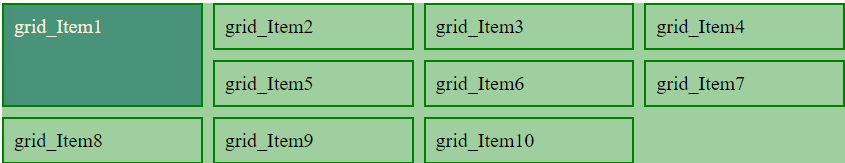
 Example 2: The example illustrates grid-row Property item 1 starts with the first-row line and ends on the third row.
HTML
<!DOCTYPE html>
<html lang="en">
<head>
<meta charset="UTF-8">
<meta name="viewport"
content="width=device-width, initial-scale=1.0">
<link rel="stylesheet" href="style.css">
</head>
<body>
<div class="containergrid">
<div class="box" id="box1">grid_Item1</div>
<div class="box" id="box2">grid_Item2</div>
<div class="box" id="box3">grid_Item3</div>
<div class="box" id="box4">grid_Item4</div>
<div class="box" id="box5">grid_Item5</div>
<div class="box" id="box6">grid_Item6</div>
<div class="box" id="box7">grid_Item7</div>
<div class="box" id="box8">grid_Item8</div>
<div class="box" id="box9">grid_Item9</div>
<div class="box" id="box10">grid_Item10</div>
</div>
</body>
</html>
|
CSS
.containergrid{
display: grid;
grid-template-columns: repeat(4, auto) ;
gap: 10px;
background-color: rgb(159, 206, 159)
}
#box1{
grid-row: 1/3;
background-color: rgb(73, 147, 122);
color: antiquewhite;
}
.containergrid>div{
padding: 10px;
font-size: 20px;
}
.box{
border: 2px solid green;
}
|
Output:
The grid area property
The grid area property offers to specify the positioning properties in a single declaration. It is a shorthand property for the four other properties including grid-row-start, grid-column-start, grid-row-end, and grid-column-end properties.
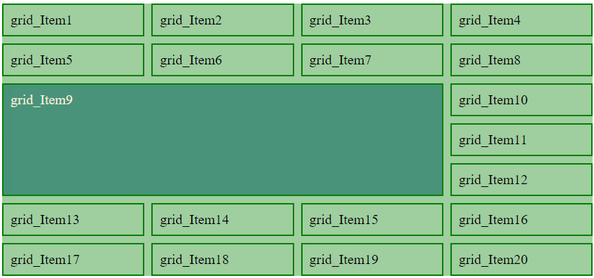
Example 1: The example illustrates grid-area Property where item 9 starts on row-line 3 and column line 1, and ends on row-line 6 and column line 3.
HTML
<!DOCTYPE html>
<html lang="en">
<head>
<meta charset="UTF-8">
<meta name="viewport"
content="width=device-width, initial-scale=1.0">
<link rel="stylesheet" href="style.css">
</head>
<body>
<div class="containergrid">
<div class="box" id="box1">grid_Item1</div>
<div class="box" id="box2">grid_Item2</div>
<div class="box" id="box3">grid_Item3</div>
<div class="box" id="box4">grid_Item4</div>
<div class="box" id="box5">grid_Item5</div>
<div class="box" id="box6">grid_Item6</div>
<div class="box" id="box7">grid_Item7</div>
<div class="box" id="box8">grid_Item8</div>
<div class="box" id="box9">grid_Item9</div>
<div class="box" id="box10">grid_Item10</div>
<div class="box" id="box11">grid_Item11</div>
<div class="box" id="box12">grid_Item12</div>
<div class="box" id="box13">grid_Item13</div>
<div class="box" id="box14">grid_Item14</div>
<div class="box" id="box15">grid_Item15</div>
<div class="box" id="box16">grid_Item16</div>
<div class="box" id="box17">grid_Item17</div>
<div class="box" id="box18">grid_Item18</div>
<div class="box" id="box19">grid_Item19</div>
<div class="box" id="box20">grid_Item20</div>
</div>
</body>
</html>
|
CSS
.containergrid{
display: grid;
grid-template-columns: repeat(4, auto) ;
gap: 10px;
background-color: rgb(159, 206, 159)
}
#box9{
grid-area: 3/1/6/3;
background-color: rgb(73, 147, 122);
color: antiquewhite;
}
.containergrid>div{
padding: 10px;
font-size: 20px;
}
.box{
border: 2px solid green;
}
|
Output:

Example 2: The example illustrates grid-area Property where box 9 starts on row-line 3 and column line 1 and spans to 3 rows and 3 columns.
HTML
<!DOCTYPE html>
<html lang="en">
<head>
<meta charset="UTF-8">
<meta name="viewport"
content="width=device-width, initial-scale=1.0">
<link rel="stylesheet" href="style.css">
</head>
<body>
<div class="containergrid">
<div class="box" id="box1">grid_Item1</div>
<div class="box" id="box2">grid_Item2</div>
<div class="box" id="box3">grid_Item3</div>
<div class="box" id="box4">grid_Item4</div>
<div class="box" id="box5">grid_Item5</div>
<div class="box" id="box6">grid_Item6</div>
<div class="box" id="box7">grid_Item7</div>
<div class="box" id="box8">grid_Item8</div>
<div class="box" id="box9">grid_Item9</div>
<div class="box" id="box10">grid_Item10</div>
<div class="box" id="box11">grid_Item11</div>
<div class="box" id="box12">grid_Item12</div>
<div class="box" id="box13">grid_Item13</div>
<div class="box" id="box14">grid_Item14</div>
<div class="box" id="box15">grid_Item15</div>
<div class="box" id="box16">grid_Item16</div>
<div class="box" id="box17">grid_Item17</div>
<div class="box" id="box18">grid_Item18</div>
<div class="box" id="box19">grid_Item19</div>
<div class="box" id="box20">grid_Item20</div>
</div>
</body>
</html>
|
CSS
.containergrid{
display: grid;
grid-template-columns: repeat(4, auto) ;
gap: 10px;
background-color: rgb(159, 206, 159)
}
#box9{
grid-area: 3/1/span 3/ span 3;
background-color: rgb(73, 147, 122);
color: antiquewhite;
}
.containergrid>div{
padding: 10px;
font-size: 20px;
}
.box{
border: 2px solid green;
}
|
Output:
Naming Grid items
Naming grid items offers to assign the names to the grid items. The grid-area property of the grid item and the grid-template-areas property of the grid container are used.
Example 1: The example illustrates naming grid items Property item 1 gets the name navarea and spans to four columns.
HTML
<!DOCTYPE html>
<html lang="en">
<head>
<meta charset="UTF-8">
<meta name="viewport"
content="width=device-width, initial-scale=1.0">
<link rel="stylesheet" href="style.css">
</head>
<body>
<div class="containergrid">
<div class="box" id="box1">grid_Item1</div>
<div class="box" id="box2">grid_Item2</div>
<div class="box" id="box3">grid_Item3</div>
<div class="box" id="box4">grid_Item4</div>
<div class="box" id="box5">grid_Item5</div>
<div class="box" id="box6">grid_Item6</div>
<div class="box" id="box7">grid_Item7</div>
<div class="box" id="box8">grid_Item8</div>
<div class="box" id="box9">grid_Item9</div>
</div>
</body>
</html>
|
CSS
.containergrid{
display: grid;
grid-template-areas: 'navarea navarea navarea navarea';
gap: 10px;
background-color: rgb(159, 206, 159)
}
#box1{
grid-area: navarea;
background-color: rgb(73, 147, 122);
color: antiquewhite;
}
.containergrid>div{
padding: 10px;
font-size: 20px;
}
.box{
border: 2px solid green;
}
|
Output:

Output
Example 2: The example illustrates naming grid items Property where item 1 gets the name navarea and spans to two columns.
HTML
<!DOCTYPE html>
<html lang="en">
<head>
<meta charset="UTF-8">
<meta name="viewport"
content="width=device-width, initial-scale=1.0">
<link rel="stylesheet" href="style.css">
</head>
<body>
<div class="containergrid">
<div class="box" id="box1">grid_Item1</div>
<div class="box" id="box2">grid_Item2</div>
<div class="box" id="box3">grid_Item3</div>
<div class="box" id="box4">grid_Item4</div>
<div class="box" id="box5">grid_Item5</div>
<div class="box" id="box6">grid_Item6</div>
<div class="box" id="box7">grid_Item7</div>
<div class="box" id="box8">grid_Item8</div>
<div class="box" id="box9">grid_Item9</div>
</div>
</body>
</html>
|
CSS
.containergrid{
display: grid;
grid-template-areas: 'navarea navarea . . .';
gap: 10px;
background-color: rgb(159, 206, 159)
}
#box1{
grid-area: navarea;
background-color: rgb(73, 147, 122);
color: antiquewhite;
}
.containergrid>div{
padding: 10px;
font-size: 20px;
}
.box{
border: 2px solid green;
}
|
Output:
Output
Example 3: The example illustrates naming grid items Property where box1 spans two columns and two rows.
HTML
<!DOCTYPE html>
<html>
<head>
<meta charset="UTF-8">
<meta name="viewport"
content="width=device-width, initial-scale=1.0">
<link rel="stylesheet" href="style.css">
</head>
<body>
<div class="containergrid">
<div class="box" id="box1">grid_Item1</div>
<div class="box" id="box2">grid_Item2</div>
<div class="box" id="box3">grid_Item3</div>
<div class="box" id="box4">grid_Item4</div>
<div class="box" id="box5">grid_Item5</div>
<div class="box" id="box6">grid_Item6</div>
<div class="box" id="box7">grid_Item7</div>
<div class="box" id="box8">grid_Item8</div>
<div class="box" id="box9">grid_Item9</div>
</div>
</body>
</html>
|
CSS
.containergrid {
display: grid;
grid-template-areas: 'navarea navarea . . ' 'navarea navarea . . ';
gap: 10px;
background-color: rgb(159, 206, 159)
}
#box1 {
grid-area: navarea;
background-color: rgb(73, 147, 122);
color: antiquewhite;
}
.containergrid>div {
padding: 10px;
font-size: 20px;
}
.box {
border: 2px solid green;
}
|
Output:
Output
Example 4: The example illustrates the grid-items Property here all the grid items get the name.
HTML
<!DOCTYPE html>
<html lang="en">
<head>
<meta charset="UTF-8">
<meta name="viewport"
content="width=device-width, initial-scale=1.0">
<link rel="stylesheet" href="style.css">
</head>
<body>
<div class="containergrid">
<div class="box" id="box1">grid_Item1</div>
<div class="box" id="box2">grid_Item2</div>
<div class="box" id="box3">grid_Item3</div>
<div class="box" id="box4">grid_Item4</div>
<div class="box" id="box5">grid_Item5</div>
</div>
</body>
</html>
|
CSS
.containergrid {
display: grid;
grid-template-areas: 'navarea navarea navarea navarea navarea '
' sidebar main main main rsidebar '
'sidebar footer footer footer rsidebar'
;
gap: 10px;
background-color: rgb(159, 206, 159)
}
#box1 {
grid-area: navarea;
background-color: rgb(73, 147, 122);
color: antiquewhite;
}
#box2 {
grid-area: sidebar;
background-color: rgb(73, 147, 122);
color: antiquewhite;
}
#box3 {
grid-area: main;
background-color: rgb(73, 147, 122);
color: antiquewhite;
}
#box4 {
grid-area: rsidebar;
background-color: rgb(73, 147, 122);
color: antiquewhite;
}
#box5 {
grid-area: footer;
background-color: rgb(73, 147, 122);
color: antiquewhite;
}
.containergrid>div {
padding: 10px;
font-size: 20px;
}
.box {
border: 2px solid green;
}
|
Output:
Order of the items
The grid items can be placed anywhere according to the requirements of the project. The order of the grid items can be changed with different screen sizes using media queries.
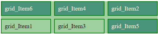
Example: The example illustrates the order of items with the help of grid area property to each element we want to change the order.
HTML
<!DOCTYPE html>
<html lang="en">
<head>
<meta charset="UTF-8">
<meta name="viewport"
content="width=device-width, initial-scale=1.0">
<link rel="stylesheet" href="style.css">
</head>
<body>
<div class="containergrid">
<div class="box" id="box1">grid_Item1</div>
<div class="box" id="box2">grid_Item2</div>
<div class="box" id="box3">grid_Item3</div>
<div class="box" id="box4">grid_Item4</div>
<div class="box" id="box5">grid_Item5</div>
<div class="box" id="box6">grid_Item6</div>
</div>
</body>
</html>
|
CSS
.containergrid {
display: grid;
grid-template-columns: 1fr 1fr 1fr;
gap: 10px;
background-color: rgb(159, 206, 159)
}
#box2 {
grid-area: 1/3/1/4;
background-color: rgb(73, 147, 122);
color: antiquewhite;
}
#box4 {
grid-area: 1/2/1/2;
background-color: rgb(73, 147, 122);
color: antiquewhite;
}
#box5 {
grid-area: 2/3/3/4;
background-color: rgb(73, 147, 122);
color: antiquewhite;
}
#box6 {
grid-area: 1/1/2/2;
background-color: rgb(73, 147, 122);
color: antiquewhite;
}
.containergrid>div {
padding: 10px;
font-size: 20px;
}
.box {
border: 2px solid green;
}
|
Output:
Share your thoughts in the comments
Please Login to comment...