Grid Container
Last Updated :
03 Jan, 2024
The Grid Container is the container element where the property display with a value grid or the inline-grid is used for defining their direct children into a grid layout. The Grid Container offers various properties these are grid-template-columns Property, grid-template-rows Property, justify-content Property, and align-content property.
We will explore the above topics with the help of suitable examples.
Grid Container with display “grid” property
The “display: grid” property in CSS is used to create a grid container, allowing efficient organization of elements in rows and columns for responsive and structured web layouts.
Syntax
.gridbox {
    display: grid;
}
The grid-template-columns Property
The grid-template-columns property is used to define the number of columns in the grid.
Example 1: The example illustrates defining a grid with grid-template-columns property for making columns.
HTML
<!DOCTYPE html>
<html lang="en">
<head>
<meta charset="UTF-8">
<meta name="viewport" content="width=device-width,
initial-scale=1.0">
<link rel="stylesheet" href="style.css">
</head>
<body>
<div class="gridbox">
<div class="divclass" id="div1">box1</div>
<div class="divclass" id="div2">box2</div>
<div class="divclass" id="div3">box3</div>
<div class="divclass" id="div4">box4</div>
<div class="divclass" id="div5">box5</div>
<div class="divclass" id="div6">box6</div>
<div class="divclass" id="div7">box7</div>
<div class="divclass" id="div8">box8</div>
<div class="divclass" id="div9">box9</div>
<div class="divclass" id="div10">box10</div>
</div>
</body>
</html>
|
CSS
.gridbox{
display: grid;
row-gap: 10px;
column-gap: 10px;
grid-template-columns: 1fr 2fr 1fr 1fr;
background-color: rgb(186, 226, 186);
padding: 5px;
border: 2px solid rgb(177, 206, 177);
}
.divclass{
border: 2px solid green;
text-align: center;
}
|
Output:

grid-template-columns
Example 2: The example illustrates how to define a grid with grid-template-columns property for making columns.
HTML
<!DOCTYPE html>
<html lang="en">
<head>
<meta charset="UTF-8">
<meta name="viewport" content="width=device-width,
initial-scale=1.0">
<link rel="stylesheet" href="style.css">
</head>
<body>
<div class="gridbox">
<div class="divclass" id="div1">box1</div>
<div class="divclass" id="div2">box2</div>
<div class="divclass" id="div3">box3</div>
<div class="divclass" id="div4">box4</div>
<div class="divclass" id="div5">box5</div>
<div class="divclass" id="div6">box6</div>
<div class="divclass" id="div7">box7</div>
<div class="divclass" id="div8">box8</div>
<div class="divclass" id="div9">box9</div>
</div>
</body>
</html>
|
CSS
.gridbox{
display: grid;
row-gap: 10px;
column-gap: 10px;
grid-template-columns: 100px 200px auto;
background-color: rgb(186, 226, 186);
padding: 5px;
border: 2px solid rgb(177, 206, 177);
}
.divclass{
border: 2px solid green;
text-align: center;
}
|
Output:
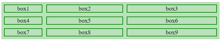
grid-template-columns
The grid-template-rows Property
The grid-template-rows property is used to define the height of the rows in the grid.
Syntax
.grid-box{
  display: grid;
  grid-template-rows: 50px, 150px;
}
Example 1: The example illustrates how to define a grid with grid-template-rows property for giving rows height.
HTML
<!DOCTYPE html>
<html lang="en">
<head>
<meta charset="UTF-8">
<meta name="viewport" content="width=device-width,
initial-scale=1.0">
<link rel="stylesheet" href="style.css">
</head>
<body>
<div class="gridbox">
<div class="divclass" id="div1">box1</div>
<div class="divclass" id="div2">box2</div>
<div class="divclass" id="div3">box3</div>
<div class="divclass" id="div4">box4</div>
<div class="divclass" id="div5">box5</div>
<div class="divclass" id="div6">box6</div>
<div class="divclass" id="div7">box7</div>
<div class="divclass" id="div8">box8</div>
<div class="divclass" id="div9">box9</div>
</div>
</body>
</html>
|
CSS
.gridbox{
display: grid;
row-gap: 10px;
column-gap: 10px;
grid-template-columns: 200px 200px auto;
grid-template-rows: 50px 80px;
background-color: rgb(178, 234, 178);
}
.divclass{
border: 2px solid green;
background-color: rgb(232, 245, 232);
text-align: center;
padding: 2px;
font-size: 20px;
}
|
Output:

grid-template-rows
The justify-content Property
The justify-content property is used to horizontally align the complete grid inside the container.
Syntax
.grid-box {
    display: grid;
    justify-content: space-between;
}
|
Property with Syntax
|
Descriptions
|
| justify-content: center; |
The property aligns the complete grid to the center |
| justify-content: space-between; |
The property distributes the complete space equally, leaving no space at the beginning or end. |
| justify-content: space-evenly; |
The property distributes the equal space at the beginning, between, and at the end. |
| justify-content: space-around; |
The property creates equal space at the beginning, between, and at the end. |
| justify-content: end; |
The property aligns the complete grid to the end. |
| justify-content: start; |
The property aligns the complete grid to the start. |
Example 1: The example illustrates property justify-content and value as space-between.
HTML
<!DOCTYPE html>
<html lang="en">
<head>
<meta charset="UTF-8">
<meta name="viewport" content="width=device-width,
initial-scale=1.0">
<link rel="stylesheet" href="style.css">
</head>
<body>
<div class="grid-box">
<div class="divclass" id="div1">box1</div>
<div class="divclass" id="div2">box2</div>
<div class="divclass" id="div3">box3</div>
<div class="divclass" id="div4">box4</div>
<div class="divclass" id="div5">box5</div>
<div class="divclass" id="div6">box6</div>
<div class="divclass" id="div7">box7</div>
<div class="divclass" id="div8">box8</div>
<div class="divclass" id="div9">box9</div>
</div>
</body>
</html>
|
CSS
.grid-box{
display: grid;
gap: 5px;
grid-template-columns: 200px 200px auto;
grid-template-rows: 50px 150px;
justify-content: space-between;
border: 2px solid green;
background-color: rgb(188, 233, 188);
padding: 10px;
}
.divclass{
border: 3px solid green;
padding: 5px;
text-align: center;
}
|
Output:

justify-content: space-between
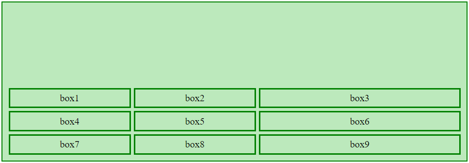
Example 2: The example illustrates property justify-content and value as an end.
HTML
<!DOCTYPE html>
<html lang="en">
<head>
<meta charset="UTF-8">
<meta name="viewport" content="width=device-width,
initial-scale=1.0">
<link rel="stylesheet" href="style.css">
</head>
<body>
<div class="grid-box">
<div class="divclass" id="div1">box1</div>
<div class="divclass" id="div2">box2</div>
<div class="divclass" id="div3">box3</div>
<div class="divclass" id="div4">box4</div>
<div class="divclass" id="div5">box5</div>
<div class="divclass" id="div6">box6</div>
<div class="divclass" id="div7">box7</div>
<div class="divclass" id="div8">box8</div>
<div class="divclass" id="div9">box9</div>
</div>
</body>
</html>
|
CSS
.grid-box{
display: grid;
gap: 5px;
grid-template-columns: 200px 200px auto;
grid-template-rows: 50px 150px;
justify-content: end;
border: 2px solid green;
background-color: rgb(188, 233, 188);
padding: 10px;
}
.divclass{
border: 3px solid green;
padding: 5px;
text-align: center;
}
|
Output:

justify-content: end
The align-content Property
The align-content property is used for vertically aligning the complete grid inside the container.
Syntax
.grid-box{
    display: grid;
    align-content: center;
}
|
Property with Syntax
|
Descriptions
|
| align-content: center; |
The property vertically aligns the complete grid to the center. |
| align-content: space-between; |
The property distributes the complete space equally, leaving no space at the beginning or end. |
| align-content: space-evenly; |
The property distributes the equal space at the beginning, between, and at the end. |
| align-content: space-around; |
The property creates equal space at the beginning, between, and at the end. |
| align-content: end; |
The property vertically aligns the complete grid to the end. |
| align-content: start; |
The property vertically aligns the complete grid to the start. |
Example 1: The example illustrates property align-content with the value center.
HTML
<!DOCTYPE html>
<html lang="en">
<head>
<meta charset="UTF-8">
<meta name="viewport" content="width=device-width,
initial-scale=1.0">
<link rel="stylesheet" href="style.css">
</head>
<body>
<div class="grid-box">
<div class="divclass" id="div1">box1</div>
<div class="divclass" id="div2">box2</div>
<div class="divclass" id="div3">box3</div>
<div class="divclass" id="div4">box4</div>
<div class="divclass" id="div5">box5</div>
<div class="divclass" id="div6">box6</div>
<div class="divclass" id="div7">box7</div>
<div class="divclass" id="div8">box8</div>
<div class="divclass" id="div9">box9</div>
</div>
</body>
</html>
|
CSS
.grid-box{
display: grid;
gap: 5px;
grid-template-columns: 200px 200px auto;
align-content: center;
border: 2px solid green;
background-color: rgb(188, 233, 188);
padding: 10px;
height: 240px;
}
.divclass{
border: 3px solid green;
padding: 5px;
text-align: center;
}
|
Output:

align-content: center
Example 2: The example illustrates to property align-content with value end.
HTML
<!DOCTYPE html>
<html lang="en">
<head>
<meta charset="UTF-8">
<meta name="viewport"
content="width=device-width,
initial-scale=1.0">
<link rel="stylesheet" href="style.css">
</head>
<body>
<div class="grid-box">
<div class="divclass" id="div1">box1</div>
<div class="divclass" id="div2">box2</div>
<div class="divclass" id="div3">box3</div>
<div class="divclass" id="div4">box4</div>
<div class="divclass" id="div5">box5</div>
<div class="divclass" id="div6">box6</div>
<div class="divclass" id="div7">box7</div>
<div class="divclass" id="div8">box8</div>
<div class="divclass" id="div9">box9</div>
</div>
</body>
</html>
|
CSS
.grid-box{
display: grid;
gap: 5px;
grid-template-columns: 200px 200px auto;
align-content: end;
border: 2px solid green;
background-color: rgb(188, 233, 188);
padding: 10px;
height: 240px;
}
.divclass{
border: 3px solid green;
padding: 5px;
text-align: center;
}
|
Output:
align-content: end
Share your thoughts in the comments
Please Login to comment...