Creating Heatmaps with Hierarchical Clustering
Last Updated :
27 Sep, 2023
Before diving into our actual topic, let’s have an understanding of Heatmaps and Hierarchical Clustering.
Heatmaps
Heatmaps are a powerful data visualization tool that can reveal patterns, relationships, and similarities within large datasets. When combined with hierarchical clustering, they become even more insightful. In this brief article, we’ll explore how to create captivating heatmaps with hierarchical clustering in R programming.
Understanding Hierarchical Clustering
Hierarchical Clustering is a powerful data analysis technique used to uncover patterns, relationships, and structures within a dataset. It belongs to the family of unsupervised machine learning algorithms and is particularly useful in exploratory data analysis and data visualization. Hierarchical Clustering is often combined with heatmap visualizations, as demonstrated in this article, to provide a comprehensive understanding of complex datasets.
What is Hierarchical Clustering?
Hierarchical Clustering, as the name suggests, creates a hierarchical or tree-like structure of clusters within the data. It groups similar data points together, gradually forming larger clusters as it moves up the hierarchy. This hierarchical representation is often visualized as a dendrogram, which is a tree diagram that illustrates the arrangement of data points into clusters.
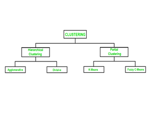
How Does Hierarchical Clustering Work?
Hierarchical Clustering can be performed in two main approaches: Agglomerative (bottom-up) and Divisive (top-down).
- Agglomerative Hierarchical Clustering: This is the more commonly used approach. It starts with each data point as its own cluster and then iteratively merges the closest clusters until all data points belong to a single cluster. The choice of a distance metric to measure similarity between clusters and a linkage method to determine how to merge clusters are critical in this process.
- Divisive Hierarchical Clustering: This approach takes the opposite route. It begins with all data points in one cluster and recursively divides them into smaller clusters based on dissimilarity. While it provides insights into the finest details of data, it is less commonly used in practice due to its computational complexity
Why Use Hierarchical Clustering?
- Hierarchy of Clusters: Hierarchical Clustering provides a hierarchical view of how data points are related. This can be particularly useful when there are natural hierarchies or levels of similarity in the data.
- Interpretability: The dendrogram generated by Hierarchical Clustering allows for easy interpretation. You can visually identify the number of clusters at different levels of the hierarchy.
- No Need for Predefined Number of Clusters: Unlike some other clustering techniques that require you to specify the number of clusters in advance, Hierarchical Clustering doesn’t have this requirement. You can explore the data’s natural structure without making prior assumptions.
Getting Started
Before diving into the code, ensure you have the necessary packages installed. We’ll use the ‘ pheatmap ‘ package for heatmap visualization and ‘dendextend’ for dendrogram customization. If you haven’t already installed them, run the following commands:
R
install.packages("pheatmap")
install.packages("dendextend")
|
Load the required packages:
R
library(pheatmap)
library(dendextend)
|
Preparing Your Data
For our demonstration, let’s consider a hypothetical gene expression dataset. It’s crucial to have data with clear patterns or relationships to create meaningful heatmaps. Replace this example data with your own dataset as needed.
R
gene_data <- data.frame(
Gene = c("Gene1", "Gene2", "Gene3", "Gene4", "Gene5"),
Sample1 = c(2.3, 1.8, 3.2, 0.9, 2.5),
Sample2 = c(2.1, 1.7, 3.0, 1.0, 2.4),
Sample3 = c(2.2, 1.9, 3.1, 0.8, 2.6),
Sample4 = c(2.4, 1.6, 3.3, 0.7, 2.3),
Sample5 = c(2.0, 1.5, 3.4, 0.6, 2.7)
)
print(gene_data)
|
Output:
 Gene Sample1 Sample2 Sample3 Sample4 Sample5
1 Gene1     2.3     2.1     2.2     2.4     2.0
2 Gene2     1.8     1.7     1.9     1.6     1.5
3 Gene3     3.2     3.0     3.1     3.3     3.4
4 Gene4     0.9     1.0     0.8     0.7     0.6
5 Gene5     2.5     2.4     2.6     2.3     2.7
Removing Non-Numeric Labels
R
gene_names <- gene_data$Gene
gene_data <- gene_data[, -1]
print(gene_data)
|
Output:
 Sample1 Sample2 Sample3 Sample4 Sample5
1     2.3     2.1     2.2     2.4     2.0
2     1.8     1.7     1.9     1.6     1.5
3     3.2     3.0     3.1     3.3     3.4
4     0.9     1.0     0.8     0.7     0.6
5     2.5     2.4     2.6     2.3     2.7
- In many datasets, the first column often contains labels or identifiers, such as gene names or sample IDs. These non-numeric columns are essential for understanding the data but can interfere with mathematical operations like distance calculations.
- To perform distance calculations correctly, we need to exclude these non-numeric columns. In this code, we store the gene names in the variable ‘gene_names’ for later use and remove the non-numeric column from the ‘gene_data DataFrame’.
- Removing the non-numeric column temporarily allows us to calculate distances without interference from these labels.
Calculating Distances and Performing Hierarchical Clustering
To create meaningful heatmaps, we first calculate distances between data points using various methods. In this case, we’ll use Euclidean, Manhattan, and Pearson correlation distances.
R
euclidean_dist_rows <- dist(gene_data, method = "euclidean")
manhattan_dist_rows <- dist(gene_data, method = "manhattan")
correlation_dist_rows <- as.dist(1 - cor(gene_data, method = "pearson"))
complete_clusters_euclidean_rows <- hclust(euclidean_dist_rows, method = "complete")
complete_clusters_manhattan_rows <- hclust(manhattan_dist_rows, method = "complete")
complete_clusters_correlation_rows <- hclust(correlation_dist_rows, method = "complete")
euclidean_dist_cols <- dist(t(gene_data), method = "euclidean")
manhattan_dist_cols <- dist(t(gene_data), method = "manhattan")
correlation_dist_cols <- as.dist(1 - cor(t(gene_data), method = "pearson"))
complete_clusters_euclidean_cols <- hclust(euclidean_dist_cols, method = "complete")
complete_clusters_manhattan_cols <- hclust(manhattan_dist_cols, method = "complete")
complete_clusters_correlation_cols <- hclust(correlation_dist_cols, method = "complete")
|
In the data analysis process, calculating distances between data points and performing hierarchical clustering are fundamental steps to uncover patterns and relationships within a dataset.
In this code snippet:
We calculate distances using three different methods: Euclidean, Manhattan, and Pearson correlation. Each of these methods offers a unique way to quantify the dissimilarity between data points.
- Euclidean distance: Euclidean distance is a measure of the “as-the-crow-flies” distance between two points in multidimensional space. It’s suitable for datasets where the variables have the same scale.
- Manhattan distance: Manhattan distance calculates the distance as the sum of the absolute differences between the coordinates of two points. It’s robust to outliers and works well with data that may not meet the assumptions of Euclidean distance.
- Pearson correlation distance: Pearson correlation distance quantifies the dissimilarity between data points in terms of their linear relationships. It measures how variables move together or apart and is often used with gene expression data.
For each distance metric, we perform hierarchical clustering for the rows and columns separately.
We use the “complete” linkage method for hierarchical clustering, which determines the distance between clusters based on the maximum pairwise dissimilarity between their data points.
other linkage methods:
- Single Linkage (method = “single”): It calculates the minimum distance between clusters’ elements. It tends to create elongated clusters.
- Average Linkage (method = “average”): It calculates the average distance between clusters’ elements. It often results in balanced clusters with moderate compactness.
By calculating distances and performing hierarchical clustering for both rows and columns, we gain insights into the structure and relationships within the dataset. These hierarchical clustering’s are essential for creating informative heatmaps, as they determine how the rows and columns should be organized to reveal patterns and similarities effectively.
Generating Distinct Heatmaps:
To gain comprehensive insights into your dataset, we generate three distinct heatmaps, each based on a different distance metric. These heatmaps visually represent the relationships and patterns within your data.
To analyze these heatmaps you must know below 6 points:
- Understanding the Color Scale: Heatmaps use color gradients to represent data values. Warmer colors (e.g., red) typically signify higher values, while cooler colors (e.g., blue) represent lower values. This color scale helps interpret the intensity or magnitude of data.
- Identifying Clusters: Look for groups of similar elements within rows and columns, often indicated by dendrogram branches.
- Interpreting Dendrograms: Examine dendrograms to understand hierarchical relationships and dissimilarity levels between clusters.
- Spotting Patterns: Identify consistent color patterns, revealing similarities or differences in data behavior.
- Comparing Heatmaps: If using multiple distance metrics, compare heatmaps to gain insights into data characteristics.
- Applying Domain Knowledge: Utilize domain-specific expertise to decipher biological or contextual significance, especially in fields like gene expression analysis.
Euclidean Distance Heatmap:
R
pheatmap(as.matrix(gene_data),
cluster_rows = complete_clusters_euclidean_rows,
cluster_cols = complete_clusters_euclidean_cols,
main = "Euclidean Distance Heatmap")
|
Output:

The Euclidean distance heatmap leverages the Euclidean distance metric, providing a view of the pairwise distances between genes and samples. Genes and samples with similar expression profiles cluster together, allowing you to identify groups of genes and samples that share common characteristics or responses. This heatmap is particularly useful for discovering clusters based on the spatial “as-the-crow-flies” distance between data points.
Manhattan Distance Heatmap:
R
pheatmap(as.matrix(gene_data),
cluster_rows = complete_clusters_manhattan_rows,
cluster_cols = complete_clusters_manhattan_cols,
main = "Manhattan Distance Heatmap")
|
Output:
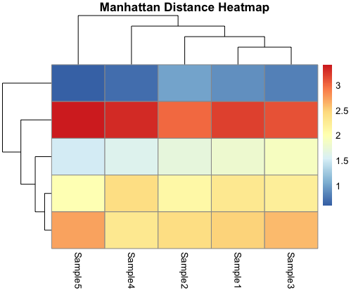
The Manhattan distance heatmap, on the other hand, employs the Manhattan distance metric. It reveals patterns and clusters within your data based on the sum of absolute differences between coordinates. Unlike the Euclidean distance heatmap, this visualization is robust to outliers and can be more suitable for datasets with variables that do not meet Euclidean assumptions.
Pearson Correlation Distance Heatmap:
R
pheatmap(as.matrix(gene_data),
cluster_rows = complete_clusters_correlation_rows,
cluster_cols = complete_clusters_correlation_cols,
main = "Pearson Correlation Distance Heatmap")
|
Output:
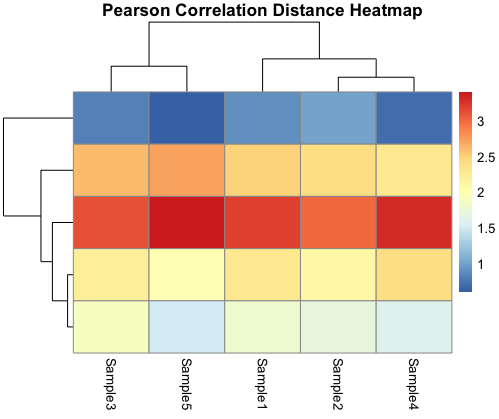
The Pearson correlation distance heatmap explores linear relationships between genes and samples. It quantifies how genes move together or apart, uncovering co-expression patterns or anti-correlations. This heatmap is valuable for identifying genes that are co-regulated under specific conditions, making it a powerful tool for gene expression analysis.
Conclusion:
Creating heatmaps with hierarchical clustering in R is a valuable technique for visualizing complex datasets, such as gene expression or any data with similar patterns. This visualization not only aids in identifying clusters but also provides a clear overview of your data’s structure.
Experiment with different datasets, clustering methods, and color palettes to unlock hidden insights within your data. Heatmaps with hierarchical clustering are your ticket to revealing intricate relationships in a visually stunning way. Explore, analyze, and discover the stories within your data.
Share your thoughts in the comments
Please Login to comment...